A. Andreassen by Bond
Opinion by Richard Baird Posted 2 February 2016

A. Andreassen is a new Scandinavian lifestyle brand that brings the high quality and longevity expected of handmade shoes and the values and ideals associated with Scandinavian design to slippers. These are characterised by their simplicity, practicality and elegance, and their balance of traditional craft and contemporary design.
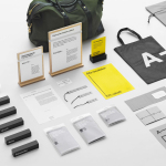
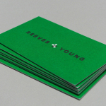
A. Andreassen recently worked with the London office of graphic design studio Bond to develop a brand identity and packaging treatment rooted in its Nordic approach and Scandinavian heritage, and would communicate quality and a natural sensibility. The project also included triplex business cards, tissue paper, boxes, brochure and web design.

It is a small and neat project that, through simple structural design and material choice, natural board colour and texture, white paper and straightforward print treatment, has a lightness and Scandinavian simplicity that both frames and secures product well, and makes the most of what is currently read as craft and natural quality.


The logotype, a monospaced and monolinear sans-serif, is carrying a few too many custom flourishes and cuts, particularly for a design-led Scandinavian brand, that makes it appear a touch unrestrained, but certainly proprietary. The A, built out into a geometric pattern, introduces a smart layer of visual texture in contrast to the fibres and physical texture of the board. This neatly links back to the themes of natural material quality and design.

Alongside a bright fluorescent green, used sparingly through the centre of a triplex business card and as the cord of the draw string bag, the pattern layers the craft tone set by box and its unbleached board with a modernity. This is explored further through its animation online.
White space, the extensive use of Curtive Mono and a responsive site structure online plays with the current favour for the utilitarian and effectively expresses the more practical nature of the products and draws out their colour, texture and detail.
Design: Bond. Opinion: Richard Baird. Fonts Used: Curtive Mono.