The Best of BP&O — January 2016
Opinion by Richard Baird Posted 5 February 2016
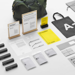
The new year got off to a great start. January’s highlights included Blok’s brand identity for LA trend watching business f32, Manual’s continued work with Californian craft beer brand Fort Point and OK-RM’s monogram, print and stationery for Antenne Books. However, there were five projects that stood out, and have made it into BP&O’s Best Of Series.
This feature brings together the most interesting, unexpected or unusual projects published on the site each month for another opportunity to be seen and shared. These typically balance a strong concept with a compelling aesthetic that appropriately plays with colour, texture, layout, form, type and print finish.

Fox Real Estate by Parallax
Fox is described by Parallax Design, the Australian graphic design studio behind its new brand identity, as one of Adelaide’s most respected boutique real estate agencies. Established in 2005 by Andrew Fox, Fox Real Estate specialises in the selling of high-end properties. Following business growth and to coincide with a move to larger premises, Fox worked with Parallax to develop a new brand identity, which extended across brochure, business card and signage, with the intention of strengthening its market position.
See more of this project here

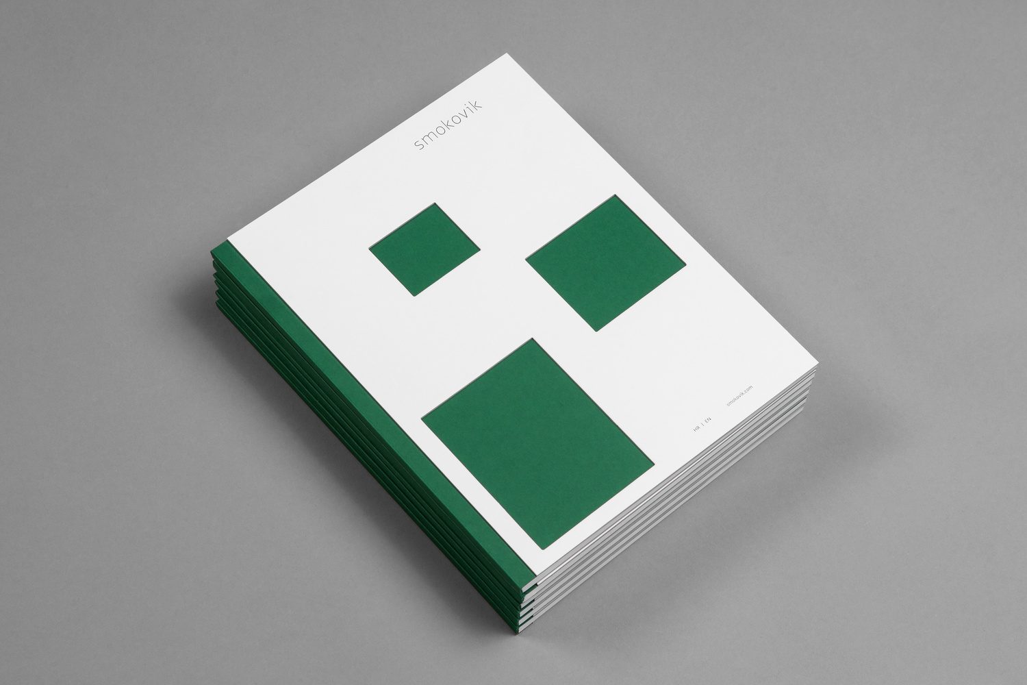
Smokovik by Studio858532
Smokovik is an exclusive property development, located on the Croatian Island of Krk, designed by renowned local architect Idis Turato. The development will be made up of both residential and commercial buildings that share a functional and sustainable build practice, a favour for modernity, flat surfaces and Mediterranean sea views. Smokovik’s brand identity, created by Studio8585 now working from Copenhagen, included logotype, brochure and website design, a copywriting component and art direction.
See more of this project here

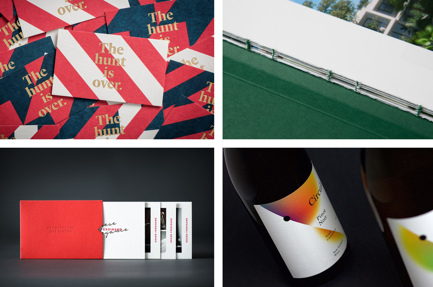
Grand Ferdinand by Moodley
Grand Ferdinand is hotelier Florian Weitzer’s fifth hotel. It features a distinctive interior of green leather upholstery and Lobmeyr chandeliers, rooms with ornate and functional furnishings, and a restaurant that is said to serve the best French champagne and the grandest Viennese cuisine, all set within a landmark building located on Vienna’s Ringstraße.
Grand Ferdinand has a philosophy that celebrates the past whilst moving forward. This meeting of tradition and modernity, whilst running throughout the hotel’s interior design and underpinning service practice, also informs its brand identity, created by Austrian graphic design studio Moodley. This encompassed stationery, signage and website design, as well as a variety of printed assets that included menus, posters and postcards.
See more of this project here

Black Estate — Circuit by Toko
Circuit is a 2014 Pinot Noir and 2015 Pinot Gris range from New Zealand’s Black Estate, a Vineyard run by The Naish Family and located across three hillsides in the Waipara Valley, an area of North Canterbury with clay and clay-limestone soil. Black Estate worked with Australian graphic design studio Toko on the branding and packaging of these two new wine varieties which extended across labels and boxes.
Read more of this article here

Bombonería Pons by Mucho
Bombonería Pons is a family owned Barcelona based business, established in 1960, dedicated to producing the finest handcrafted chocolates. With a desire to engage with a younger consumer Bombonería Pons recently worked with international graphic design studio Mucho to develop a brand identity treatment that would be sensitive to its traditional values and history yet give it a new contemporary appeal. This extended across packaging, brochure, stationery, business cards and print communication.
Read more of this article here