Reeves & Young by Matchstic
Opinion by Richard Baird Posted 8 February 2016

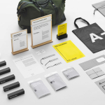
Reeves & Young is an Atlanta based construction and sub-contracting business that was formed in 2015 following the merger of Reeves Contracting Company and Potts Construction. To coincide with this merger, Reeves & Young worked with American graphic design studio Matchstic to develop a new brand identity that would convey the combined strength of the two businesses but would also be sensitive to their respective partners and clients. This extended across business cards, stationery, brochures and website.

Matchstic’s concept draws its inspirations from the relationships and people that form the foundation of Reeves & Young, and is communicated through the line “Built by Relationship”, a copywriting component and a number visual expressions. These include a plus symbol / monogram, photography and overprint detail.


The monogram appears as a strong, understandable and memorable visualisation of partnership. It is a neat observation and typographical trick that functions well as both a standalone RY monogram with clear collaborative connotations, and, as part of the logotype, links partners Reeves and Young.
Although it relies on colour to define the two letters, which limits its flexibility in a conventional sense, the monogram is identifiable and grounded by a relatable and clear concept, particularly following a merger. Type choice favours continuity over contrast with similarly weighted letters and generous spacing that provides balance.


The transparency of the monogram is also used online and as an overprint detail in print. This links images of construction sites and people with statements that are straightforward and reassuring. These statements play with antitheses and alliteration, and fit in well with the context of a name with two parts.
A colour palette of black ink across white boards and a bright green find a good balance between the practical, distinctive, and the sustainable. This contrast of colour also extends to flat panels of ink alongside the visual texture of imagery, emphasising their consistently collaborative, people-centric compositions.

Where colour palette and monogram are distinctive but practical, and the photography and language firmly rooted in the people-centric and collaborative nature of the business, bold uppercase typography, robust material choices and construction photography are reassuring in their familiarity and association with the industry.
Design: Matchstic. Opinion: Richard Baird. Fonts Used: Antenna & Effra.