Art Museum by Underline Studio
Opinion by Richard Baird Posted 23 March 2016

Art Museum unites the Justina M. Barnicke Gallery and the University of Toronto Art Centre as one new institution dedicated to exhibition and education. It is one of the largest gallery spaces for the visual arts in Toronto and is housed within an iconic gothic-style building.
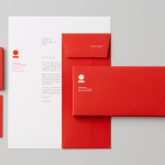
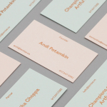
The museum worked with Canadian graphic design studio Underline to develop a new visual identity system that would emphasise its placement within the city, and engage both the university community and the Toronto public. This links, through type, layout and multi-colour, a variety of print communications that included brochures, programs, posters, signage and website.

Although the program can be reduced down to two key components, sans-serif type and colour palette, the new Art Museum identity draws its memorability and communicative value from its iconic period setting, and through a great use of juxtaposition.
Bright contemporary colour and precise typographic form stand out from the natural colour and irregular qualities of stone, and the building’s imposing gothic forms. As such, brand identity, in conjunction with its environment, feels like a fair expression of Art Museum’s program of modern and classical art exhibition and education.
Where identity is restrained, its context, and the contrast that this establishes, is acute, appropriate and impactful. The white decal, sans-serif type and angle, floating in an interior space of warm lighting and stone arches is particularly effective and a personal highlight.


Toronto’s street grid, angled at 16.7 degrees, informs the baseline of the logotype with the intention of establishing a link with place. Outside of a bold colour palette, this angled typographical treatment and its cropped implementation, appears as the only other element of individual expression, with print, signage and business cards all having a rather conservative quality. While it is a very subtle nod to place it is grounded in something relevant and unique, even if the aesthetic is familiar.
NB International stands up well as the single type choice, both as a logotype implemented as large signage and as small body copy online. Its origins are far less about place, but its reference to book printing and international-style, while nuanced, continues to play with tradition and modernity set up by colour and context.

Much like the contrast between venue materials and brand identity colour palette, the angled type contributes a little more to the tension between modernity and traditionalism. However, some form of play or variation in print layout, the expansion of the angle, or additional type choice might have provided Art Museum with a touch more character, beyond a striking colour combination, when existing outside of its iconic context.
Design: Underline. Opinion: Richard Baird. Fonts Used: NB International Pro.