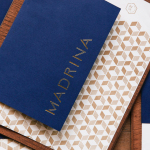
2016 Brand Nieuwe Conference
Opinion by Richard Baird Posted 4 April 2016
Brand New, a division of UnderConsideration, is one of the first and foremost design blogs to offer opinion on corporate and brand identity work. It has amassed a huge following, often quoted by international press, and provokes frequent and heated debated. Complimenting the site is an annual conference that draws speakers and designers from across the globe
Rather than just the one conference, this year will see a European two-day event take place, prior to Brand New Nashville, between the 20th and 21st of June in the city of Amsterdam, and fittingly renamed Brand Nieuwe Conference. Total Design legend Ben Bos, as well as representatives of studios that have featured on BP&O will be speaking at the event. These include Brian Collins of Collins, Marko Salonen of Bond and Pablo Juncadella of Mucho.
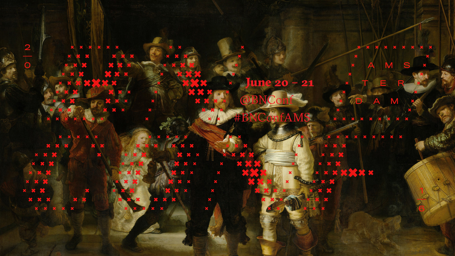
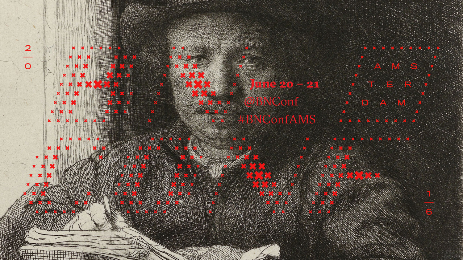
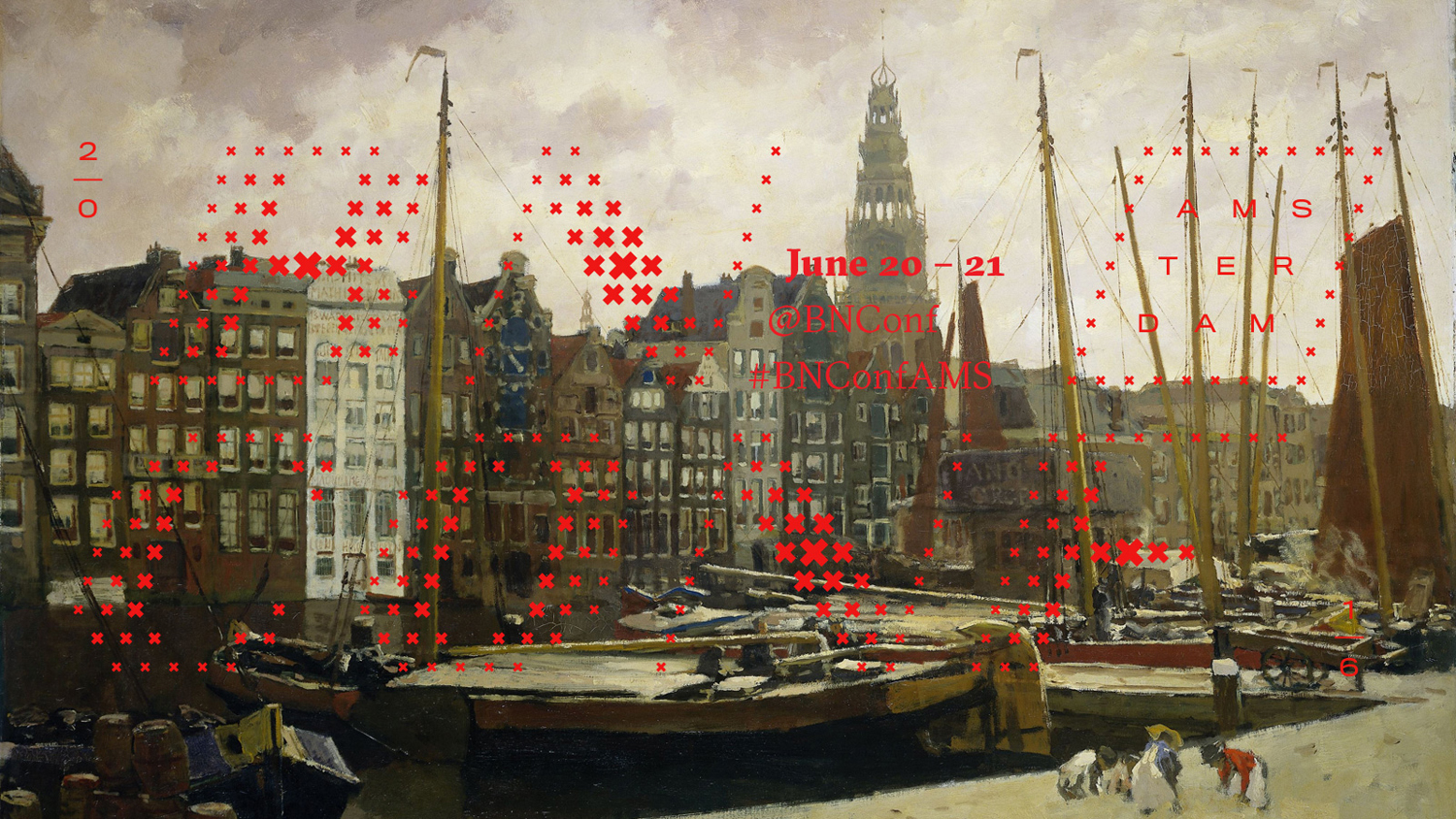
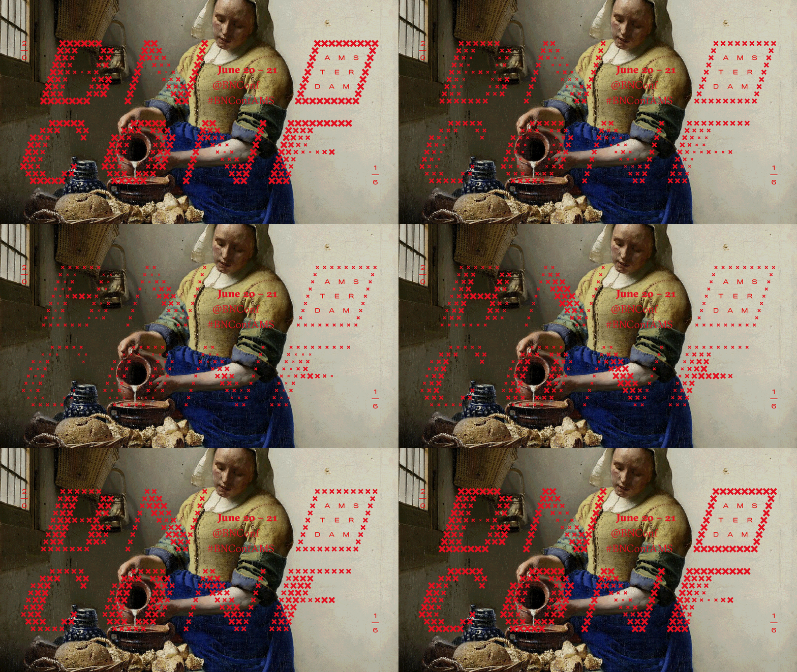
As with previous Brand New events, the Brand Nieuwe Conference has its own unique brand identity that draws on the host city and, as an extension of a blog that talks extensively about rationale and communicative intention, is grounded in some clear (and occasionally abstract) ideas that underpin a distinctive aesthetic. Art and design, past and present, American origin and European destination collide, and expressed through static image and dynamic type, and successfully brought together, at least initially, online.
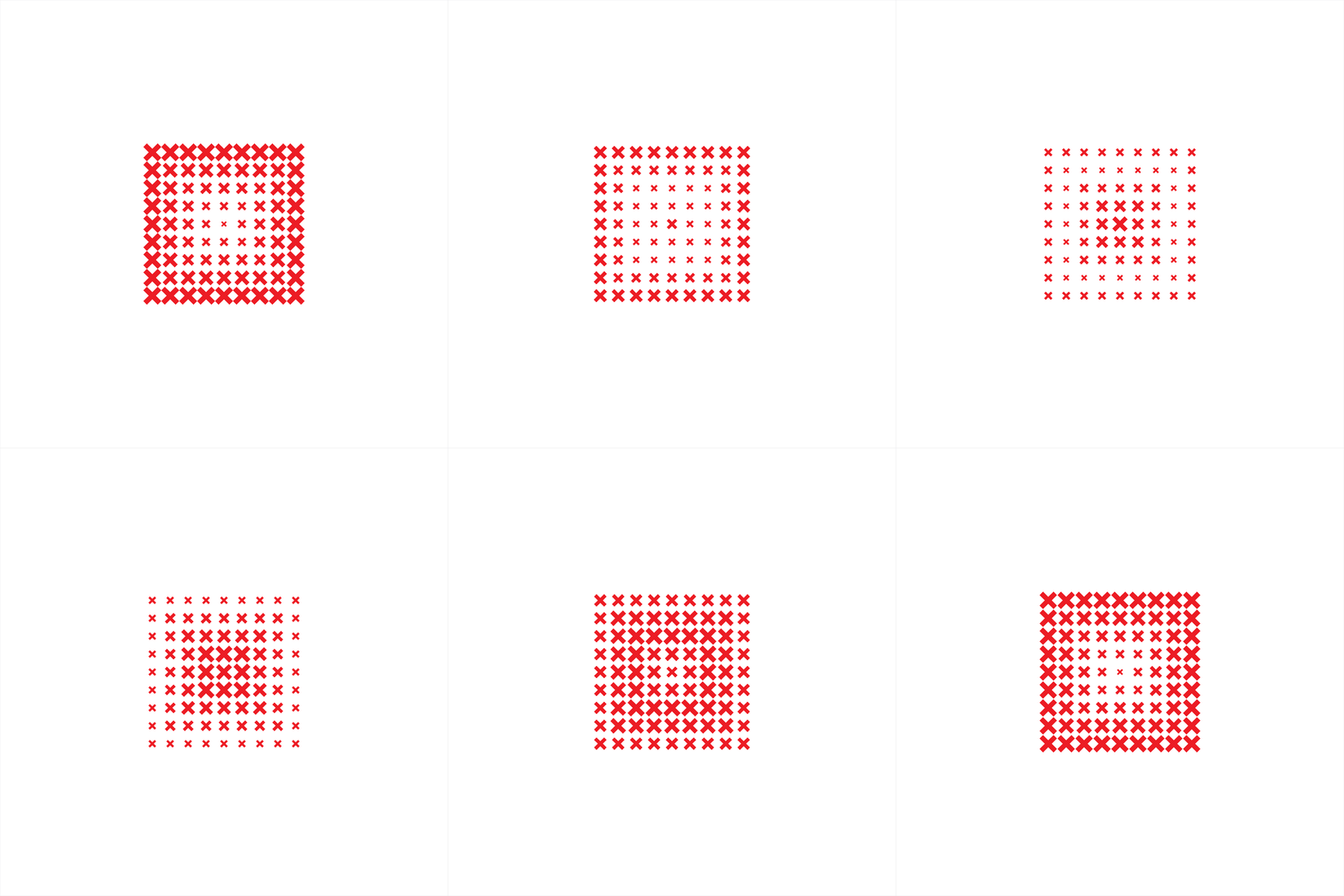
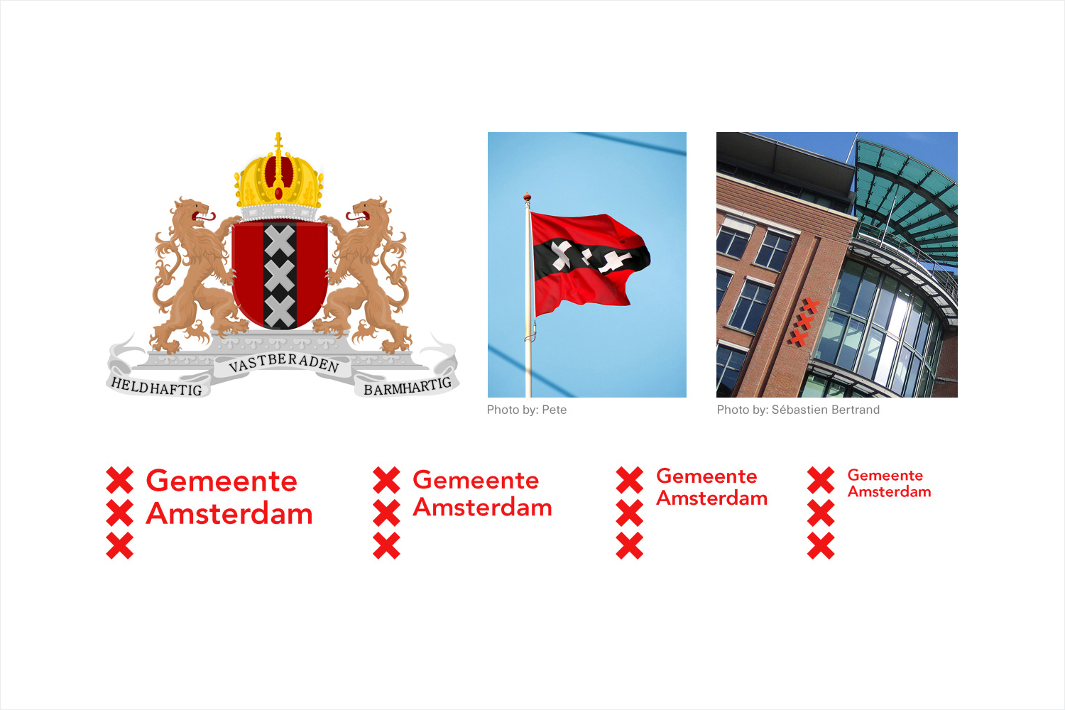
Amsterdam’s own city identity is effectively weaved into and throughout the Brand Nieuwe Conference system. The ××× visual device, an interesting and contemporary brand identity component, but one actually rooted in the city’s history, is the foundation of lettering, which sits within an underlying grid system.
Animation gives each character a radiating quality, a very subtle nod to the concentric structure of Amsterdam’s canals. Lettering exists somewhere between an 8-bit screen image and cross stitch, and stands up well both large, reduced down, and animated. Embroidery is acknowledged in Brand New’s write up, and to move it further away from this a tilt is added, very loosely informed by the speeding bikes of the city.
The most interesting things occur from happenstance, viewer association and interpretation. The embroidery quality is strong, even with the tilt, but alongside the letter shapes, makes for an interesting juxtaposition of the digital and the crafted, which is explored further through image and the way type is responsively rendered online.
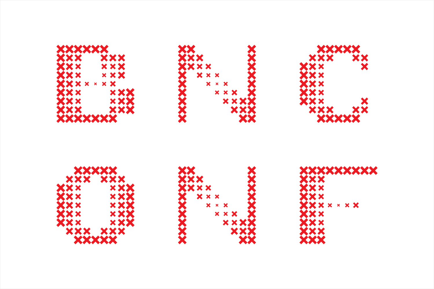
These animations, the systematic grid-structure, and the variation in application gives the Brand Nieuwe Conference a thoroughly contemporary and visually interesting quality, but it is its bold appropriation of an existing city identity, something Brand New describe as being very nearly cliché, that really gives this project its unique character. It confidently draws an individual expression that is identifiably, and easily associated with the event, from a sense of place.

This sense of place is further explored and emphasised through the smart use of the Rijksmuseum’s high-res, free-to-use digital collection of 800 years of Dutch art and history, and a resource that would be criminal to not use. This provides significant contrast to type, not only in colour but in form and intention, one with a distinctly personal, rich in detail and depth, and the other a systems-based, inclusive, modernistic and coherent city identity and its typographical reinterpretation. Both share a pleasant textural quality.
The interplay and boundaries between type, image and legibility is pushed, at times challenging and, as media sponsor, difficult to pull that one clear compelling image to use on limited social media platforms, but overall, is well-pitched for an audience of designers and a one-off event.
Other neat details include the contrast of Swiss type foundry Grilli Type’s GT Sectra and Font Bureau’s Titling Gothic, a subtle mix of European heritage, and calligraphic lettering, and type inspired by railroad infrastructure, neatly avoiding the very current favour for geometric sans.
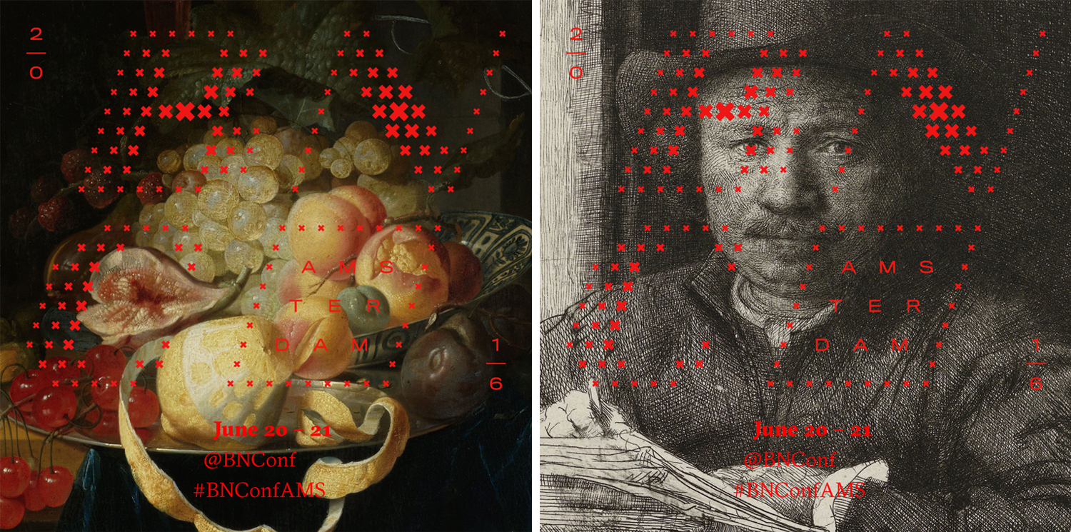
As a conference, a lot of this really hinges on its application; programmes, brochures, lanyard, tickets and totes, as well as presentation formats and videos. As it stands here, there is clearly plenty of character, thought and originality in the remixing of existing image and place, impact in the juxtaposition of static image and dynamic type, and is certainly something that I will look forward to seeing play out across the conference space.
Design: Brand New. Opinion: Richard Baird. Fonts Used: GT Sectra & Titling Gothic.
