FR-EE by Pentagram
Opinion by Richard Baird Posted 15 April 2016

Fernando Romero Enterprise (FR-EE) is an architecture and design firm with offices in New York and Mexico City. The firm was founded by award-winning architect Fernando Romero, and is recognised internationally for their work on projects such as the new Mexico City International Airport and Museo Soumaya. FR-EE worked with Pentagram partner Natasha Jen, plus team, to help them capture and convey their innovative and pioneering spirit and democratic approach, through a new brand identity system. This went on to include business cards, stationery, brochure and web design.

BP&O has a soft spot for architectural brand identity work and its visual vernacular. This is often characterised by typographical neutrality and a sense of structure, a preference for functionality and reduction over any kind of flourish, a strong and often appropriate desire to convey architectural materiality, and occasionally touching upon the light and shade that defines three-dimensional space through the shadow cast by a blind emboss. Natasha Jen’s work for FR-EE is in opposition to most of these, favouring the bright and impactful, the personable and an element of play online.


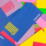
Pentagram’s write up is, as you would imagine, filled with fair rationale. Each choice is justified and, for the most part, perceptible. These include a colour palette of blue, green and purple as an expression of vibrant Mexican culture, a sense of origin, and a commitment to environmental sustainability, and draws on and expresses FR-EE’s democratic approach and adaptability through Circular.
A lot of weight is placed on colour palette. Although perhaps too few colours to be immediately and explicitly associated with a Mexican origin, however, it does step away from convention with a contemporary exuberance. The use of spot colours and their consistent and thorough application across stationery and brochure cover is impactful, unusual and distinctive.


Circular is personable, enhanced by an all-lowercase typesetting, but with an air 0f corporate professionalism. Shapes remain free from excessive flourish, and its bold and robust weight and geometric forms link in with structure. It has become a bit of a go-to choice for digital lifestyle brands, and although this is far from endemic, it has the potential to be marred by specific associations.
The relationship between type and space, logotype and information, and overall layout, particularly across the business cards, at times does not feel particularly well-balanced, and two similar but different sans-serifs, Circular as logotype and Work Sans as body, neither establishes continuity or introduces a moment of contrast or variation.

Colour is appropriately dialled down online. And although it goes back to the industry’s favour for black and white, reversing this pushes it further away from convention, framing compelling architectural image and drawing the eye in rather than being pulled outward.

The front page is a candy shop of form and colour, and is the real highlight of the project, alongside the ability to rotate each of these on their respective project pages. Much like type and colour, there is an underlying accessibility to these choices, grounded in the firm’s democratic positioning. So while there is not a clear aesthetic continuity, apart from type, between print and online presence, it is linked by concept and tone.

The website finds a pleasant balance between aesthetic appreciation of texture and colour, but also, and not often emphasised, of three-dimensional form through interaction rather than as an observer of static image. This backed up by some good insight, moving image and a focus, through type size, on scale and current status.
Design: Pentagram. Partner In Charge: Natasha Jen.
Designers: Joseph Han & Xinle Huang.
Opinion: Richard Baird. Fonts Used: Circular.