Danish Selection by Kontrapunkt
Opinion by Richard Baird Posted 22 April 2016

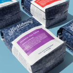
Danish Selection is a new range of high-quality fruit spreads cut with alcohol. The range includes blackcurrant infused with Jamaican rum, orange with cognac and a wild blueberry variety with Scotch whiskey. Orkla, the company behind Danish Selection, worked with Copenhagen based graphic design studio Kontrapunkt to develop a packaging treatment that would clearly communicate this new concept to consumers. Kontrapunkt’s solution is characterised by a circular label of type, pastel colour and uncoated paper.

In response to an unusual product and new category, and a target market that would be primarily men, Kontrapunkt developed a label system with a bold typographic clarity, rather than ornament, a strong focus on fruit content, which is far higher than competitors, and a colour palette that provided both impact and differentiation, where the market is saturated by white.


Kontrapunkt’s direction appears as an interesting fusion of fruit preserve and alcohol visual vernacular, where fruit content stands in for alcohol volume, and round stickers and type along curved baselines draw on whisky labels and beer taps. It is an appropriation that feels natural, with distilling, brewing and preserving sharing similar craft traditions, and benefitting from a current favour for small craft brands and a sense of heritage in both categories.
Proportion, space and letter shape looks to draw distinctive visual presence from precise communicative intention. And for the most part this works. Brandon Grotesque feels like an obvious and increasingly ubiquitous choice, but an understandable shorthand for small craft brands (even though Orkla is pretty large), and a masculinity without being exclusory. This continues in the use of condensed sans-serif Knockout. The label is largely well-typeset, and effectively negotiates some difficult pairs, with plenty of space and good legibility.
The relationship between bold number and fruit content gets a little lost due to the proportion and placement of the %, and the breaking of “contains” over two lines. This does introduce a moment of friction in understanding, although rooted in an appreciation for old packaging, but is easily picked up on closer inspection, following the initial attention drawing impact of its aesthetic.
A concentric, rather than a top down hierarchy, forms a pleasant and clear connection between an unfamiliar combination of ingredients, makes good use of the label shape, with the lid providing more insight, and balances modernity and tradition.
The colour palette, a crafty mix of pastels, and the very flat and full coverage of these, manages to skirt that line between the perception of batch production and the quality and consistency of an established brand without being disingenuous. Product also contributes to understanding and aesthetic, making up an important second colour. Craft is further reinforced with the choice of rough, uncoated paper stock with a matt finish, and provides a contrasting surface texture over the high gloss of the jar.
Shunning twee but familiar images of fruit, and embracing type over form language, instantly marks Danish Selection out as different, while structural design and material choice, clearly showing content, is reassuringly fruit spread.
Design: Kontrapunkt. Opinion: Richard Baird. Fonts Used: Knockout, Thirsty Script & Brandon Grotesque.