The Best of BP&O — April 2016
Opinion by Richard Baird Posted 29 April 2016
April’s highlights included Neue’s packaging for hi-fi expert Hegel, Mast’s brand identity for restaurant Madrina, and IS Studio’s work for LADFest 2016. However, there were five projects that stood out, and have made it into BP&O’s Best Of Series.
This feature brings together the most interesting, unexpected or unusual projects published on the site each month for another opportunity to be seen and shared. These typically balance a strong communicative concept with a compelling aesthetic that appropriately plays with material colour and texture, form, type, layout and print finish.
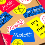
Mercht by Robot Food, United Kingdom
Mercht is a UK based custom merchandise business, created by the team at Awesome Merchandise, that offers its customers a risk-free way to design, sell and ship customised t-shirts and wearable accessories, through an online showcase and print on demand service. It is a platform where, if designs sell well, both parties profit, with neither loosing if they do not.
Leeds based graphic design studio Robot Food, the studio behind Awesome Merchandise’s brand identity, developed an identity for Mercht that captures the creative, custom and accessible spirit of the service through a playful and convivial mix of bright colour, hand drawn lettering and pattern, which links a variety of collateral. This included badges, stickers, notebooks and packaging, postcards and branded t-shirts.
See more of this project here


Danish Selection by Kontrapunkt, Denmark
Danish Selection is a new range of high-quality fruit spreads cut with alcohol. The range includes blackcurrant infused with Jamaican rum, orange with cognac and a wild blueberry variety with Scotch whiskey. Orkla, the company behind Danish Selection, worked with Copenhagen based graphic design studio Kontrapunkt to develop a packaging treatment that would clearly communicate this new concept to consumers. Kontrapunkt’s solution is characterised by a circular label of type, pastel colour and uncoated paper.
See more of this project here

Farah by Post, United Kingdom
Farah is a men’s fashion brand with a seasonal catalogue of shirts, polo shirts, knitwear, jackets, footwear, bags and accessories available online and from high street and department store premises in the United Kingdom. Following two years of collaboration, London based graphic design studio Post were commissioned by Farah to refresh its visual identity, from labelling, retail concept, internal communications and art direction, to stationery, business cards, brand book and signage.
See more of this project here

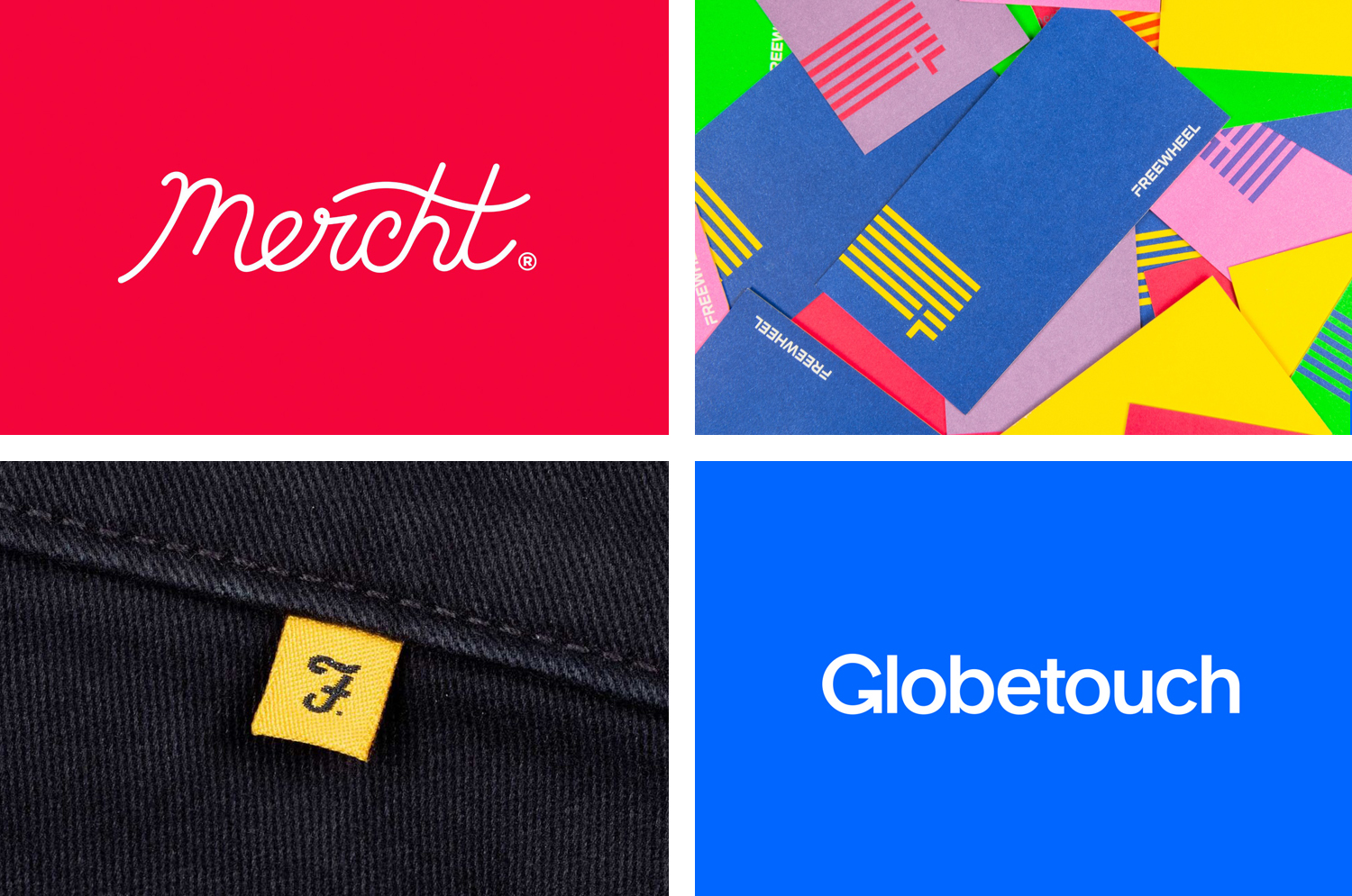
Freewheel by Collins, United States
Freewheel is a dedicated Wi-Fi only mobile phone service launched by American cable television company Cablevision. Freewheel allows people to break free from contracts by providing unrivalled communications accessibility without large and expensive data plans and hidden fees. This is made possible by a network of over a million Wi-Fi hotspots.
Freewheel’s egalitarian intention and connectivity is effectively expressed by its visual identity, created by New York based studio Collins, through a unifying flag-based graphic device, which then expands into a bold, dynamic and brightly coloured visual texture of lines and intersections and a similarly styled logotype. These go on to link print communication, packaging and website with a youthful and empowering quality.
Read more of this article here

Globetouch by Bunch, United Kingdom
Globetouch is a UK communications business and platform owned by operators and providing a wide range of mobile devices with access to a global and cloud-based ecosystem through an extensive network of offices and data centres.
This extensive network and global reach is expressed throughout Globetouch’s brand identity, created by Bunch, using a modern pared-down colour palette inspired by migratory birds, a G that matches the tilt of the earth, patterns that draw on binary code, and a photographic library that touches upon exploration, travel and data.
These assets connect a variety of print and digital communications including, but certainly not limited to, brand guidelines, business cards, stationery, brochures, packaging and website.
Read more of this article here