Fathom Architects by dn&co
Opinion by Richard Baird Posted 6 May 2016

Fathom is a new UK based architectural practice, set up by Justin Nicholls, former partner at Make Architects and Foster+Partners, that draws beautiful and logical buildings from complex briefs, and within the context of sensitive sites. Fathom Architects worked with dn&co. to develop a visual identity that would encapsulate this focus as well as their curiosity and use of technology.

dn&co’s direction, based around the concept of deep thinking and measured results, drawn from a memorable name that subverts the industry’s favour for putting partners above the door, is expressed through a deep blue colour palette, the deep impression of a blind deboss, the gradation of horizontal lines, and similarly styled monogram.
There is a strong continuity and visual simplicity in type, colour and the way that concept plays out, both in print and online, rooted in name and approach which is expressed clearly online through a concise statement of values and intentions.


The postal tubes and box tape make good use of the stepped graphic device, perhaps an unintentional but relevant nod to Fathom’s sensitivity to context, with an element of materiality, a staple of any architectural brand identities, appearing in the choice of uncoated, dyed and unbleached boards, as well as a blind deboss.

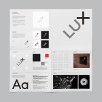
The stepped lines benefit from a number of associations, universal and contextual, touching upon architectural structure, the process of literal measurement, the measurement of results and deep thinking in conjunction with name, which is a lot from so little and a good example of minimalist practice. These lines also have a functional quality, dividing content and adding visual interest.


Typography is straightforward but professional in appearance, mixing architectural cuts with a corporate restraint, while a bright blue dyed board (a neat mix of tech convention and a deep sea/deep thought metaphor) and white ink add a little extra detail and value without undermining concept. More from dn&co. on BP&O.
Design: dn&co. Opinion: Richard Baird. Fonts Used: Theinhardt. Images: Design Week.