Elements by dn&co.
Opinion by Richard Baird Posted 6 June 2016
Elements is the latest spout and handle range from Brooklyn-based boutique brassware business The Watermark Collection. It features 15 metal finishes, 3 handle designs and 19 hand-crafted covers. These make up a potential quarter of a million possible combinations. The modularity, materiality and variety of Elements is drawn on and expressed through a visual identity created by British design studio dn&co, which then plays out across a range of distinctive brochure covers.

dn&co. have managed to take the core make-up of the range, one of high-quality craftsmanship, design, modularity, materiality and variety, and communicate this through visual identity in a direct but distinctive way.
This is clearly expressed in the functionality and utility of neutral type—an uppercase sans-serif of geometric monolinear forms—in the metallic qualities of a copper block foil print finish, the modularity of pattern, and in the use of organic visual texture. It is this texture that really gives the work its compelling quality, both in its aesthetic but also in its conceptual foundation.

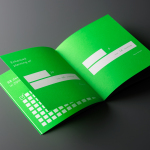
Inspired by the The Memphis Group, and sharing some of the qualities of the work of Nathalie du Pasquier & George Sowden, dn&co’s brochure covers deliver a great sense of continuity and contrast, materiality and variety, much like product, without the expense of cutting and gluing a mix of boards. Contrast is used to good effect, with bold geometric shapes holding a convincing mix of well-rendered and organic visual texture that appear like natural hand-made papers.

Although copper foil does a good job of bridging visual identity and range directly, capturing the polished metallic surfaces, the choice not to replicate other materials such as the marbling of stone, embracing a more suggestive direction that leans more towards arts and crafts, gives a bit more communicative breadth to the work, even though it is really only a few assets. This continues through to a colour palette that moves from the cool concrete grey to the rather more crafty tints of orange and blue, and the shade of green.

It is a small project but with some nice ideas. It is visually distinctive but grounded in the aesthetic, craft, functionality and variation inherent to the Elements range, and expresses this through an interesting and appropriate mix of form language, colour, type and print finish. Thanks to Joy Nazzari & Michael Lemmetti for sorting out images. More from dn&co. on BP&O.
Design: dn&co. Opinion: Richard Baird.