International School of Helsinki by Kokoro & Moi
Opinion by Richard Baird Posted 16 June 2016

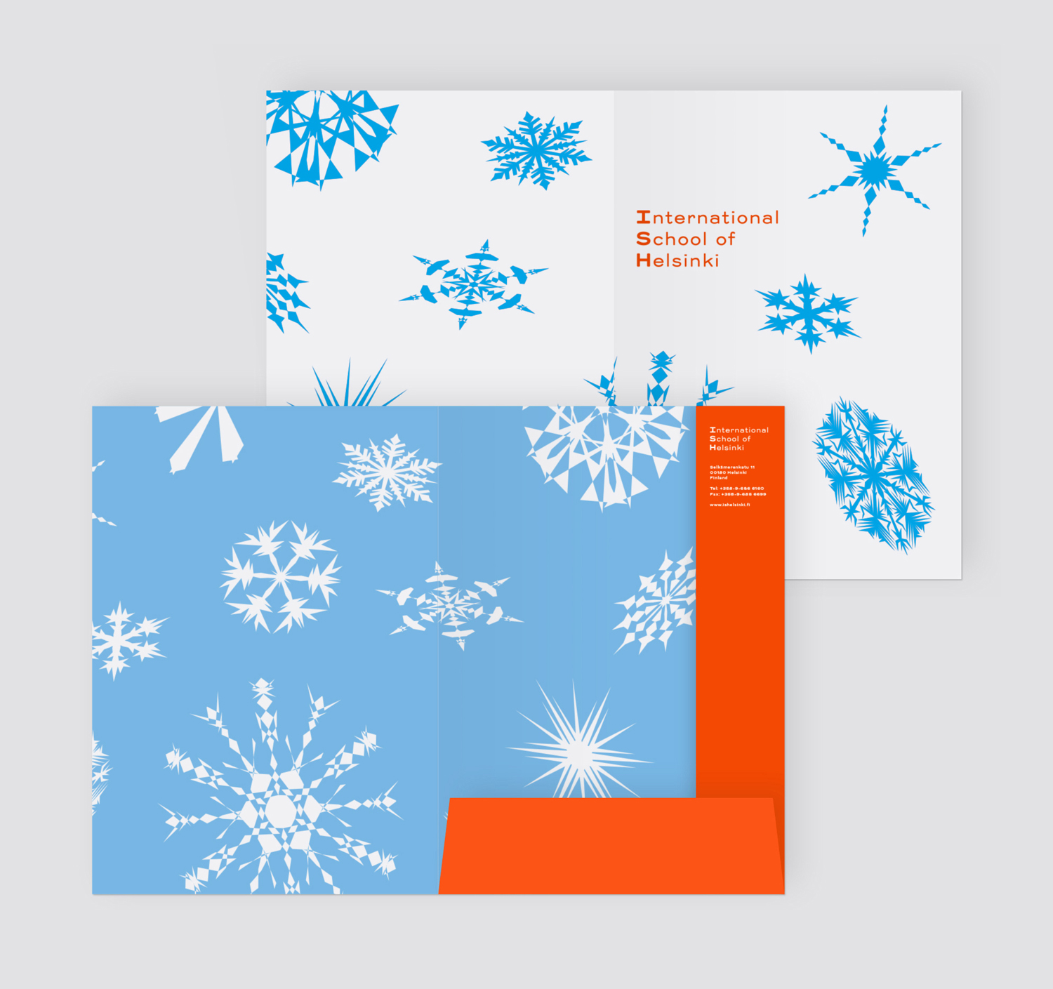
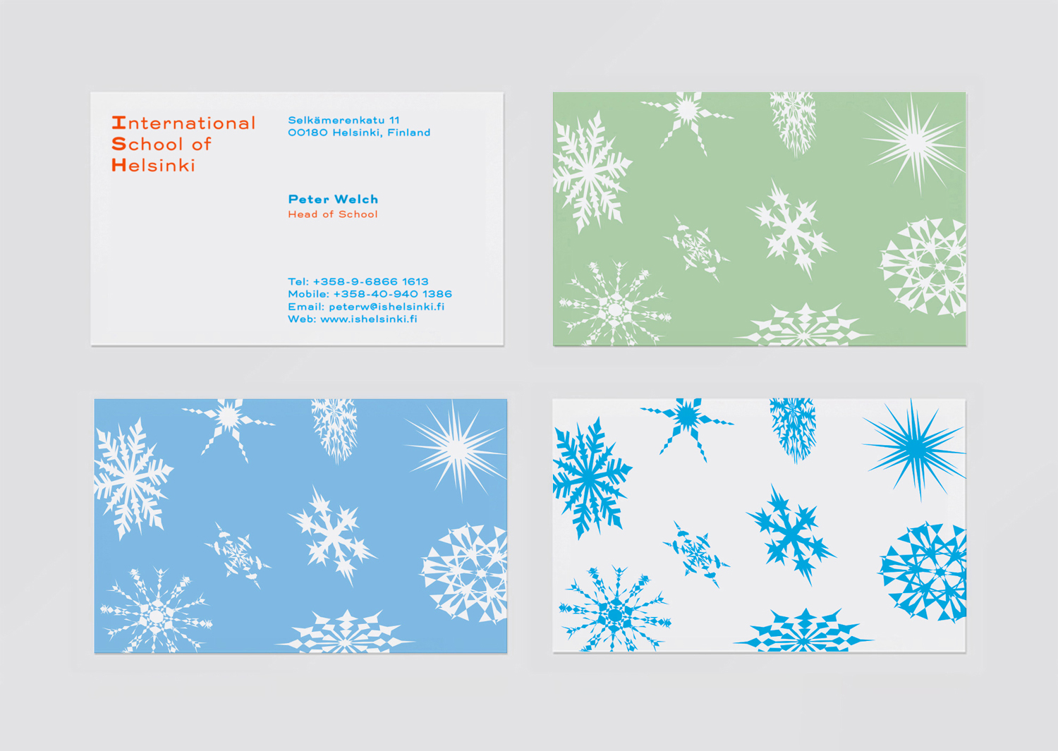
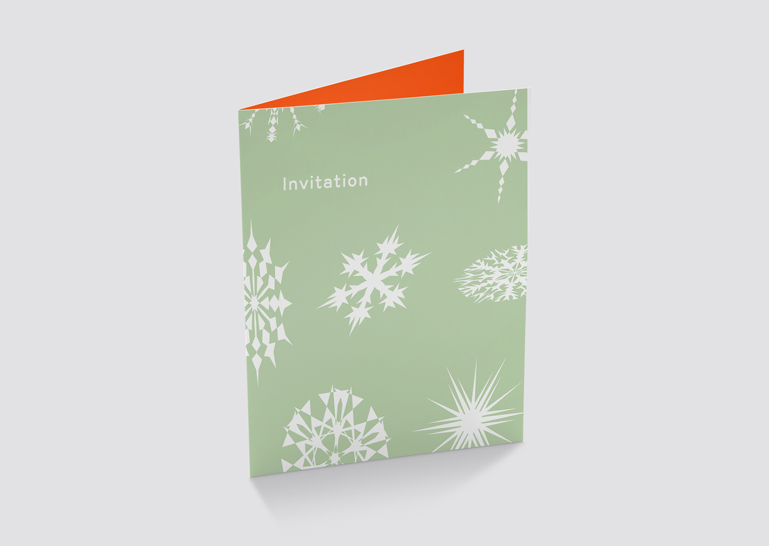
The International School of Helsinki is an independent co-educational school, established in 1963, with a student body from over 40 different countries. It is a place where diversity and difference is valued, and a commitment to international-mindedness is weaved throughout its curriculum. The school’s motto, Each One Is Unique, is an articulation of these values and is the basis of its original identity, a simple snowflake, and is now explored in a more digital savvy, compelling and creative way through the school’s identity, developed by Scandinavian graphic design studio Kokoro & Moi. This links business cards, stationery, signage and invitations.
ISH’s original logo, a combination of what looks like a live trace snowflake and all-uppercase serif, took uniqueness and the institutional and expressed these in an incredibly tired, unmemorable and inflexible way.
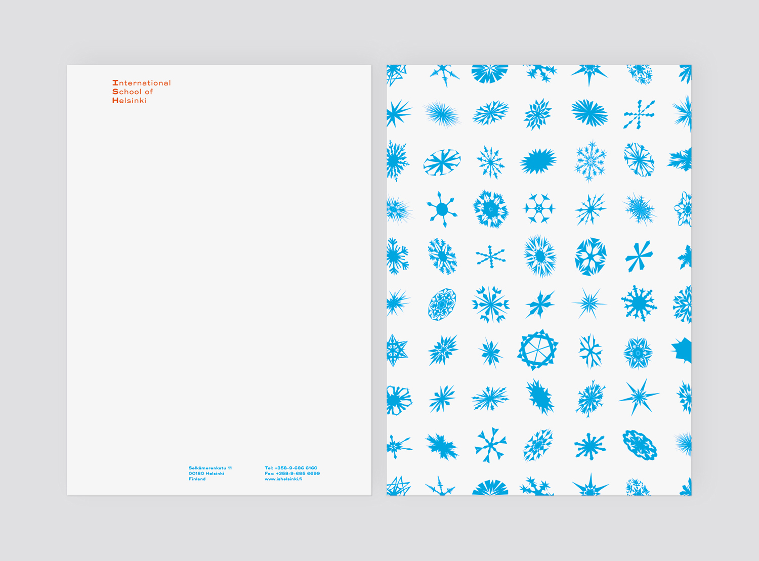
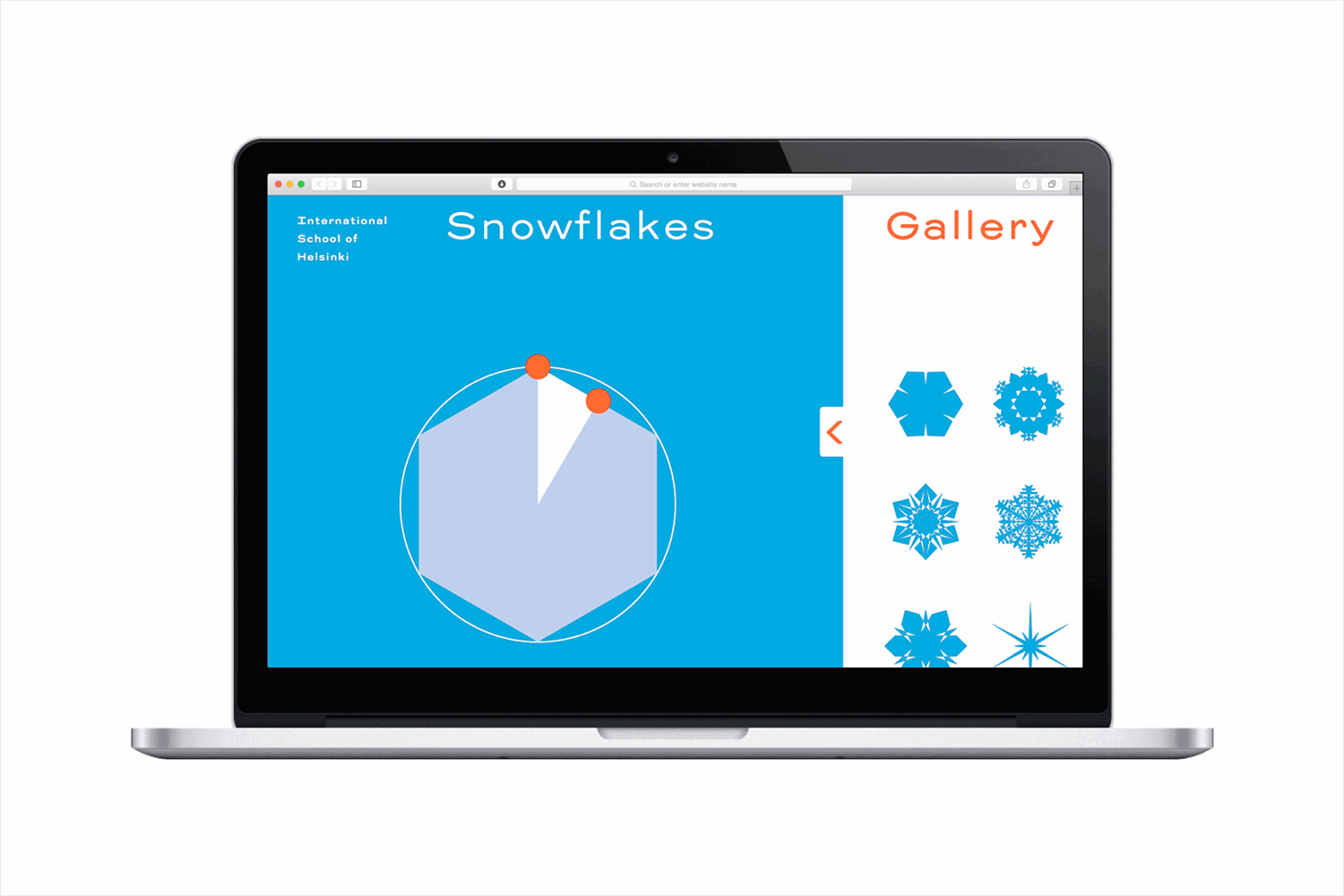
Kokoro & Moi go all in on individuality, uniqueness and engagement, creating an application for generating one-off snowflakes and setting up workshops with students studying branding and graphic design to output hundreds of variations. These snowflakes then formed the basis of visual identity, applied across a variety of print communication, although yet to make it online.
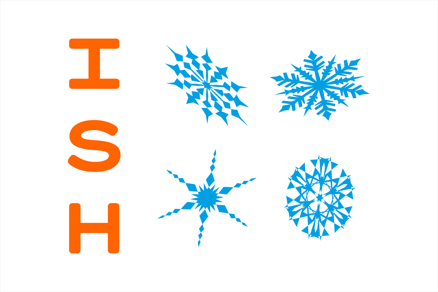
Conceptually it is well-grounded and understandable, designed in a collaborative and technologically savvy way. Aesthetically, it feels a touch awkward in places, particularly in the typesetting of logotype which emphasises initials, and in the squashed form of some of the snowflakes, although this does give them a sense of rotation as if falling. It is also difficult to shake the strong sense of seasonality, it is, however, distinctive, memorable and a significant improvement.
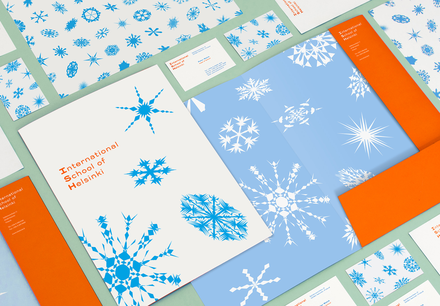
Contrast is used to good effect, and feels rooted in diversity and opposing ideas. Although there is variety in form, there is a simplicity in implementation. Icy blue and green inks play up to the perception international students might have of a cool Scandinavian location, yet is juxtaposed alongside the warmth of a bright orange. Trio Grotesk, a font based on an early 20th century sans serif typeface, brings a softness and further character to identity where snowflakes are sharp and geometric in form, and a subtle sense of legacy where there is largely modern brand expression. More from Kokoro & Moi on BP&O.
Design: Kokoro & Moi. Opinion: Richard Baird. Fonts Used: Trio Grotesk.
