M11 studio by Inhouse
Opinion by Richard Baird Posted 7 July 2016

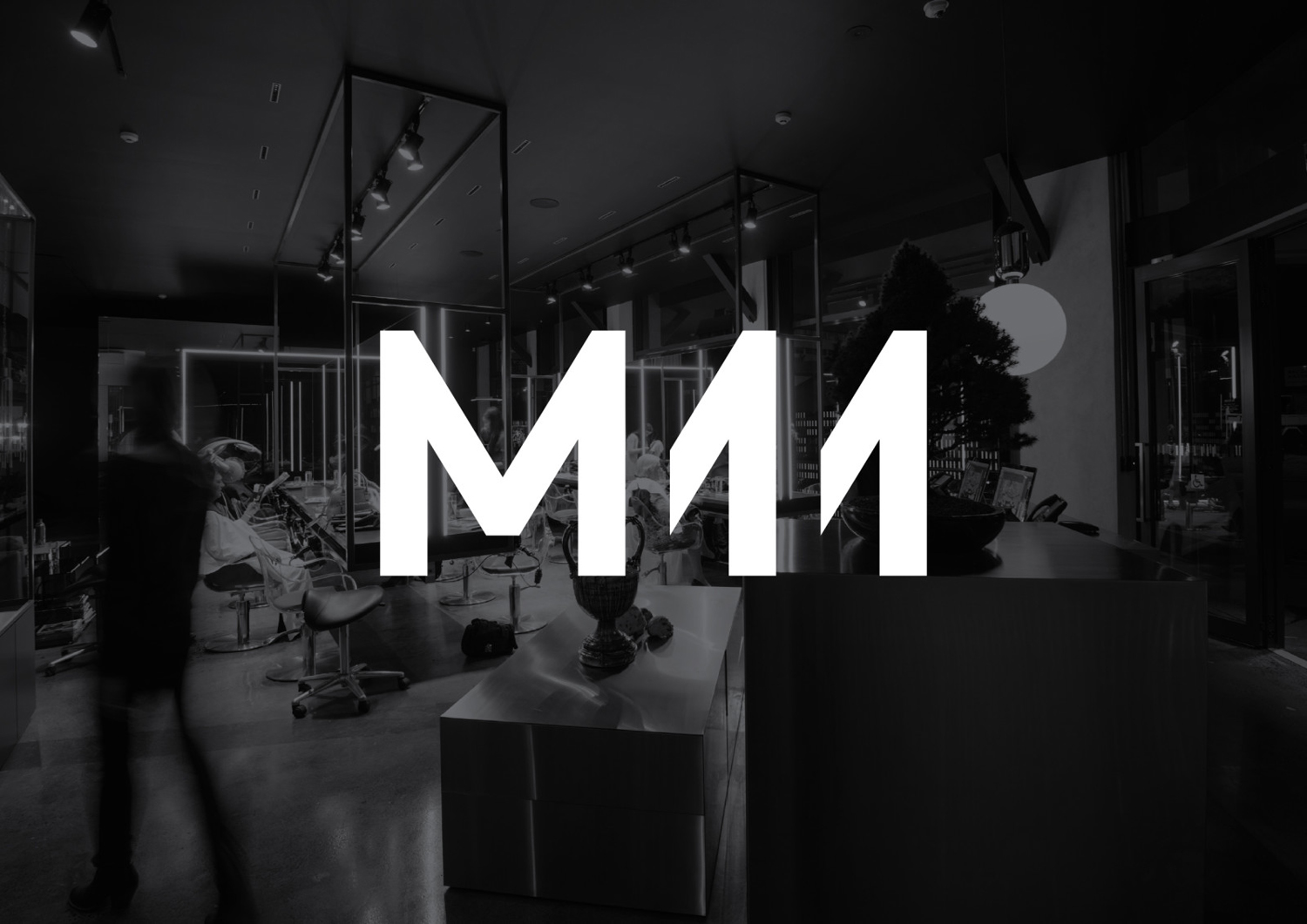
M11 studio is a luxe salon, located in the heart of the fashion, shopping and entertainment district of Newmarket, Auckland, that references the refinery of a Tom Ford fashion boutique. It has a well-proportioned, spacious, linear and light filled interior of large mirrors, strip and spot lighting, white and black walls, gold fixtures, concrete surfaces and robust furniture developed by architects Young + Richards and designer Lauren Hare.
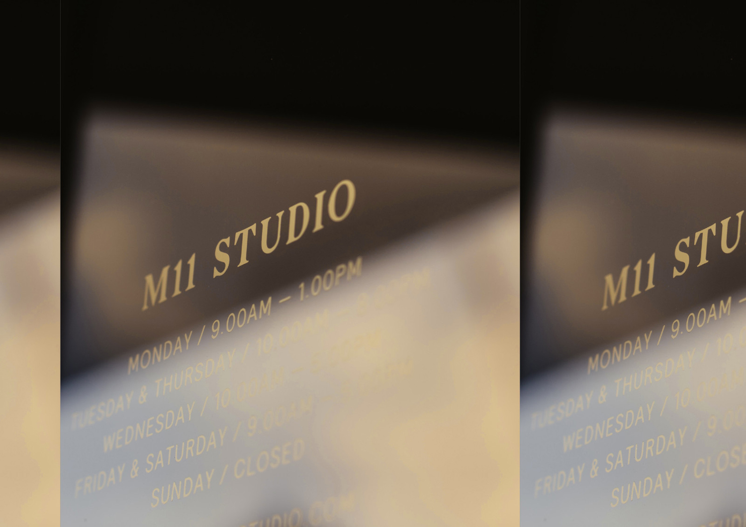
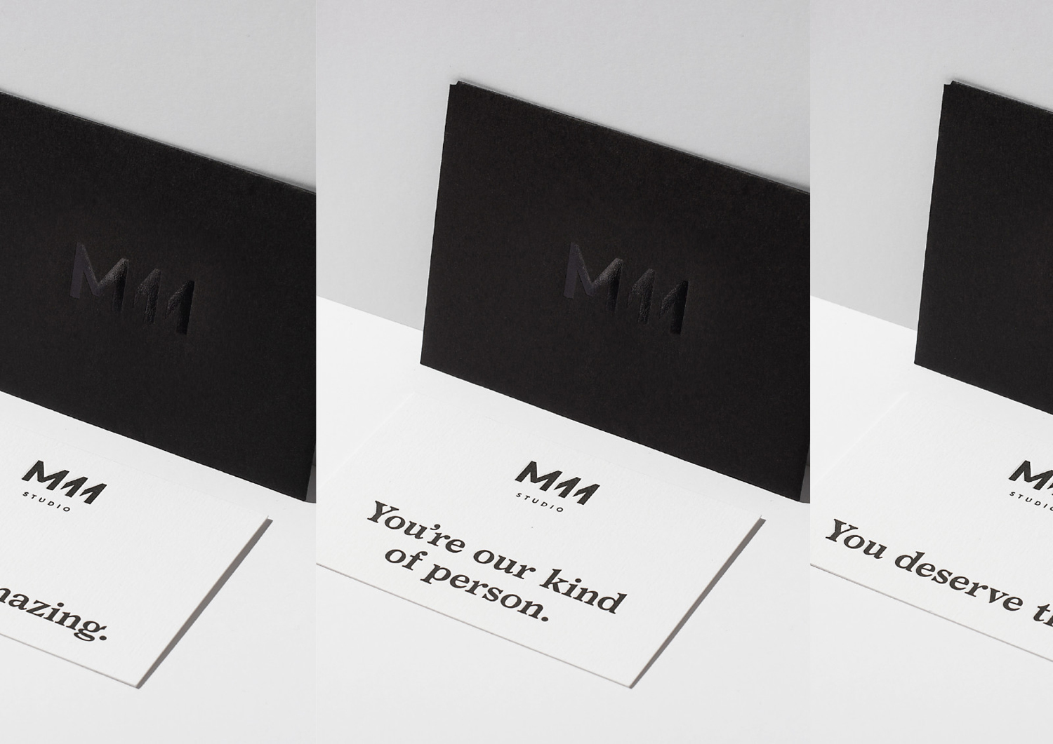
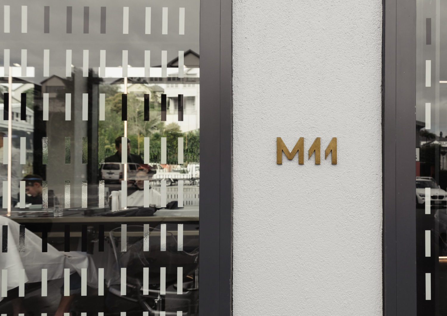
This mix of contemporary space and luxe service is expressed through the structure, colour and materiality of the salon’s brand identity, created by graphic design studio Inhouse, in the form and construction of the logo, the finish of printed collateral, the application of window graphics and the material of exterior signage.
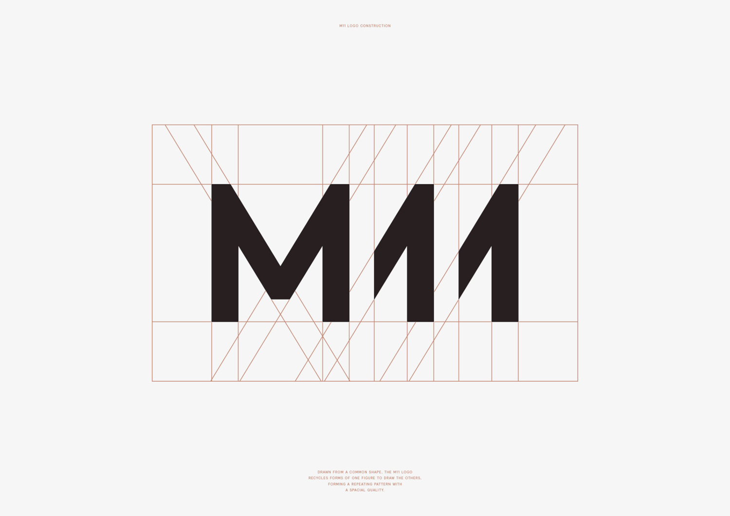
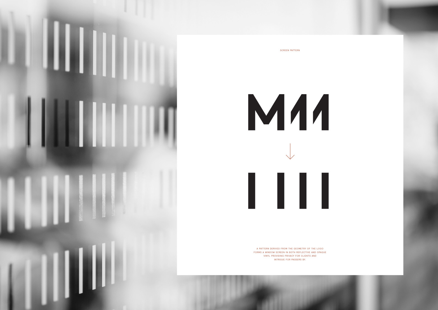
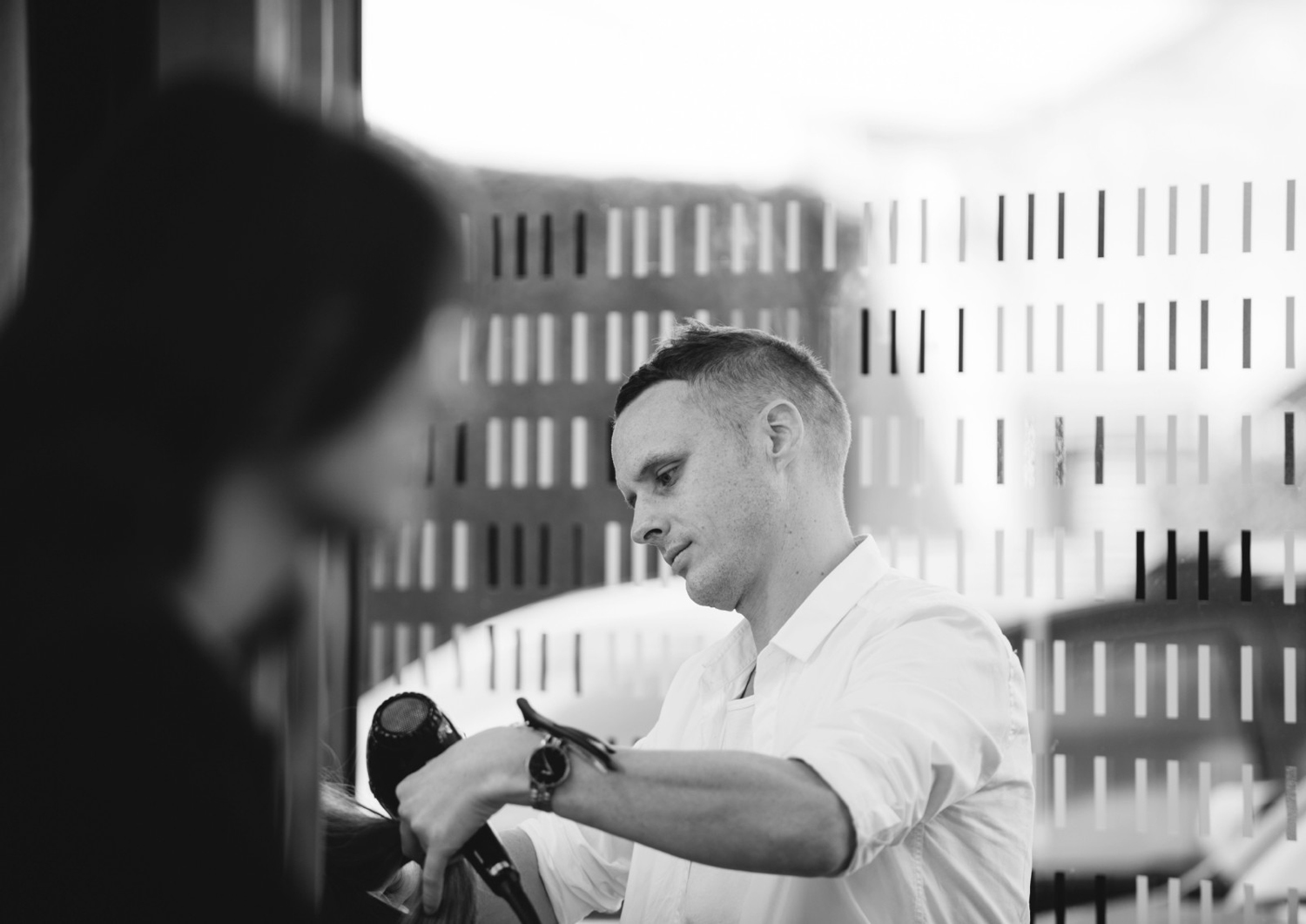
Inhouse were commissioned to create a simple and timeless identity that would sit comfortably within the salon’s interior space. Mirrors, cuts, crops, and structure are all touched upon by Inhouse’s work, and feel well-suited to a contemporary salon and the interior of M11. This comes through not only in the weight, build and facets of the logo but also in the pattern, derived from the logo, applied as reflective and opaque vinyl decals across windows which provide interest to those on the outside and privacy to those inside. That balance between compelling aesthetic and a genuine usefulness is neat.
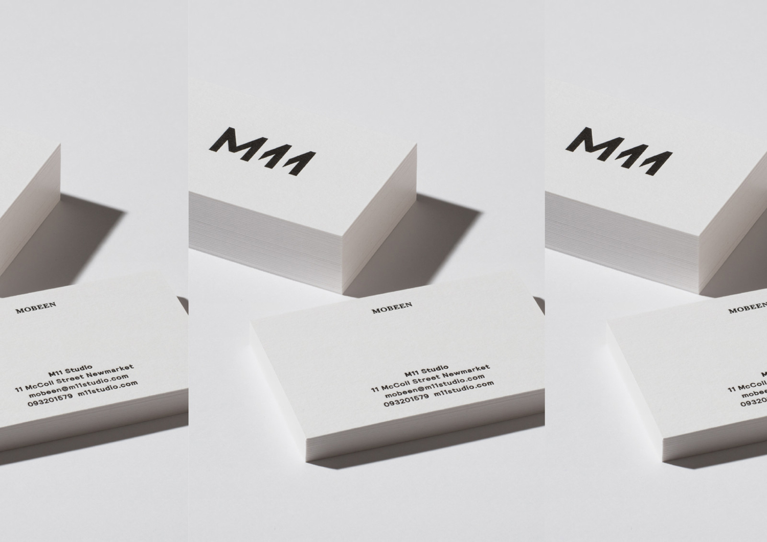
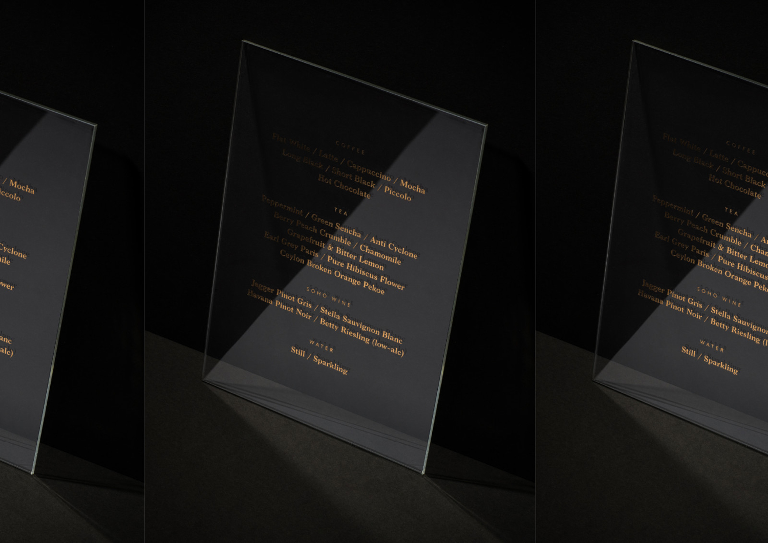
The materiality of identity plays a role in emphasising the luxe experience of the salon in context and communicating some of this outside. Uncoated black and white boards, and high-quality print finishes that include a copper and bronze foils draw on the colours and details of interior space. Other highlights include the strong relationship between the patterns of the windows and the notable horizontal lines that punctuate interior space. Check out Hare Interiors’ project page to get a better sense of this. Keep an eye out for the chandelles, neon tubes, and suspended worktops.
The choice of a bold serif brings a bit more communicative and visual depth to an identity and interior that leans heavily towards contemporary forms and moments of reduction (there is a pleasant commonality here between design process and haircutting). This feels more personable, which also comes through in tone of voice, and makes sure that the interactions that happen within the salon are represented. More from Inhouse on BP&O.
Design: Inhouse. Opinion: Richard Baird.
