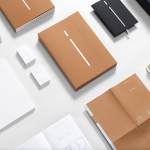
Sommos by Mucho
Opinion by Richard Baird Posted 3 August 2016
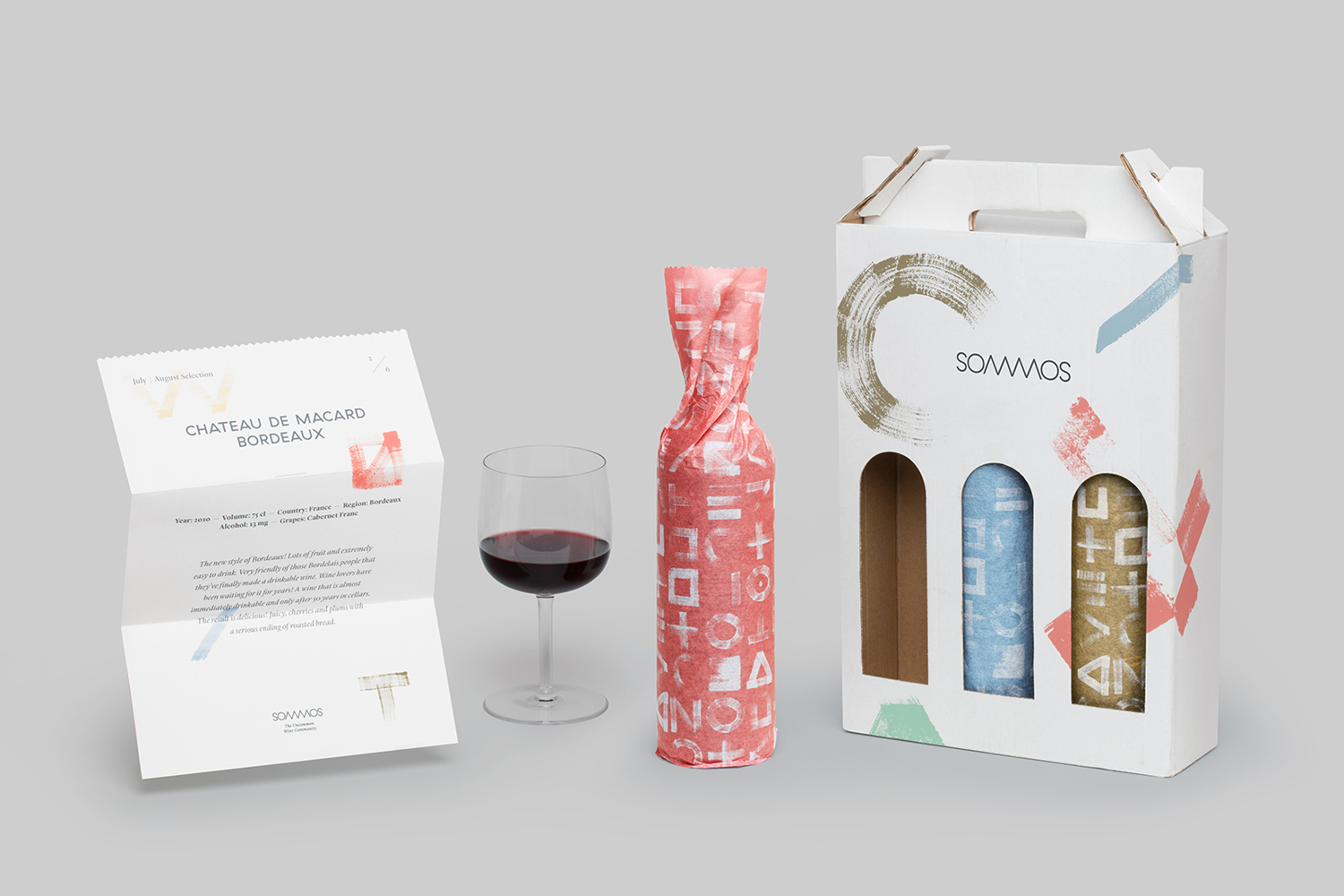
Summos is an online platform that gathers together and shares the knowledge of the six best sommeliers of the Netherlands and offers a seasonal subscription service that sends out a selection of some of the country’s best wines once every two months. Sommos worked with graphic design studio Mucho to develop name, brand identity and packaging.
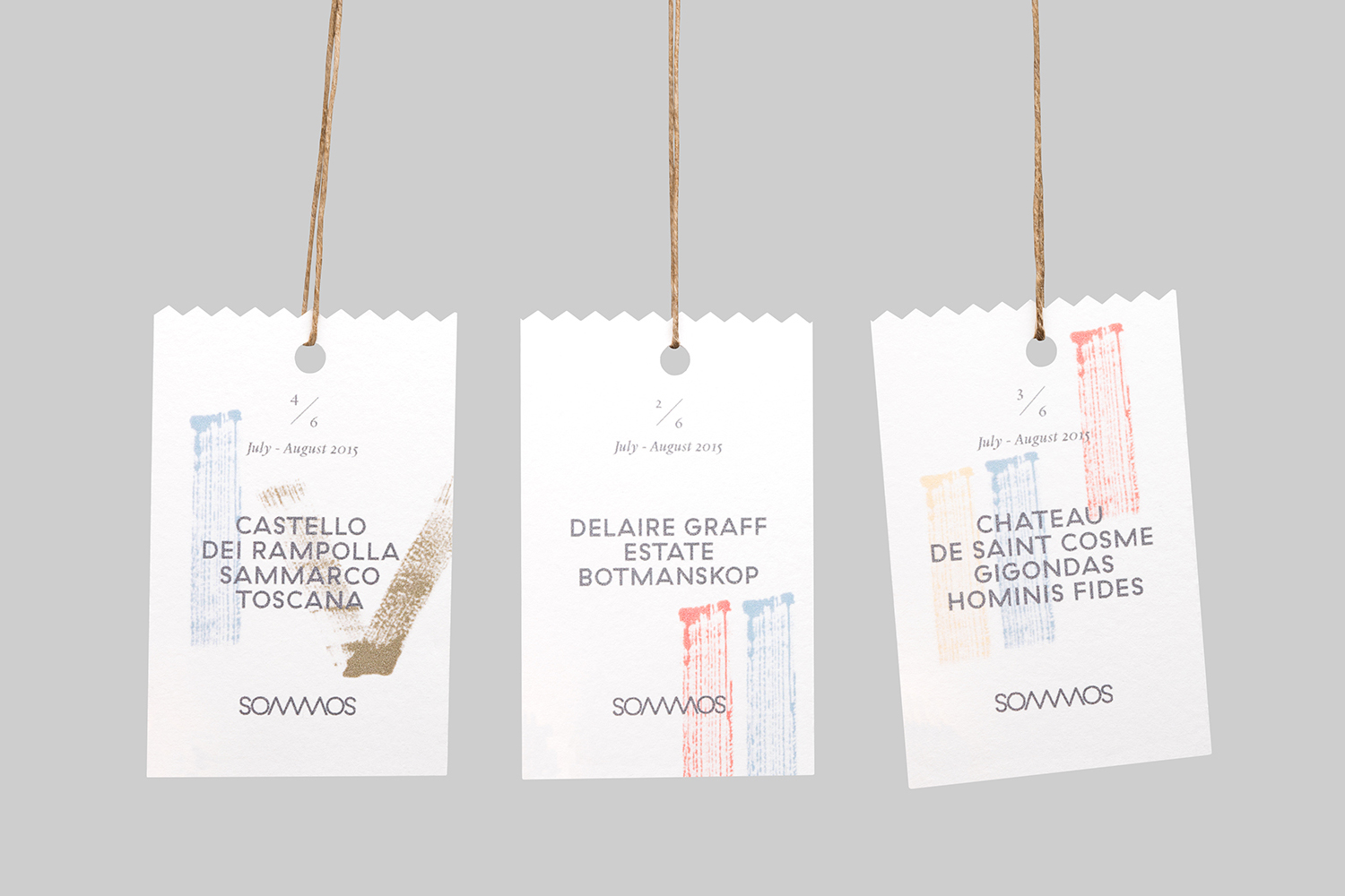
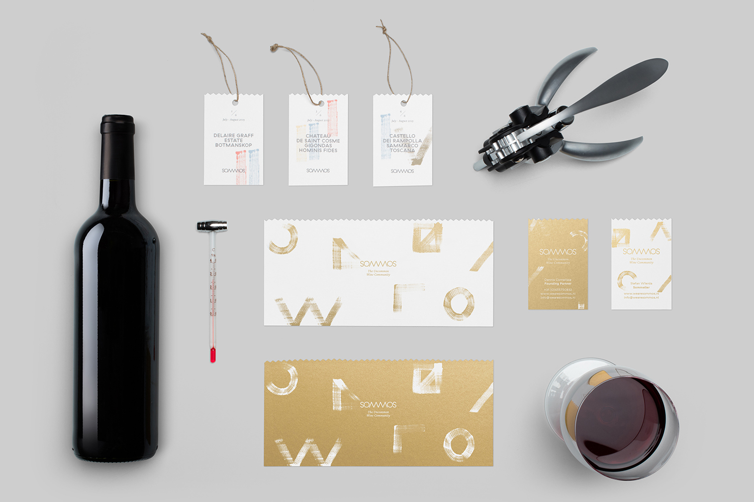
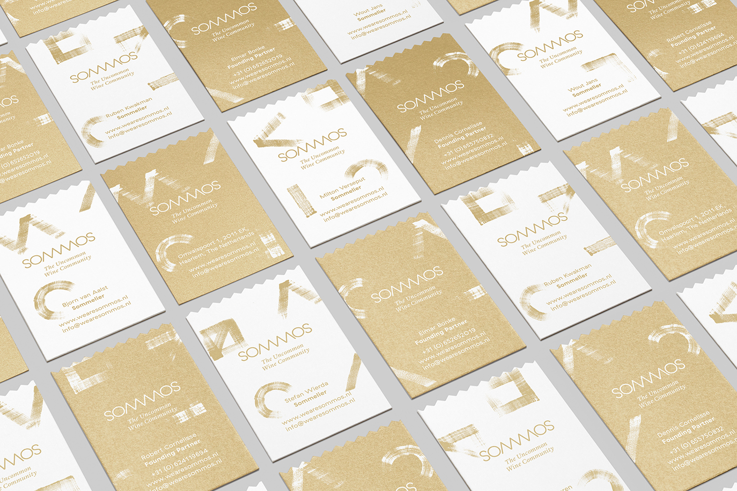
Based around the concept of group and innovation, and clearly informed by the curated nature of Sommos’ content, service and sommeliers, Mucho delivered a name and logotype with a simple corkscrew at its centre, a light and contemporary colour palette and the crafted and personable qualities of brush stroke patterns. This links subscription boxes, business cards, stationery, tags and tissue paper. This project was completed in 2015 but was documented and uploaded to Mucho’s site recently.
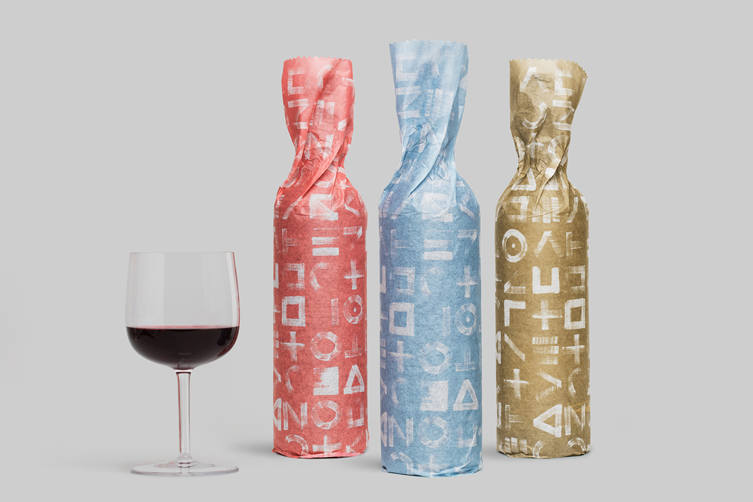
Where often the is a favour for legacy, expressed through darker tones, traditional ornament and typographical flourish, Mucho’s work for Sommos is light and bright with a clear preference for contemporary craft, the personable, youthful and accessible. This comes through in the abundance of white space, a current and distinctive colour palette of pastels and gold ink, and the brush stroke texture of the patterns. This feels well-suited to a platform managed by young but award winning personalities, rather than a corporate endeavour, and as an expression of their individual insights.
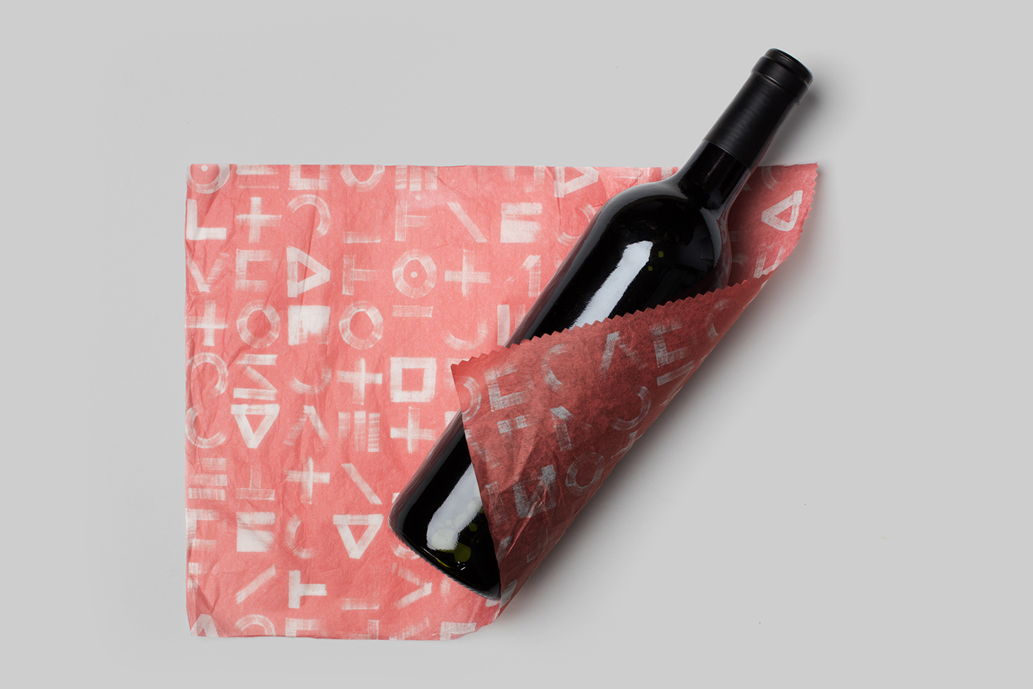
Naming and the visual representation of name plays with a variety of ideas. These include the contraction of sommelier, the similarities it has with sumus,” a latin word that means together, and the relationship between six members and six letters. The corkscrew, a usually trite visual device, is actually rather neat. It is unforced in its implementation and brings a proprietary quality to some rather unassuming character shapes. The toothed qualities of logotype also make their way across the stationery, tags and tissue paper as die cut edges.
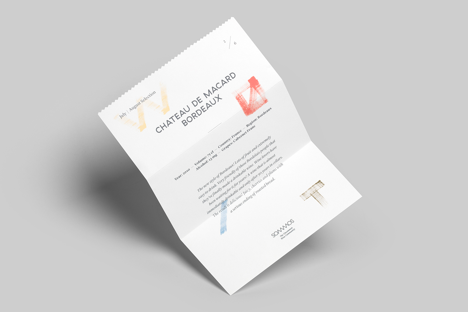
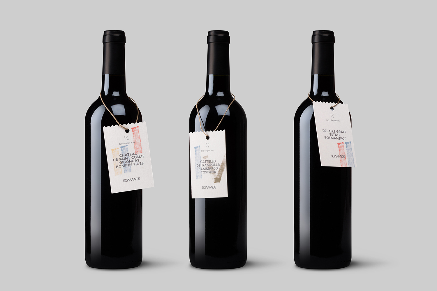
Where patterns and brush strokes provide character and a very individual quality, type, for the most part tempers this with the more conventional and reassuring. Uppercase sans-serif, serif and italic combinations play with the more formal and reliable bringing a much needed balance. While the team at Sommos might be young, they are also experienced, type goes some way to conveying this. More from Mucho on BP&O.
Design: Mucho. Opinion: Richard Baird. Fonts Used: GT Haptik (Website).
