Mister by Brief
Opinion by Richard Baird Posted 9 August 2016
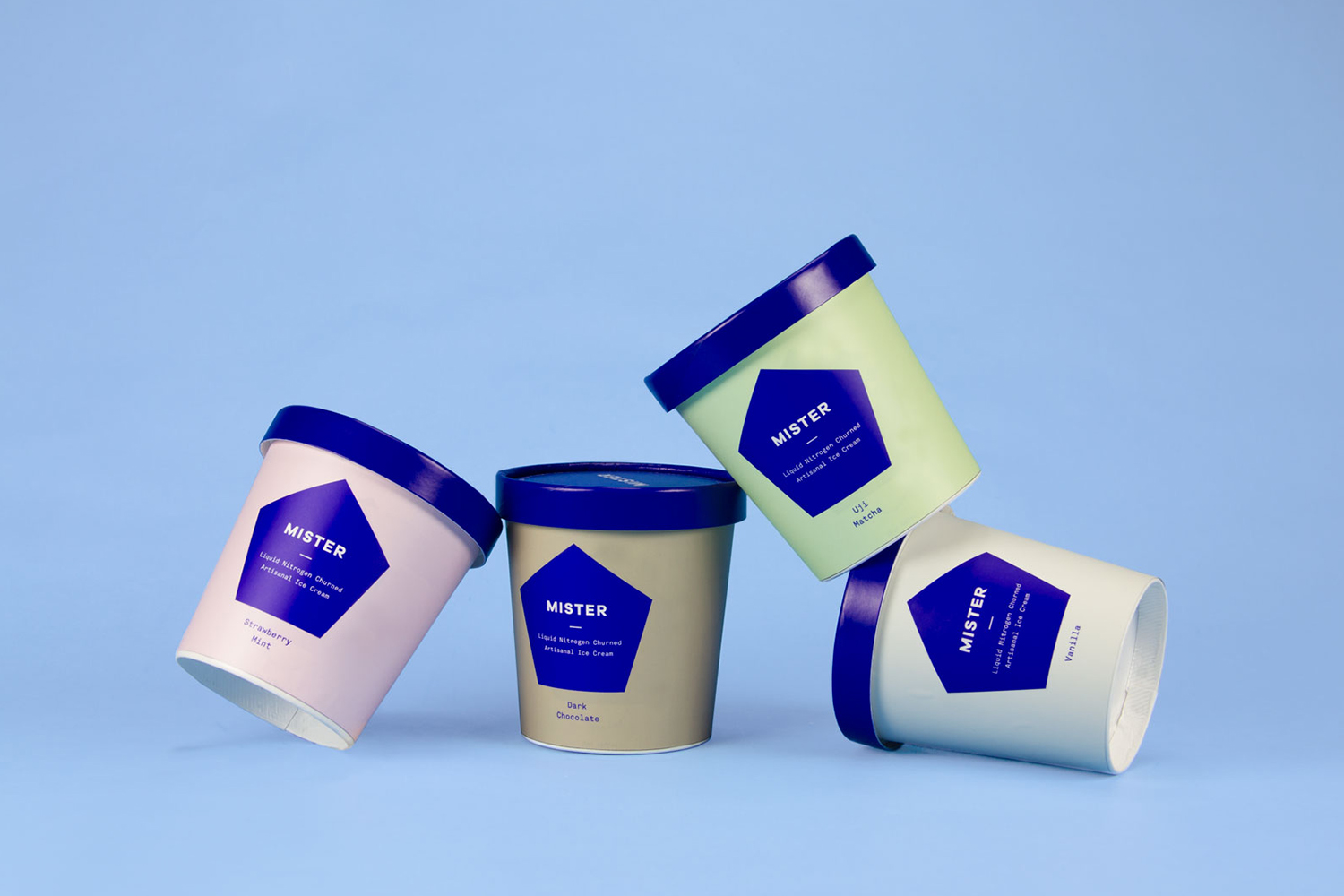
Mister crafts all natural, artisanal and seasonal ice cream from its location on Mainland Street, Vancouver, using a liquid nitrogen technique that rapidly freezes products to create less ice crystals and air compared to traditional ice creams. This gives Mister’s ice cream a richer, creamier and denser quality that does not require stabilisers or fillers.
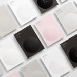
Mister worked with local graphic design studio Brief to develop a visual identity that would run across and unite signage, packaging and business cards. Taking their cues from the modern production technique, and in opposition to a premises with a rough interior of exposed brick and a history dating back to 1912, Brief created a reductive but impactful brand expression based around a pentagon motif and a bright blue ink.


Brief’s work for Mister is certainly not something that could be trademarked, it is, however, distinctive and memorable, in a world of superfluous detail, and is clearly and appropriately grounded in the science of liquid nitrogen, expressed through form, colour and monospaced type. Identity comes through in the unwavering consistency of application. The blue pentagon appears on everything, and likely to catch the eye on the street.
The single blue ink across white papers and boards is striking, rather current and a good choice that acknowledges and compliments the pastel tones of ice cream. These pastels are then used online to introduce a little more variety and an accessible quality alongside the mechanical utility of type.


Although there is a sense of the economical in the off-the-shelf structural choices and a frugality of form and colour, there are a few other details that give the work a bit more value, these include colour matched straws, string tied tags, and the approach to signage.
Communicatively it is fairly one-dimensional but there is brand insight available on site and online, with much of the brand’s character likely to come through in interaction. The result differentiates, is affordable and consistent, and an understandable direction for a small business. More from Brief on BP&O.
Design: Brief. Opinion: Richard Baird. Fonts Used: Akkurat Mono (Print) & Oxygen Mono (Online).