The Best of BP&O — August 2016
Opinion by Richard Baird Posted 30 August 2016

August’s highlights included UMA’s wordmark, signage and facade for APartMent, Swear Word’s brand identity for restaurant IDES, and Mucho’s work for online platform and wine subscription service Sommos. However, there were five projects that stood out, and have made it into BP&O’s Best Of Series.
This feature brings together some of the most unexpected and unusual projects published on the site each month for another opportunity to be seen and shared. These typically balance a strong communicative concept with a compelling aesthetic that appropriately plays with a mix of material colour, texture and image, form, type, layout and print finish.

Meg’s Tailoring by Studio South, New Zealand
Meg’s is a tailoring service, established by Megan Kenny, that began as a single store on Garfield Street in 1995. Meg’s now has two locations in Auckland, New Zealand, provides a broad range of services; from hems to full garment design, and works on large projects with high-end designers and labels such as Hugo Boss, Prada and Gucci, and on smaller jobs from High Street drop-ins.
Megan Kenny has worked in Sydney and London, has decades of experience in dressmaking, fashion and interior design, and has built a team of tailors, seamstresses, designers and machinists, many of whom she has trained herself. Megan and her team are passionate and respectful, and pride themselves on their attention to detail and customer care.
With the intention of better communicating the team’s ongoing ambition to deliver quality work and exceptional service Megan worked with Auckland-based Studio South to evolve Meg’s brand identity and re-introduce it to the market in a fresh and contemporary way. This was achieved through universal motif and colour palette, the materiality of uncoated papers and glossy finishes, and a modern restraint. Alongside digital presence and art direction, Studio South also provided Meg’s Tailoring with a variety of printed assets, these included branded t-shirts and carrier bags, signage, decals and business cards.
See more of this project here


Helbers by Only, United Kingdom
Helbers is a Parisian menswear label created by Paul Helbers, the former Head of Menswear at Maison Margiela and ex-Menswear Director at Louis Vuitton. The label has a carefully curated lookbook of garments and footwear with an unpolished elegance, and feature a subtle contrast of materials. Helbers has secured early acclaim for his AW16 collection, and is due to appear in stores around the world in the coming weeks.
Paul worked with Leeds-based graphic design studio Only to create a brand identity that would clearly express the meeting of what the studio describe as the contemporary and the antiquarian, craftsmanship and utility. This is visually articulated in the simplicity and materiality of identity, type contrast and a limited colour palette that runs across a variety of assets. These included tags, labels, stationery, business cards, hangers, packaging, lookbook and responsive website.
See more of this project here

The True Honey Co. by Marx Design, New Zealand
The True Honey Company (TTHC) dedicates itself to the production of mānuka honey, a monofloral variety produced in Australia and New Zealand from the nectar of the mānuka tree. It has a unique colour and texture, and a high level of Dietary Methyglyoxal, an organic compound with antibacterial and antiviral properties.
With a price range starting at 60.00AUD and rising to 230.00AUD per jar, and working in a market flooded with sub-standard honey and dishonest marketing, communicating the value of product and the commitment of TTHC to quality and ethical production through an impactful and engaging brand identity and packaging design was paramount. This task was given to Auckland-based graphic design studio and packaging specialists Marx Design who collaborated with Think Packaging and writer Kate Phillips.
See more of this project here

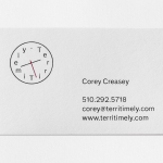
David Rowland by ico Design, United Kingdom
David Rowland is an award-winning and straight-talking London-based photographer who has been capturing images for leading brands and agencies for over two decades. With a desire to remind existing and potential clients of his expertise and technical know-how David worked with graphic design studio and client ico Design to develop a new brand identity and supporting collateral. This included, alongside a new logotype, business card, stationery, lookbook/mailer design and website.
Read more of this article here

Kimski by Franklyn, United States
Kimski is a Korean-Polish street food restaurant, created by Ed Marszewski and chef Won Kim, located in the Bridgeport area of Chicago. The restaurant has a distinctive interior of geometric wood panelling, bright yellow stools, utilitarian booth seating, wood panelled ceiling and concrete floor with a warehouse quality in its space, shape and box-like exterior. In contrast, Kimski’s brand identity, developed by New York graphic design studio Franklyn and informed by the mash-up of culture, is a full of illustrative flourish, colour and character. This runs across menus, coasters, business cards and t-shirts, and punctuates dark exterior as backlit signage.
Read more of this article here