Helsinki City Museum by Werklig
Opinion by Richard Baird Posted 21 October 2016
Helsinki City Museum, through its collection of objects and images, provides visitors with historical insight into the everyday lives and personal experiences of the people of Helsinki. It is free to enter and features 2400 sqm of exhibitions and public spaces, a cafe, inner courtyard, areas to relax and conference rooms.
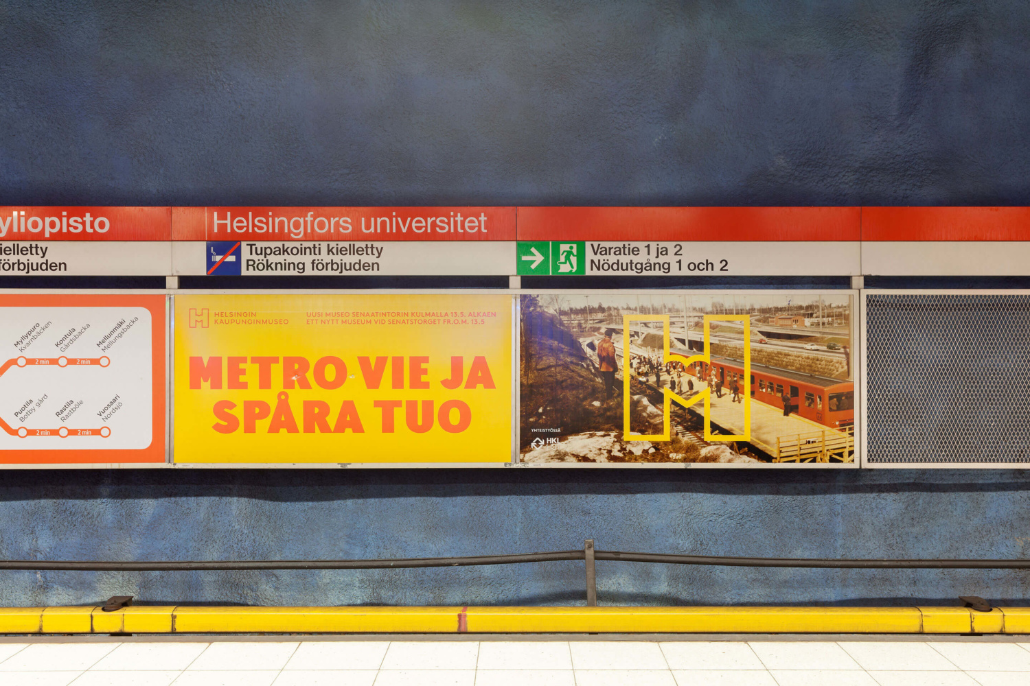
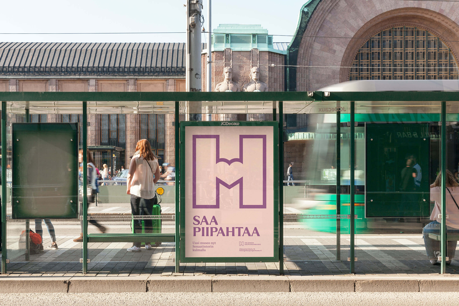
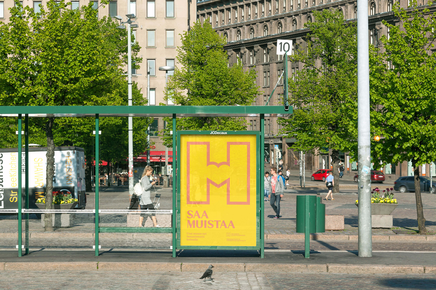
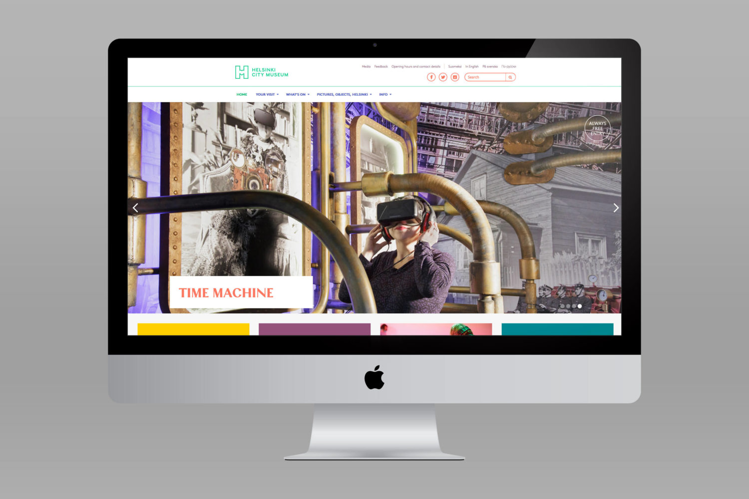
To coincide with a move to a new space; created by interior architecture office Kakadu and located in the oldest part of the city, the museum worked with Scandinavian graphic design studio Werklig to develop a new visual identity based around the Museum’s vision that “Everyone has the opportunity to fall in love with Helsinki”. This runs across stationery, business cards, merchandise, ad campaign, signage and website created in collaboration with Byroo.
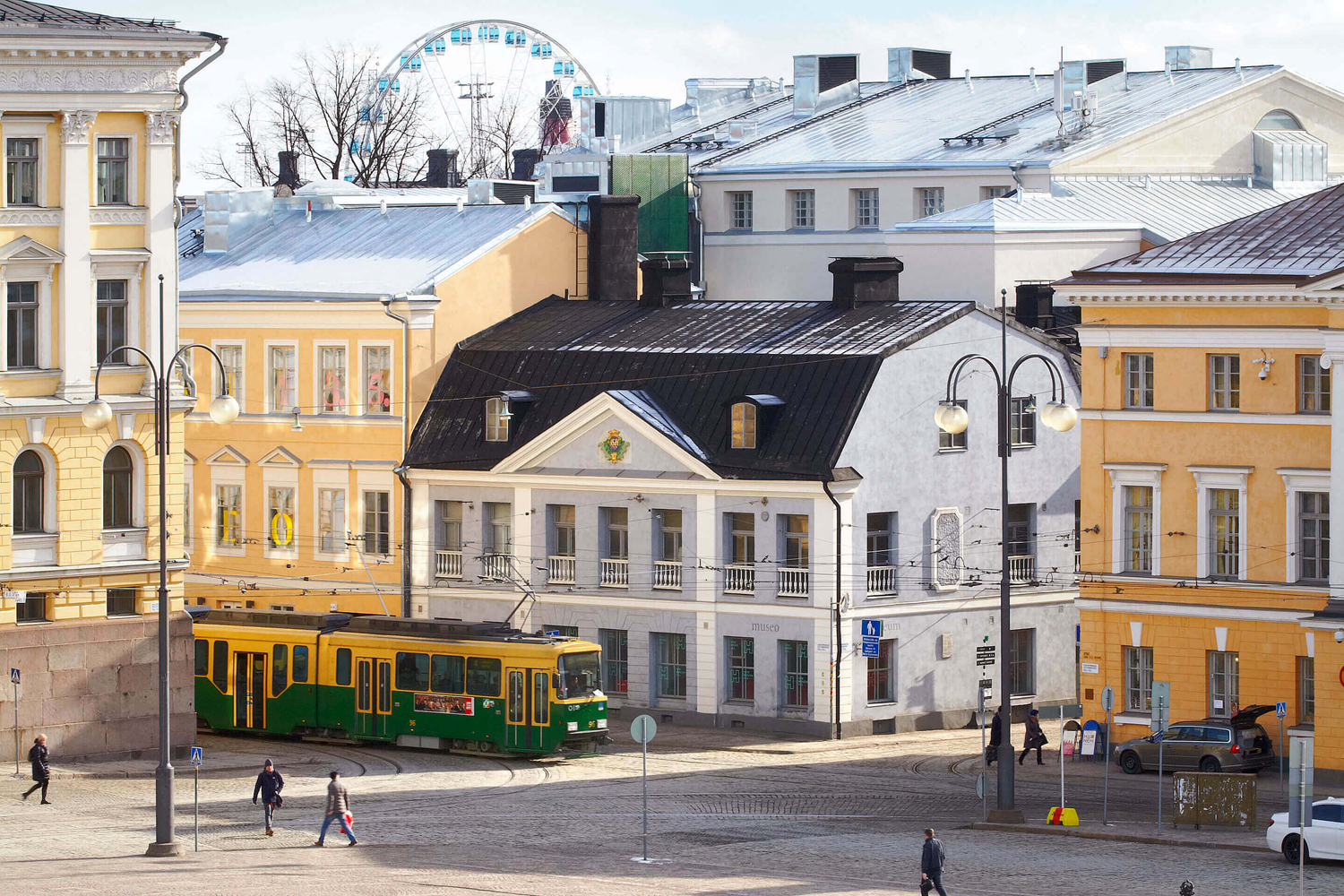
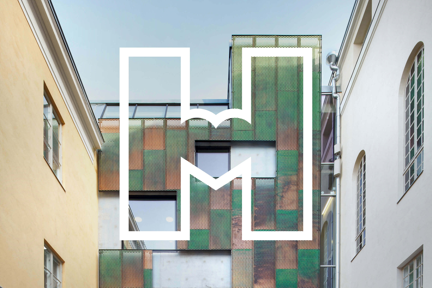
Helsinki City Museum’s new location in the Tori Quarters, the oldest part of the city, features an modern and accessible interior design by Kakadu that takes up five buildings that date back to the 1750s.
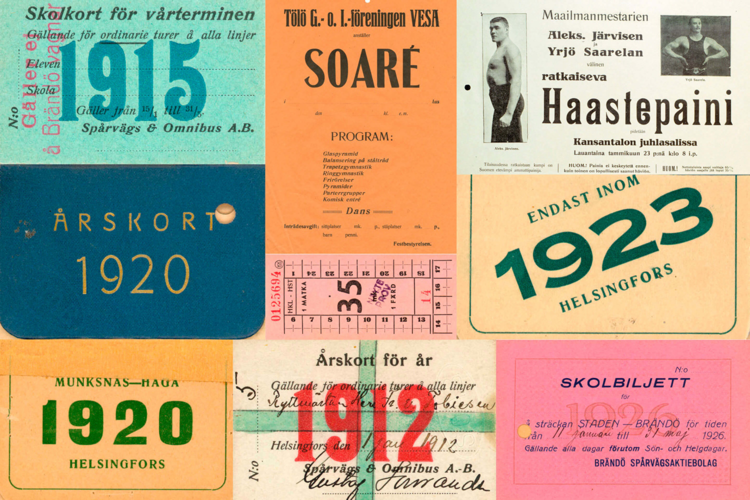
Werklig’s visual identity for Helsinki City Museum is bold and contemporary in its visual expression but grounded in some genuine historical artefacts, and the modern renovation of 18th century buildings. Although type is perhaps the more obvious articulation of this, colour is the most surprising. You can see this in the materials gathered from the museum (above); an interesting mix of pink, orange and green, sampled from tram tickets, brochures, newspapers, wrappers and adverts, which make an authentic connection with place.
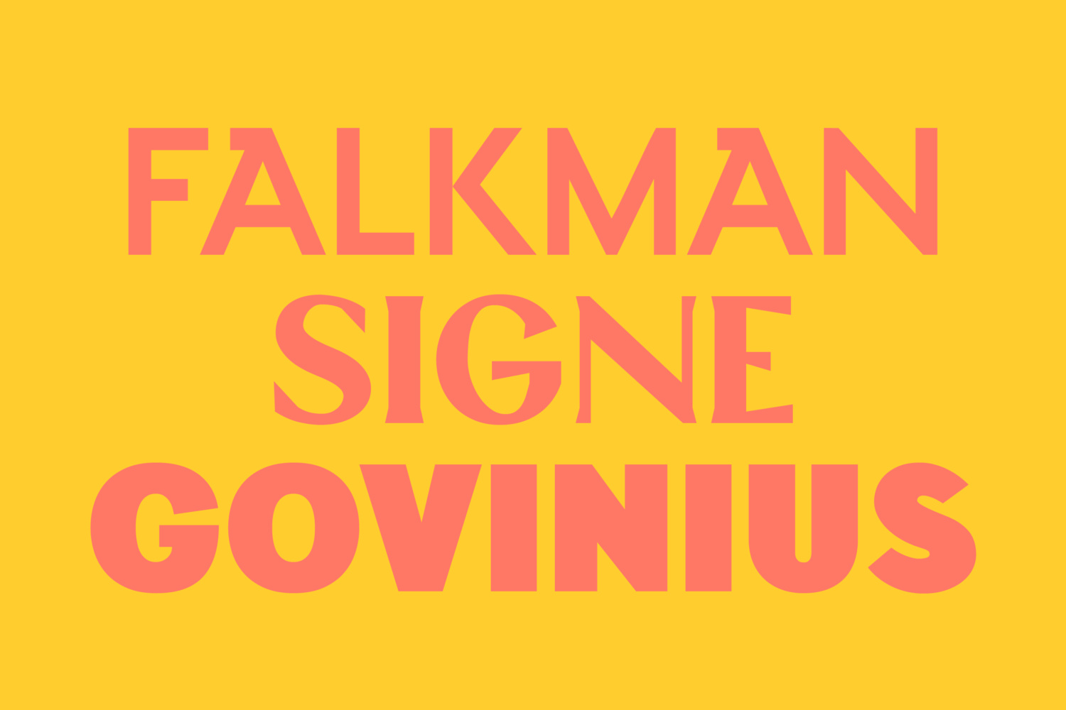
Colour, although referential, is unique and distinctive in its pairings, and functions well to unite a broad palette of custom typefaces, themselves drawn from artefacts of the museum, with the more modern qualities of logo. It delivers impact and provides a visual variety to moments of logo-centricity.
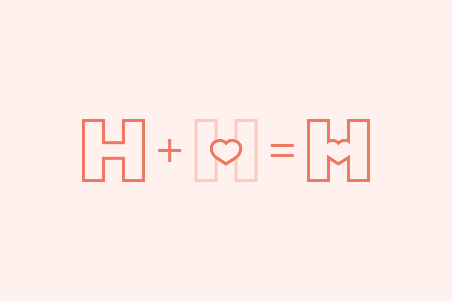
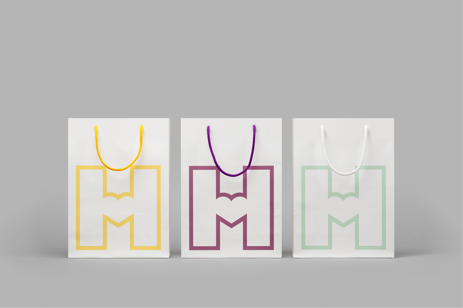
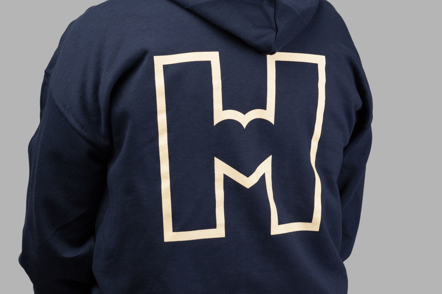
Logo is simple but smart, universal in its expression and has something of Glaser’s I ♥ NY in its messaging and directness. Aesthetically it feels contemporary in its monolinear rendering, bold in its confident oversized implementation across bags and branded t-shirts, and flexible and iconic enough to work small or large, and over images or solid colour.

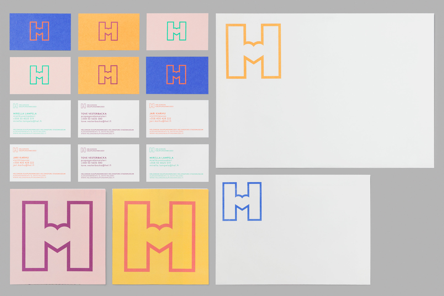
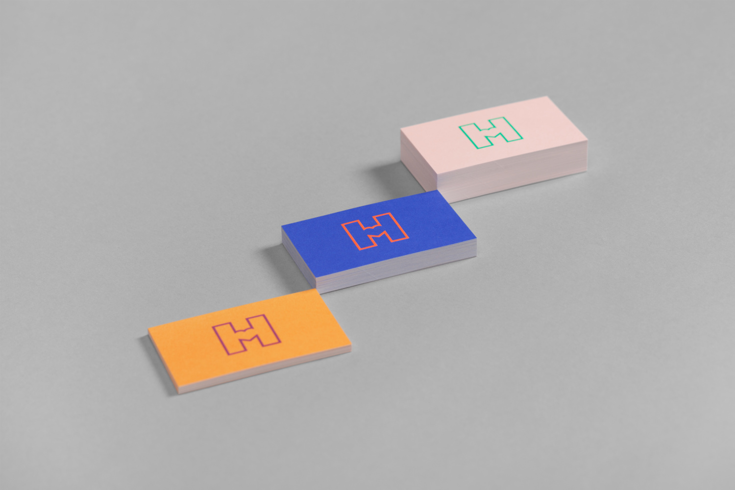
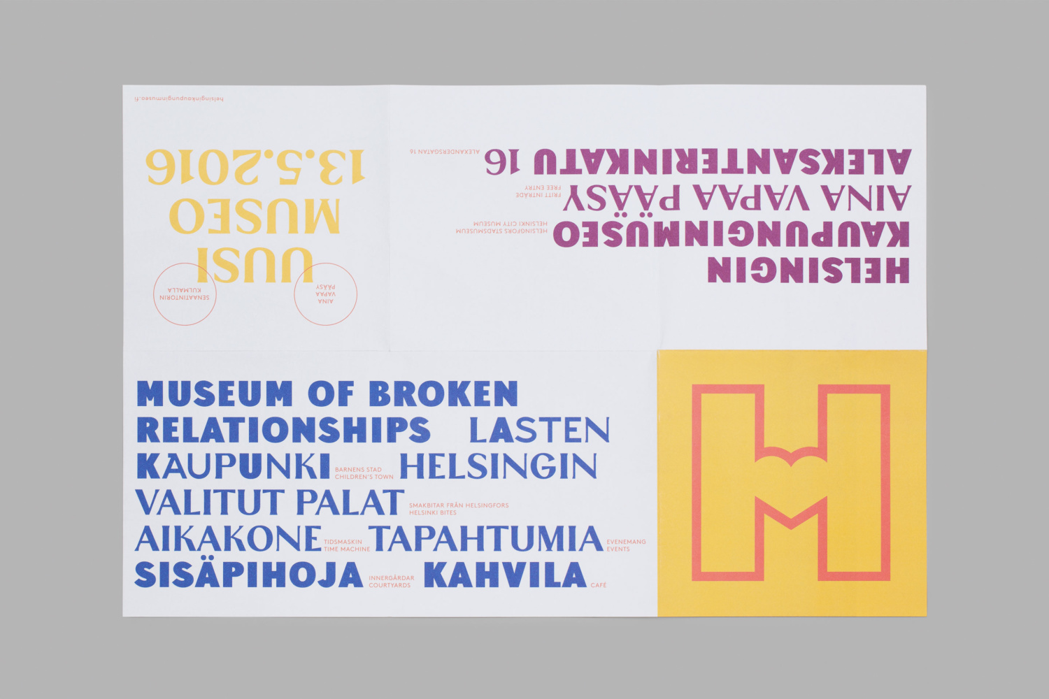
Typographical contrast is impactful, with different typefaces worked into sentences and alternative characters punctuating single words. In print this appears quirky, but also, and perhaps more intelligently, works as an expression of transformation, moving through periods and communicative intentions but united by a shared origin.
Although these periods might not be easily discerned by the casual viewer, and the references unfamiliar to those new to the city, typographical form certainly helps to convey the historical nature of the museum while naming firmly ties it to place.

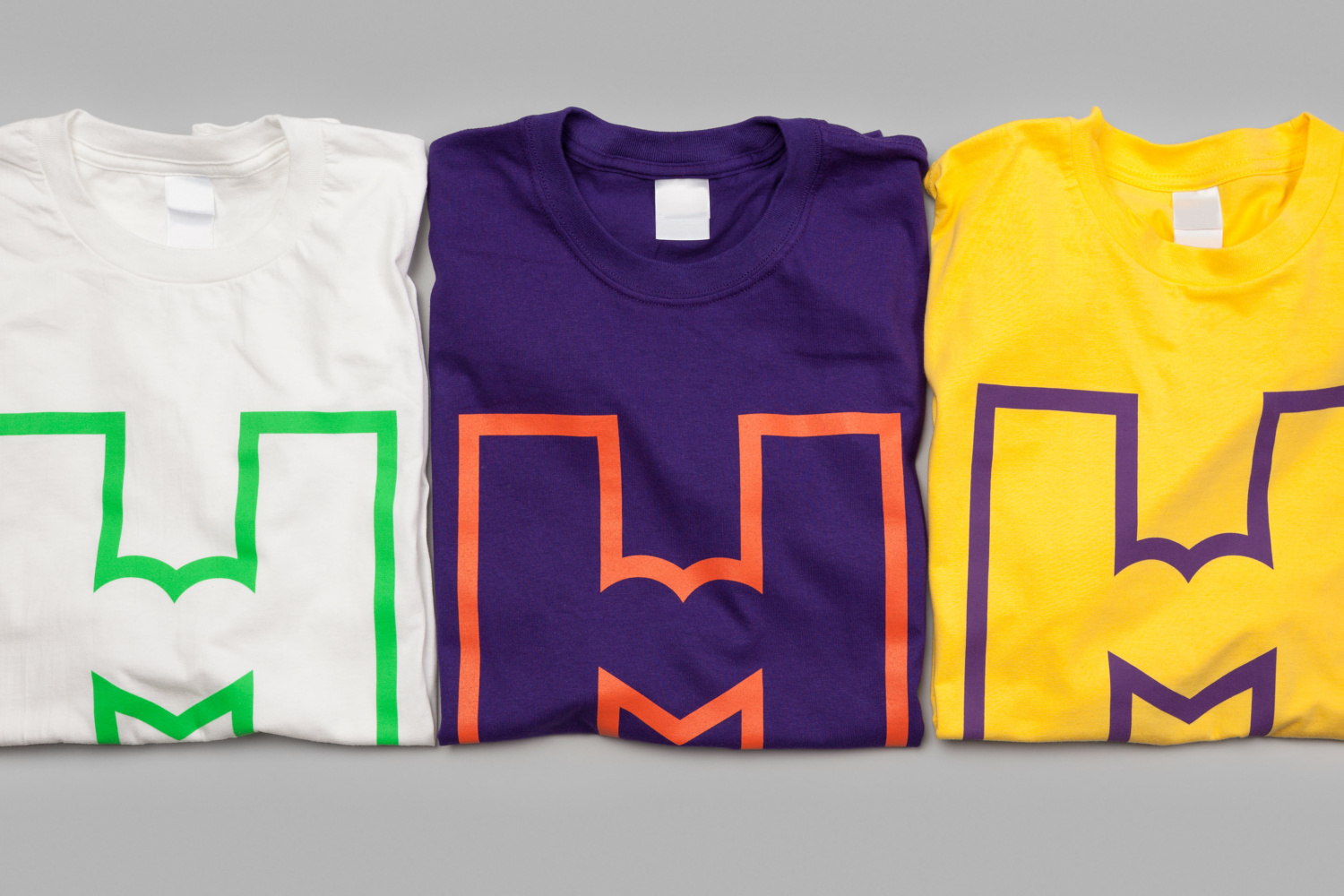
As a little known museum, a bolder direction was needed, and Werklig’s approach satisfies this, not only through logo and its unwavering implementation, but also in colour and typographical contrast. Everything is built from scratch, contemporary in its polish and systematic foundation, but perhaps most importantly, rooted in some genuine reference points and grounded in a sense of place. The way the outdoor campaign makes the most of colour and form, intersecting a visually busy urban environment is a particular highlight. More from Werklig on BP&O.
Design: Werklig. Website: Byroo. Images: Angel Gil and Helsinki City Museum. Opinion: Richard Baird.
