The Best of BP&O — October 2016
Opinion by Richard Baird Posted 31 October 2016
October’s highlights included Mucho’s work for Casa Bonay, Park Bench Deli by Foreign Policy, and Tung’s brand identity and packaging for Hatch Cold Brew Coffee. However, there were five projects that stood out, and have made it into BP&O’s Best Of Series.
This feature brings together some of the most unusual / distinctive projects published on the site each month for another opportunity to be seen and shared. These typically balance a strong concept with a compelling aesthetic and communicative intention that appropriately plays with a mix of form, colour, type and layout, as well as material, texture, image and print finish.

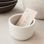
Common Lot by Perky Bros, United States
Common Lot is restaurant located near the Papermill Playhouse in Millburn, New Jersey. It has a menu of seasonal dishes made from locally foraged produce and fresh ingredients, and features an interior design described as being minimalist with unexpected finishes, natural materials, texture and light.
The restaurant was created by Australian chef Ehren Ryan and draws upon his globally diverse culinary background and free spirit. This is seen in the communal dining experience, open kitchen and shared tables which contribute to a relaxed and convivial atmosphere.
Chef Ehren Ryan is described as being serious about food and jocular about life, and it is this that informed the visual identity design for Common Lot, created by graphic design studio Perky Bros. This runs across and links a variety of assets that included menus, stationery, bags, thank you cards, signage and branded aprons.
See more of this project here


YO! by Paul Belford Ltd, United Kingdom
London-based graphic design studio Paul Belford Ltd. worked with UK restaurant chain YO! Sushi, now Yo!, to rebrand, as it expands into the US, the Middle East and further into Europe. This included an updated logo together with an extensive 200 page brand book, presented in a bespoke Japanese bento box, that covered a variety of new assets. The brand book covers menus, packaging, signage and illustrative noren curtains, as well as a guide to art direction.
See more of this project here

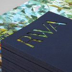
Faust by Snøhetta, Norway
Faust is a high-end shoemaker with its first signature store located in Oslo’s Barcode area. The shop is a small but impressive space consisting of five concrete niches and large carved wooden doors. Faust worked with Scandinavian studio Snøhetta to create both interior and brand identity. This was based around the The legend of Faust from the Renaissance, its basis for many literary, artistic, cinematic and musical works through the ages, and Faust as an ambitious person who surrenders moral integrity in order to achieve power and success. These served as historical reference points, taking a look back at a period where all shoes were handmade and bespoke. This then informed the calligraphic strokes of signage, wordmark and custom typography, is seen in the materiality of identity across stationery, business cards and packaging, and in the wood and vaulted forms of interior design.
See more of this project here

Sauvage by Triboro, United States
Sauvage is a Brooklyn-based cafe and cocktail bar from Joshua Boissy and Krystof Zizka, the duo behind Maison Premiere. It is described as being reflective of the staple establishments of New York and Paris, and has a menu of French-accented American dishes. This is also reflected throughout its interior design, a mix of mosaic flooring, brass rimmed circular tables, bent wood furniture, ornamental mirrors, brass fixtures and fittings, and a curved bar with a white marble top.
Sauvage’s visual identity, designed by New York studio Triboro, mirrors some of the period European and American interior influences, whilst working in individual personality through colour and form. This runs across business cards, menus, coffee cups, coasters and tote bags, and included signage and web design.
Read more of this article here

Helsinki City Museum by Werklig, Finland
Helsinki City Museum, through its collection of objects and images, provides visitors with historical insight into the everyday lives and personal experiences of the people of Helsinki. It is free to enter and features 2400 sqm of exhibitions and public spaces, a cafe, inner courtyard, areas to relax and conference rooms.
To coincide with a move to a new space; created by interior architecture office Kakadu and located in the oldest part of the city, the museum worked with Scandinavian graphic design studio Werklig to develop a new visual identity based around the Museum’s vision that “Everyone has the opportunity to fall in love with Helsinki”. This runs across stationery, business cards, merchandise, ad campaign, signage and website created in collaboration with Byroo.
Read more of this article here