Earls.67 by Glasfurd & Walker
Opinion by Richard Baird Posted 22 November 2016

Earls is a family-owned premium but casual restaurant chain with 66 locations throughout Canada and the United States and a thirty year history. The hospitality sector has seen a lot of change in this time. It continues to be highly competitive and often demands innovation and adaptability to remain relevant. With this in mind, Earls commissioned Canadian graphic design studio Glasfurd & Walker and interior design studio Ste Marie to reimagine the Earls brand as a one-off canteen and bar. Earls.67 is the result of this collaboration.
Earls.67 is a prototype, located at Bankers Hall in downtown Calgary, developed to test collaborations and new ideas. It is inspired by Earls 30 year history of burgers and bustling bars, food with an international twist, experimentation, energy and a focus on customer service. This is reflected in its menu, interior design and throughout a brand identity design that draws on Earls’ heritage and, in the words of Glasfurd & Walker, refocuses this through a contemporary lens. Brand identity runs across a variety of assets, these include, but are not limited to, logo and logotype, menus, interior graphics, business cards, wallpaper, gift cards, growlers and napkins.

Glasfurd & Walker’s work for Earl.67 is clear in its intentions. The refocusing of heritage through a contemporary lens is a familiar concept, however, given a distinctive history, can often produce some interesting results. This can be seen in Ste Marie’s interior design which moves from the warm lighting and woods of the canteen to the darker, subterranean and more industrial qualities of Bankers Bar. It is a more sophisticated take on those features of Earls’ early premises, which is emphasised by contrast and hints at a dual personality that also runs through brand identity.


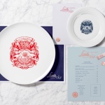
Brand identity is not subtle. Concept is evident and consistent. Uncoated materials and block foil, crest and the serif flourish of Larish Neue clearly leverage a sense of formality, quality and heritage, while the approach to rendering the crest, the choice of blue block foil and dyed boards, and the reductive and informal qualities of Larsseit and Acrom, work in a sense of the modern.
The tension between heritage and modernity varies between the complimentary and the well-resolved, particularly in the very current monolinear rendering of crest, to the abrupt and slightly awkward, as seen in type choice and the use of proportion. This lends some of the work an occasionally awkward but quirky character but also an opportunity to play with what Glasfurd & Walker describe as both highbrow and lowbrow brand expressions.
Heritage, as communicated by type and crest, is familiar. BP&O is full of identity programs with similar communicative intentions, expressed through familiar contrasting aesthetic gestures. However, drawing on a genuine history and the quirks of time, often elicit more interesting results. Here, it is the animal component, icons of Earls, recognised by those familiar with the brand and likely to feel leftfield (but be memorable) to those who are not.
The parrot draws on the original Earls restaurant which featured oversized parrots and parrots hanging from the ceiling. It certainly had character, but today, is far from the more sophisticated dining experience Earls delivers.
Glasfurd & Walker have managed to reference this through illustration and photography. Illustration is well-drawn with a good eye for space and detail, contemporary line and traditional forms. Applied as foil across menus, gift cards and business cards it feels high quality, as ink across napkins and growlers more playful, and as wallpaper, makes a connection with interior design. Photography by Eydis Einarsdóttir introduces real life colour and texture, breaking up more precise lines of logo and type.


Implementation is straightforward, at times logocentric, but with a materiality in papers, boards and print finish to provide a high quality finish. This is effectively broken up by the changing tone of type, and the use of feather close ups.


Brand identity manages to find a balance between heritage and modernity. Typographically it is occasional awkward yet quirky and flexible in its expression. The parrot reference layers this with something memorable, interesting and unexpected, which is grounded in a genuine piece of history. This is well-rendered, consistent but occasionally repetitive but tempered by photography.
Interior graphics and wallpaper do a good job of linking printed assets with a high quality interior design, which also plays with duplicity and contrast. There is a clear tension between the serious and the playful, the traditional and the modern, the high and low brown. Although there could have been a split personality these are wrangled into something cohesive and coherent, helped by a consistency in colour and finish. More work by Glasfurd & Walker on BP&O.
Design: Glasfurd & Walker.
Interior Design: Ste Marie.
Parrott Photography: Eydis Einarsdóttir.
Opinion: Richard Baird.
Fonts Used: Larish, Larsseit, Colonna & Acrom.