The Best of BP&O — November 2016
Opinion by Richard Baird Posted 30 November 2016
November’s highlights included Glasfurd & Walker’s work for Earls.67, Emma Magnusson Arkitektur by Lundgren+Lindqvist, and Folch’s brand identity and packaging for product company for DOIY. However, there were five projects that stood out, and have made it into BP&O’s Best Of Series.
This feature brings together some of the most unusual / distinctive projects published on BP&O each month for another opportunity to be seen and shared. These typically balance a strong concept with a compelling aesthetic and clear communicative intention that appropriately plays with form, colour, type and layout, as well as material, texture, image and print finish.

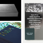
Royal West of England Academy by Spy, United Kingdom
Royal West of England Academy brings world-class visual art from around the world to Bristol. It is the city’s first art gallery, the UK’s only regional Royal Academy of Art, and is located in a grand Grade II listed building. RWA worked with London-based graphic design studio Spy to develop a visual identity that would feel relevant and engaging, and re-establish confidence in the institution’s mission, both internally and externally. Spy developed a system that works with a vast library of content, and provides staff with the tools to effectively communicate with visitors and potential patrons. This runs across and links a variety of assets including brochures, posters, business cards and website.
See more of this project here


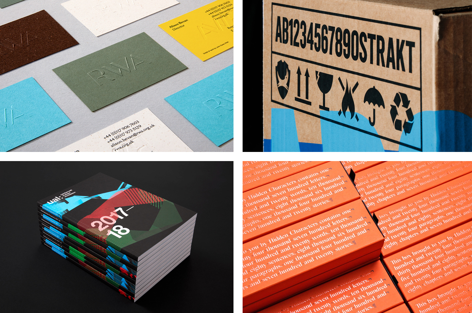
Brewdog Abstrakt by O Street, United Kingdom
Brewdog’s Abstrakt is a limited edition craft beer concept that has released 20 different varieties since it began in 2010. Each beer is bottle-conditioned (bottled with a small amount of yeast, providing further fermentation and maturation), brewed and released just once, individually numbered and known only by their release code. It is a concept described as more art than beer, as boundary pushing and blurring the line between categories.
Graphic design studio O Street worked with Brewdog to create a new brand identity and packaging system for Abstrakt, informed by its creative, limited edition concept, flavour varieties, individually crafted nature and the use of release codes rather than names. This is expresses through colour, typography, print finish and structural design.
See more of this project here

Little Italy by Here Design, United Kingdom
Little Italy is a restaurant, gelateria and pizzeria located in the Jordanian capital of Amman. The restaurant features a distinctive, period and European-inspired interior of stained wood, glossy white tiles, concrete floor, vintage glass light shades, wood panelling and exposed I beams, brought together with a modern balance and lovely sense of form and contrast. This continues through to the restaurant’s brand identity, developed by London based Here Design, in its mix of type and illustration. This links menus, interior graphics, signage, packaging and business cards.
See more of this project here

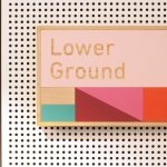
UAL 2017–18 Campaign by Spy, United Kingdom
The University of the Arts London is Europe’s largest specialist arts and design university. It is made up of six colleges, each with its own unique character and programme, yet unified in their effort to deliver a high quality creative eduction. This united position is expressed through a visual identity system developed by Pentagram partner Domenic Lippa. Based around Helvetica, UAL’s visual identity affords each college the opportunity to experiment with its own approach to visual communication.
This week London-based graphic design studio Spy published images of their work on UAL’s 2016 campaign for the 2017–2018 academic year, developed for Camberwell, Chelsea and Wimbledon. Spy were commissioned, for the second year, to develop an engaging brand campaign that would drive student recruitment and brand awareness. The campaign included posters, brochure, flyers and animations.
Read more of this article here

Hidden Characters by RE, Australia
Hidden Characters is the latest PR offering from international advertising agency network M&CSaatchi. It replaces/is an evolution of Bang PR, developed in response to the changing public relations landscape.
With the advent of social media and the subsequent growth of non-traditional influencers and an increase in inauthentic product placement, Hidden Characters intends to make sure that their client’s reach is handled in an ethical and authentic way.
Sydney-based graphic design studio RE worked to created a brand identity for Hidden Characters that articulates this intention with a concept that makes a connection between the hidden characters that shape how text appears and the creative behind the scenes shaping of a brand’s public perception. The idea of the seen and unseen plays out in a number of ways in print, and links business cards, headed paper, stationery and brochure.
Read more of this article here