Tilly Sveaas Jewellery by Bond
Opinion by Richard Baird Posted 7 December 2016

Tilly Sveaas is a London-based jewellery designer, and the designer behind Silver Service Jewellery. This year sees the launch of her first collection under her own name. This features a brand identity created by the London office of international design studio Bond, and included art direction, postcards, business cards and packaging. Through typographic form, colour, material, print finish and image, Bond’s brand identity for Tilly Sveaas intends to distil down and express the signature style of the brand, one described as being luxury with a progressive edge.

Bond’s work for Tilly Sveaas Jewellery is an unexpected combination of type, colour and material that forgoes familiar luxury cues, and typographical and colour conventions in favour of something a little more robust.
Where often you see gold block foil, there is white, and where you might expect dyed uncoated black or white boards, there is grey. The natural skin tones and brighter dressing of fashion photography gives way to a more moody black and white, and typographically, the reductive and bold exists where typically you might expect to find the delicate and more ornamental.


Art direction clearly takes its cues from brand positioning, outlined online as being a mix of rock chick petulance, sophisti-grunge charm and androgynous allure. This feels well-suited to a collection of chains and charms, layers of long and short, and a contrast of fine and heavy, silver and gold. Where the is an absence of colour, there is plenty of texture and detail. Jewellery feels complimentary rather than a focal point.

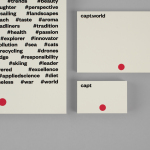
Although colour, materiality and photography deliver on impact, positioning and continuity, type is unexpected, distinctive and a particular highlight. Not just in the condensed uppercase letterforms but also in typesetting; a mix of both generous letter and line spacing, and a contextual awareness, its proportions comfortably filling the front of packaging and business cards, and bisecting postcards.

Materially, the grey uncoated boards, a white block foil and a blind emboss across business cards feels distinctly industrial, architectural and urban in nature, and has an unconventional but high quality finish. In conjunction with type and image, this sets brand apart, has a strong sense of continuity in print and online, functions to frame and draw out the qualities of jewellery and feels in line with a progressive brand tapping into a current rock chic appeal. More from Bond on BP&O.
Design: Bond. Photography: Jonni. Opinion: Richard Baird. Fonts Used: Dax & Futura. Papers: Colorplan Real Grey.