Heritage: A User’s Manual by Bond
Opinion by Richard Baird Posted 25 January 2017

Heritage: A User’s Manual was an exhibition at Southbank Centre’s Archive Studio—a temporary space located within the foyer of the Royal Festival Hall—that took place between the 24th November – 13th December 2016. The exhibition was curated by MA Culture, Criticism and Curation students from London art school Central Saint Martins and “was founded on the belief that the heritage of a building is characterised by the ever-changing contributions of its community.”
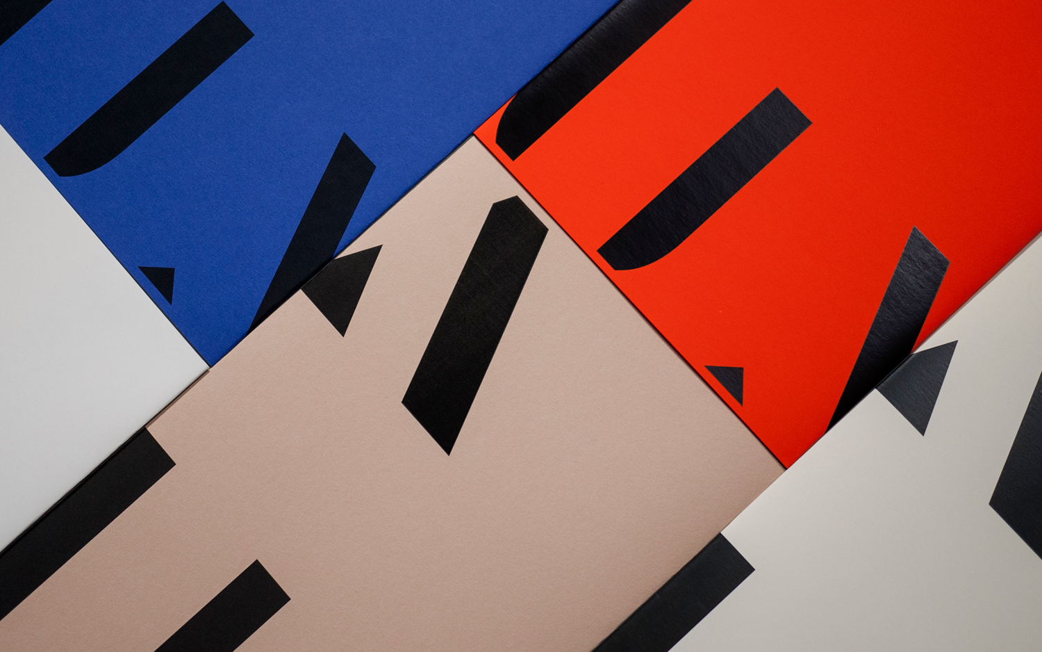
The London office of international graphic design studio Bond worked to develop a visual identity for the exhibition that would create a unifying visual story for the different eras it covered. Drawing on the archival material and architectural components that were the basis of the exhibition, Bond created an typographical visual identity, based around MuirMcNeil’s Cut, that is utilitarian, structural and of two different historical periods in its stencil cut qualities and lettershapes. This, alongside bright colour, warm greys and material quality, links programme, information packs and single sheets.

Type, created by MuirMcNeil, is reductive yet discernible, has a timelessness (it is inspired by those from two different historical periods yet share a commonality of form), and is appropriately used as a strong and consistent motif for the time covered by the exhibition, the methodical process of archival and documentation, and draws on the universal associations with manuals and the clarity of their insight. This is used to deliver visual impact from a distance, draw out headlines and, when blown up and cropped across covers, makes a very clear connection with architectural structure. It is a blunt tool, but one that is inclusive and understandable.


Colour palette brings together the urban qualities of cool and warm greys, the clarity of black and white, and a striking and warmer qualities of red, whilst also adding a few different coloured covers. Dyed papers and black block foil give what is a fairly austere graphic expression a layer of material quality, just as colour functions to work in something more cheerful and accessible alongside the architectural, in line with the community component of exhibition.
Conceptually, it is not particularly challenging, but it acknowledges the public facing nature of the exhibition rather than one aimed at specialists (although they will appreciate the historical references in typographical forms), is universal in its visual language and still manages to deliver impact from a distance a few nice details up close. More work by Bond on BP&O.
Design: Bond. Opinion: Richard Baird. Fonts Used: Cut Stencil & Futura. Paper Suppliers: Fedrigoni & G.F. Smith.