In Search Of The Present at EMMA by Werklig
Opinion by Richard Baird Posted 8 February 2017

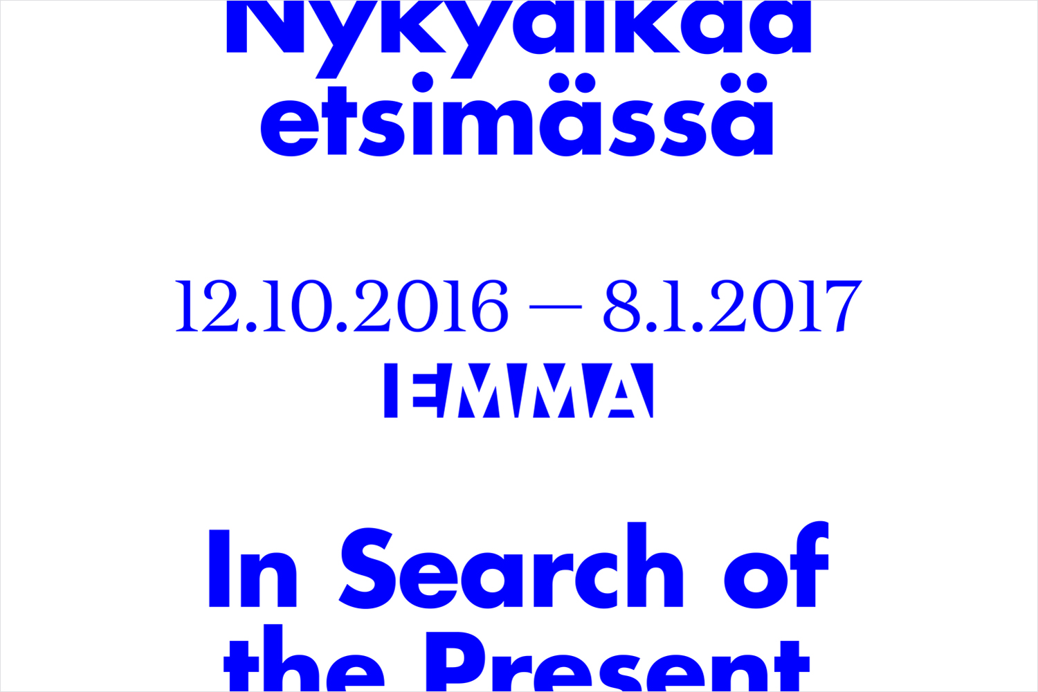
In Search Of The Present is a new series of exhibitions on a 3–4 year cycle held at Helsinki’s Espoo Museum of Modern Art (EMMA). These intend to tackle many of the existential questions that we face in an ever changing world. The first exhibition, inspired by Olavi Paavolainen’s essay collection from 1929, took place between October ’16 – January ’17 and was a study in the representations and expressions of human identity in the digitalized world.
Drawing on the themes of change and the passage of time, Finnish graphic design studio Werklig developed a brand identity connected by a sense of movement, implied in the cropping of text across posters, books, and supergraphics, physically in the motion of outdoor campaign posters, and digitally in the scrolling of social media content.

The multi-media landscape that the brand identity extends across, and its constant and discernible change, is rather fitting for an exhibition series that intends to explore our place in a world that is continually in motion. There is a strong sense of identity to the work in type choice, colour and layout, and in particular the continuity that exists between the static and the dynamic. Motion becomes a distinctive brand asset, whether that be that implied in the cropping of text and image, or more literally in their movement. Where you expect outdoor campaigns to scroll and stop, the continuous motion is unexpected.

There are a couple of other neat ideas worked in that also manage to capture the passage of time (or at least bookend periods) through simple graphic expressions. These include the flourishes and fine lines of a serif and the heavier monolinear lines of a bold sans-serif, the continuity of concept across print, website and social media, and the tension between the conservative black and white of EMMA’s own identity and the very current electric blue of exhibition. This colour choice still functions in a similar way, framing artworks with a single solid colour, and working in conjunction with plenty of white space.

Other highlights include the continuous stream of information and purposeful placement of title across the folds of the invitations, the typesetting of book and the arrangement of interior graphics, both of which use text to frame areas of space, and a text-based identity within the context of an image-centric exhibition. More from Werklig on BP&O.
Design: Werklig. Opinion: Richard Baird. Fonts Used: Futura & Domaine.