Suomen Jäätelö by Werklig
Opinion by Richard Baird Posted 22 February 2017

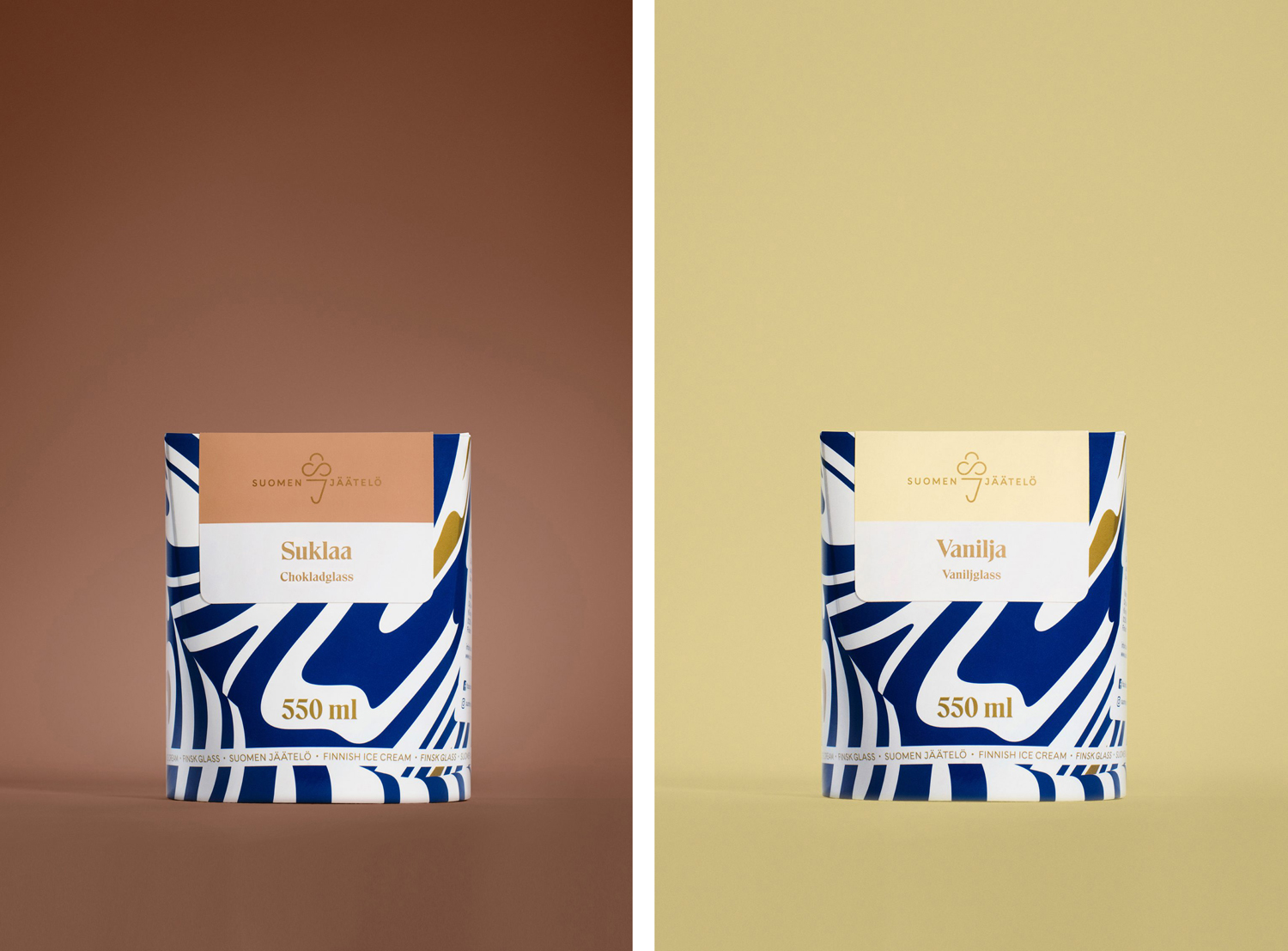
Suomen Jäätelö is a super-premium ice cream brand currently available in five flavours and a sorbet. These include Milk, Pistachio, Vanilla and Chocolate made from Finncattle milk, a Rhubarb sorbet and Spruce created in collaboration with iconic furniture maker Artek. Although ice cream is internationally ubiquitous, Suomen Jäätelö is described as having a distinctively Finnish character. This is expressed throughout its packaging design, developed by Helsinki-based Werklig, in its balance of unique structure, use of space and pattern, modern logo and type contrast, in conjunction with a still life approach to art direction.
With the intention of helping Suomen Jäätelö establish a new globally recognised Finnish Ice Cream brand, Werklig developed a strategy, from which a complete and holistic brand experience was derived, that would position the brand as super-premium, distinctive and modern. This included naming, packaging, web design, point-of-sales materials, marketing communications and art direction.
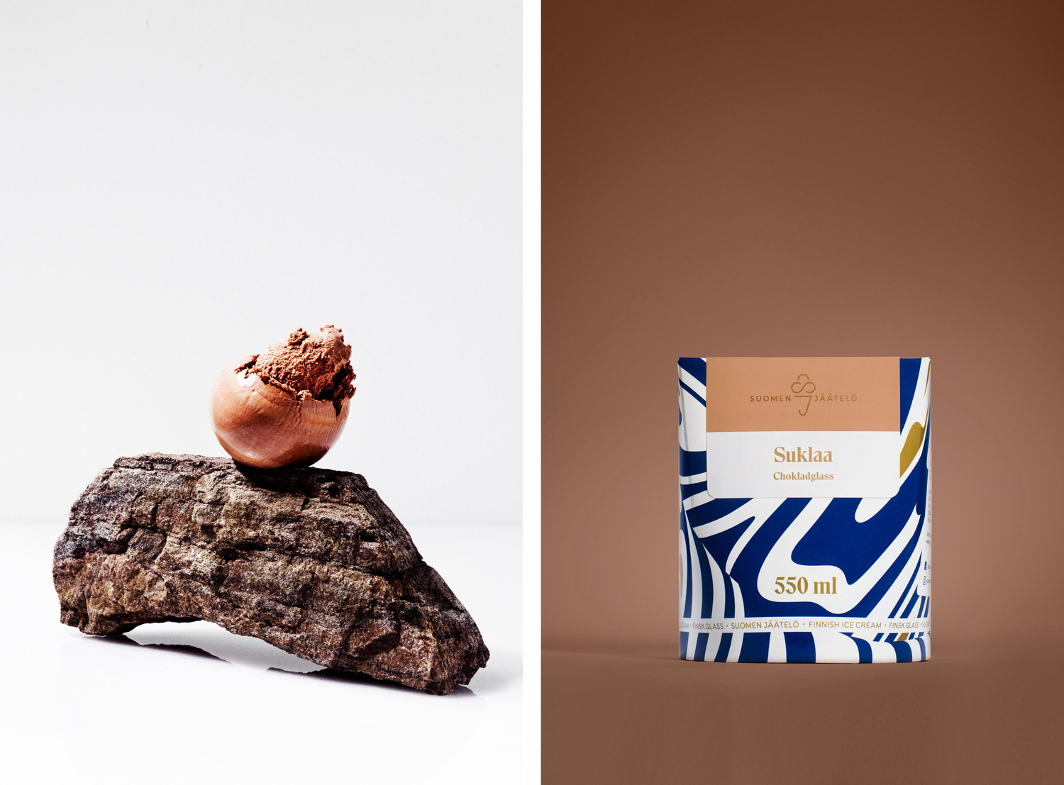
Although structural design is unusual, delivering differentiation from what is perhaps now the conventional, over-familiar and utility of tubs, it is graphic expression and art direction that work well to secure memorable visual character and aid positioning.
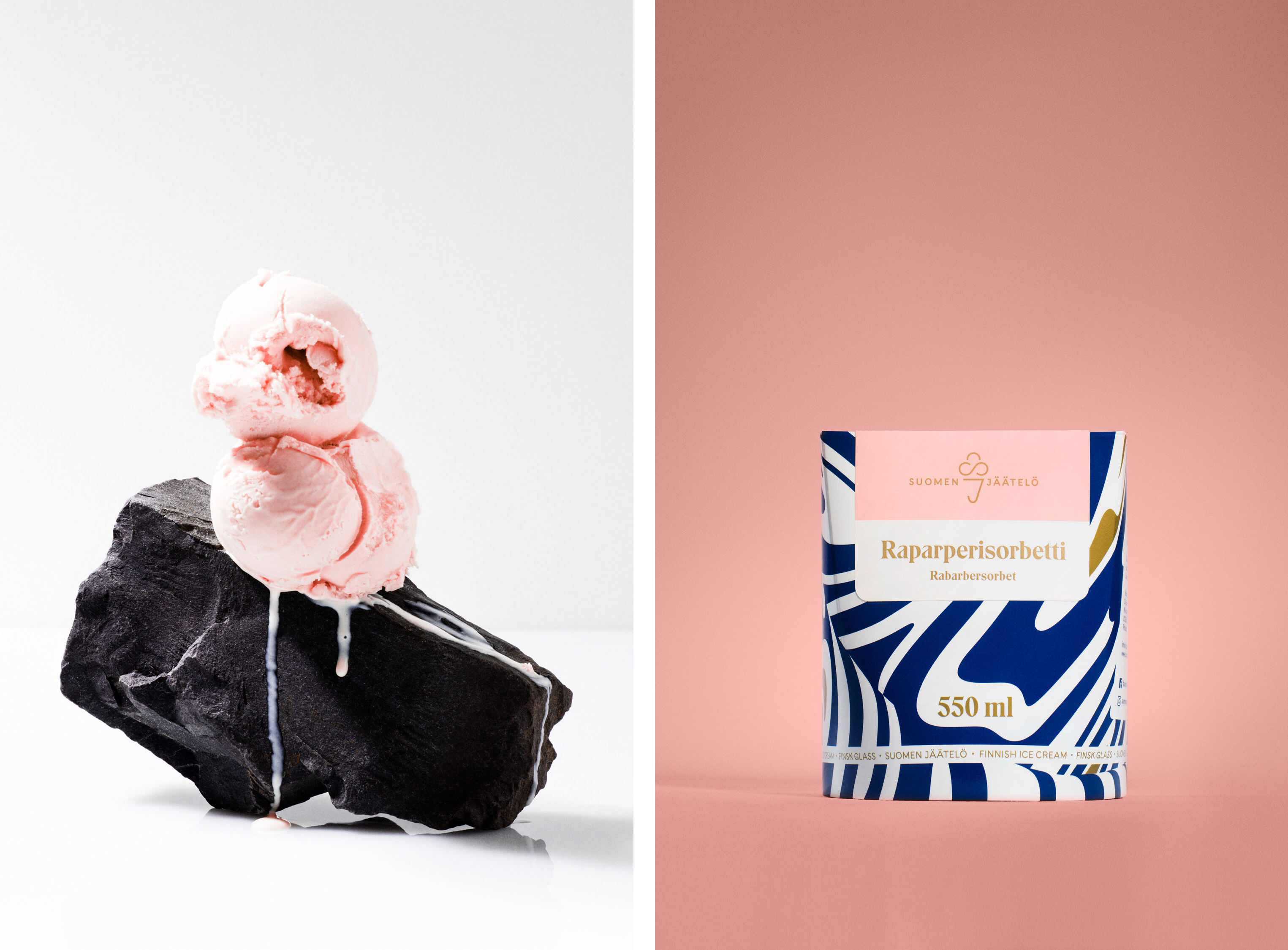
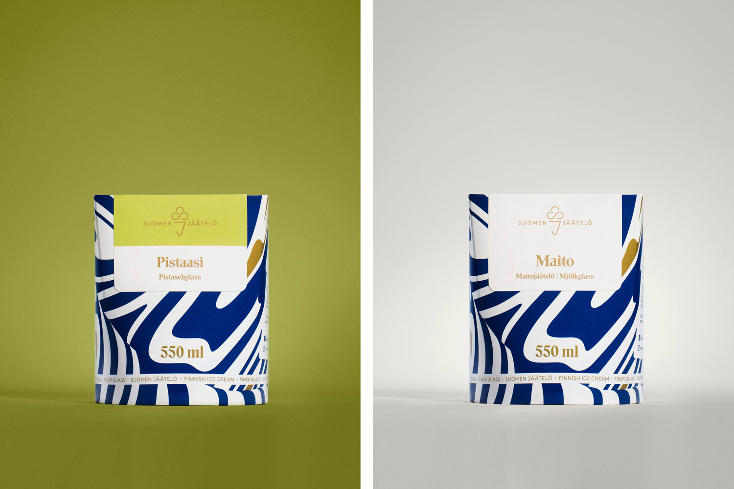
Inspired by the balance of elasticity and viscosity of Suomen Jäätelö’s ice cream, Werklig’s pattern work is a real highlight. It is a familiar device, but often under-utilised, with a boldness of coverage, a visceral communicative quality and a striking blue, white and gold mix managing to play with expectation, provenance, quality and impact. The way it combines the flatness of swirls with the depth of folds is neat and visually interesting, with the ml satisfying in its placement, anchoring the label above.
Logo feels a little less successful in its rendering. The lightness of lines, the breaks and overall form, although current and communicatively direct, does not have the distinction or memorability of pattern, but does works as a visual shorthand for a long name.
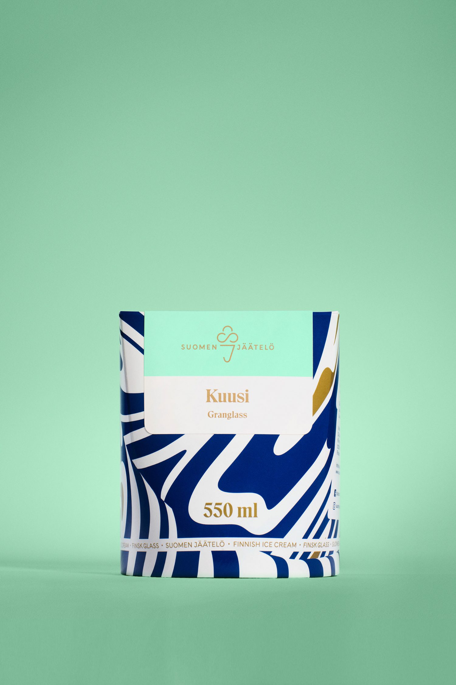
Where pattern is organic, type, label and logo have a sense of centre-aligned balance. This contrast helps to separate a consistent pattern across range with individual variety information, alongside colour, naming and surrounding space.
This contrast continues through to finer typographical detail in the juxtaposition of a very current favour for the monolinear sans-serif (and similarly styled logo), and the traditional flourishes of a serif. This leverages some well-established premium conventions, the meeting of modern Scandinavian brand and the high quality craft of its products.
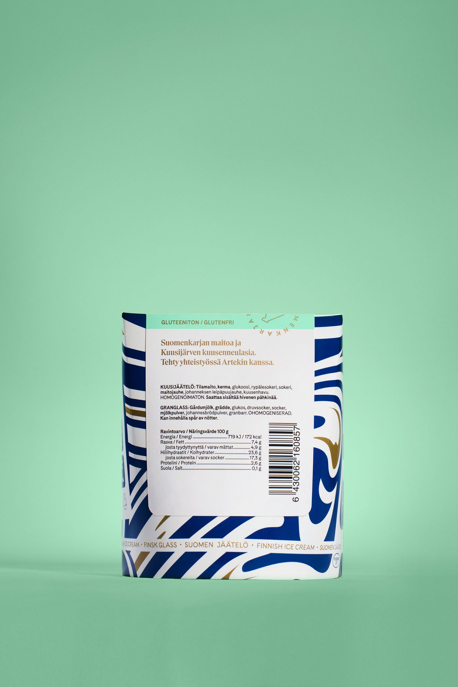
Close-up, the layout and adhesive fold-over nature of label, the abundance of space around the shorter names and the build of the logo does border on the small craft brand, rather than the super-premium, it is, however, a very practical solution, particularly for a product which intends to have an international reach.
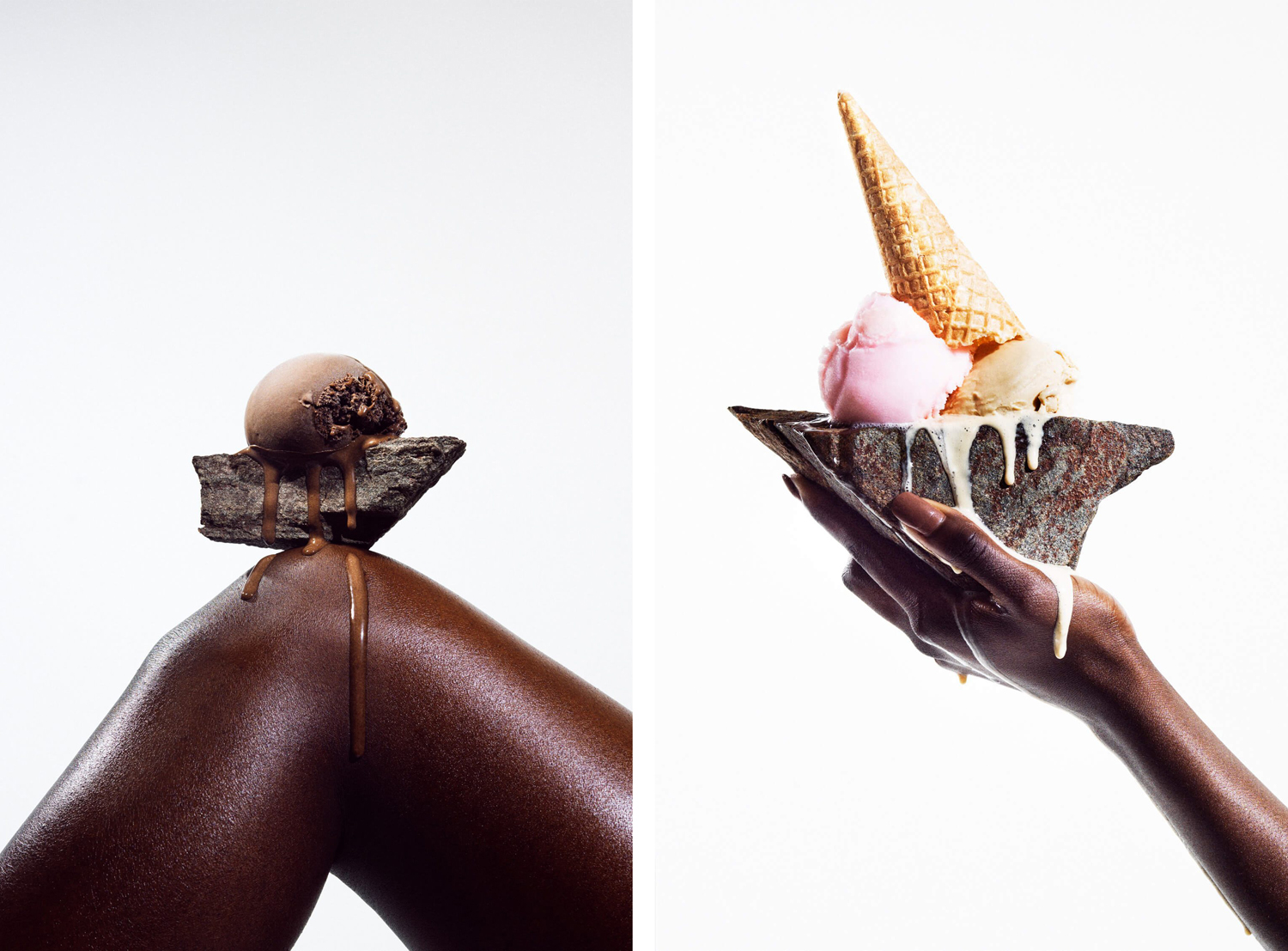
Photography, created in collaboration with KoskiSyväri, utilises something of a still life approach and contrast, placing the smooth exterior qualities of scooped ice cream against the roughness of stone. This is, alongside pattern, is a real highlight, effectively touching upon a rugged Scandinavian provence (or at least making the most of an international association) and the softness of product. Juxtaposition is pronounced and elevates image.
The shots of hands and legs and the melting of ice cream is a little more conventional, although it does work towards conveying a sensuousness and indulgence, a bit of a category necessity. There is an expense to this kind of art direction. It avoids the familiar images of spoon in tube and ingredient photography, and instead provides visual distinction rooted in a discernible concept, adding a sense of artistic value to a product that, for the most part, looks similar. There is a slight disconnect between image and packaging, absent type and logo, but this is likely to come together in campaigns and website.
Iconography builds on the monolinear qualities of logo and type. Theses articulate the Vegan nature of product and the milk of Finnish cattle. There is a continuity of type, illustrative style, space and composition, but again, much like the layout of information, feels more like the product of a small local brand rather than something super-premium with international ambitions.
There are some really neat and creative ideas here, alongside those that are more familiar, yet commercially reassuring. It avoids the obvious flag-waving national tropes in favour of something more nuanced and sophisticated, but rooted in provenance and the qualities of product. Pattern, structure and metallic ink, alongside art direction, work well to establish a sense of the premium while label and logo appear touch more small-scale. These still feel well-resolved if communicatively a little mismatched. More from Werklig on BP&O.
Design: Werklig & KoskiSyväri. Opinion: Richard Baird. Fonts Used: Eksell Display.
