Modern by Dwell Magazine by Collins
Opinion by Richard Baird Posted 27 February 2017

Modern by Dwell Magazine is a new range of home decor products, tablewear and furnishings for those who want to create a welcoming space with a modern aesthetic. It is a collaborative project between design and architecture magazine Dwell, designers Chris Deam and Nick Dine of Deam+Dine, and the American retailer Target.
The range features over 120 products. From chairs, tables and glassware to kitchen utensils, bowls and cocktail shakers. These all balance an everyday functionality with what is described as a high-quality material beauty and share a modernistic design foundation, good design for everyone, only truly made a reality with more recent improvements to mass manufacturing.
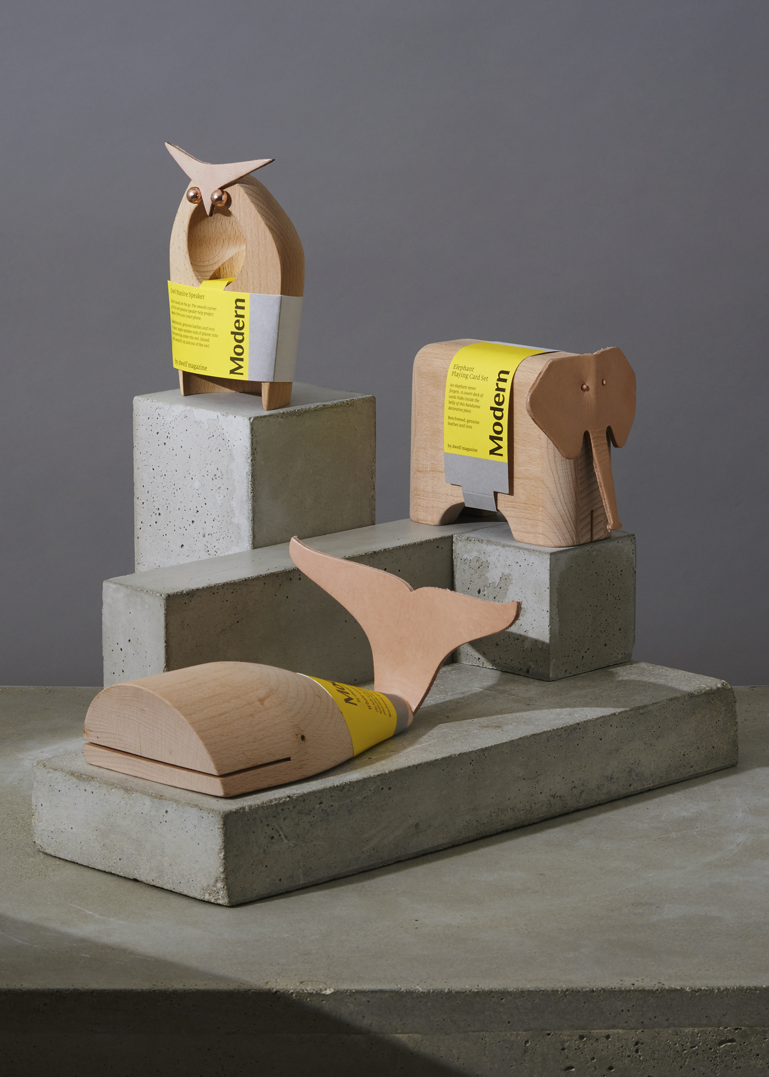
New York-based design company Collins, working with the Target Creative Team, drew on a similar modernistic approach taken by Modern’s designers to create brand identity and packaging. This can be seen in structure and high quality materials, and throughout the range’s graphic expression, a balance of high-impact colour, typographical detail and a practical grid-based layout.
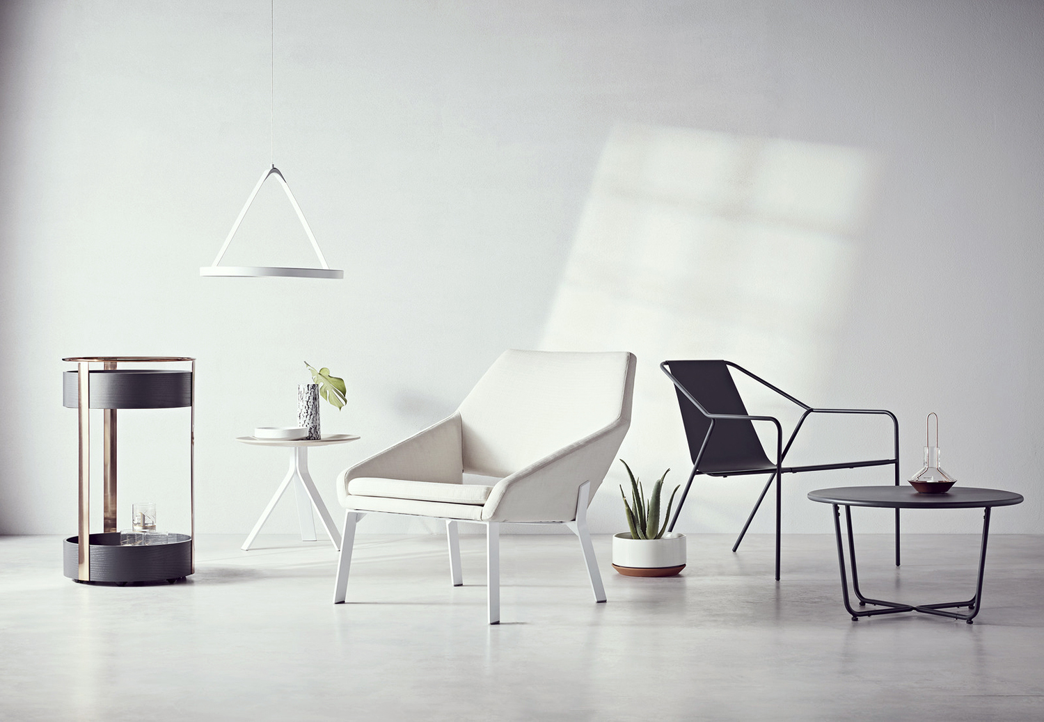
The range, collectively, is characterised by a simplicity but a distinction of form, and a consistent high quality in design and build. Individually, these feature the occasional graphic flourish, an element of the playful, or a contrast in colour, material or texture. Although there is a diversity to range, brand identity and packaging clarifies and articulates their conceptual commonality, where aesthetically this may be more nuanced, distilling down a multifaceted and optimistic ideal from the past into an universal, inclusive and current visual language.
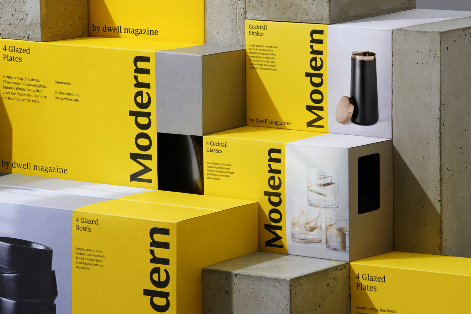
Much like the products themselves, structural design is functional, based around a modular system that can accommodate variety yet establish a clear continuity. Rectangles have an inherent visual robustness, regardless of material, and establishes one of the first layers of Modern’s brand language.
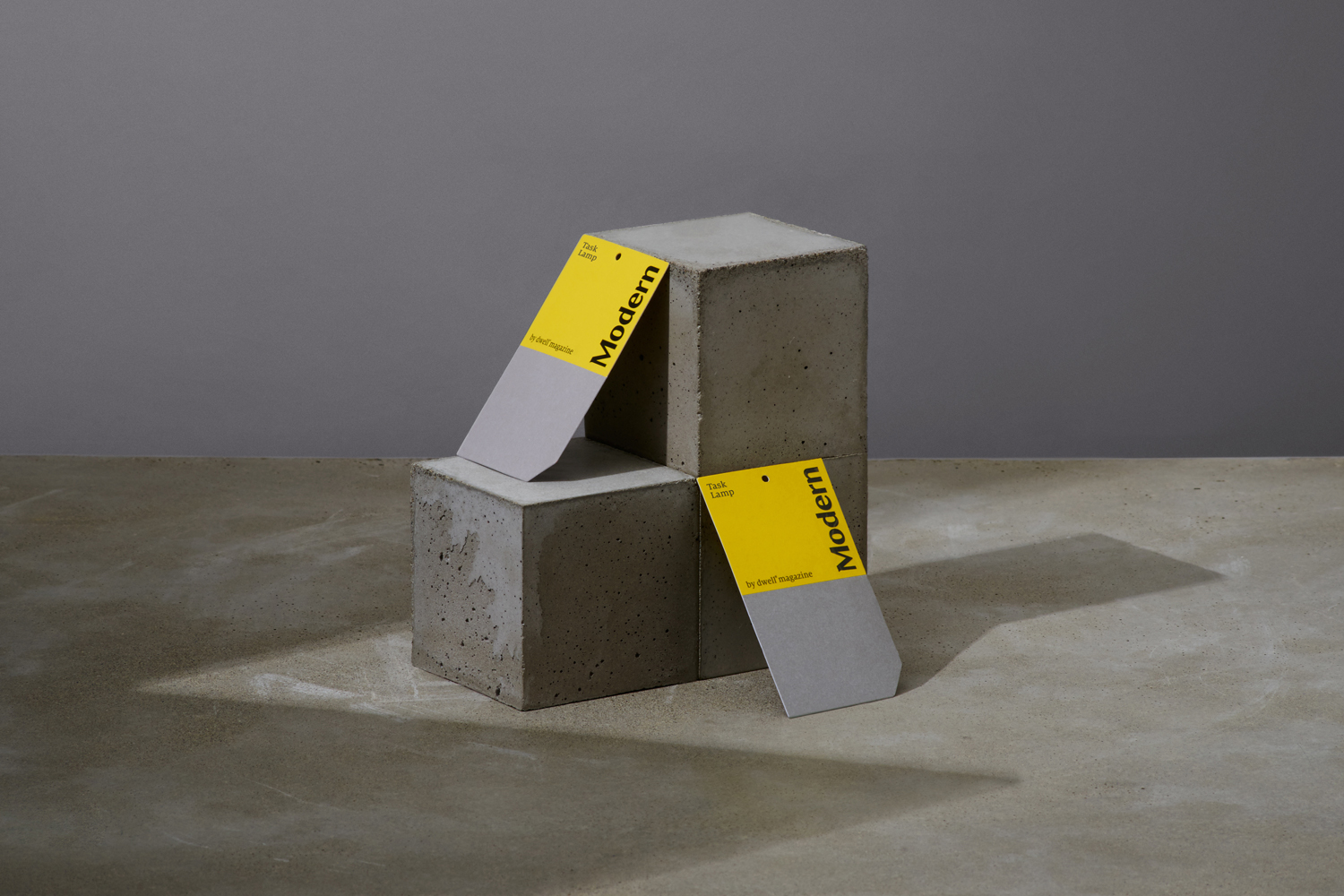
This is built on using colour. A bright yellow and cool grey—whether that be a dyed board or by way of image—find a balance between compelling aesthetic consideration (initial impact that draws the eye), and something rooted in the architectural and industrial. Again, a simple leveraging of association that reflect the modernist influences on products.
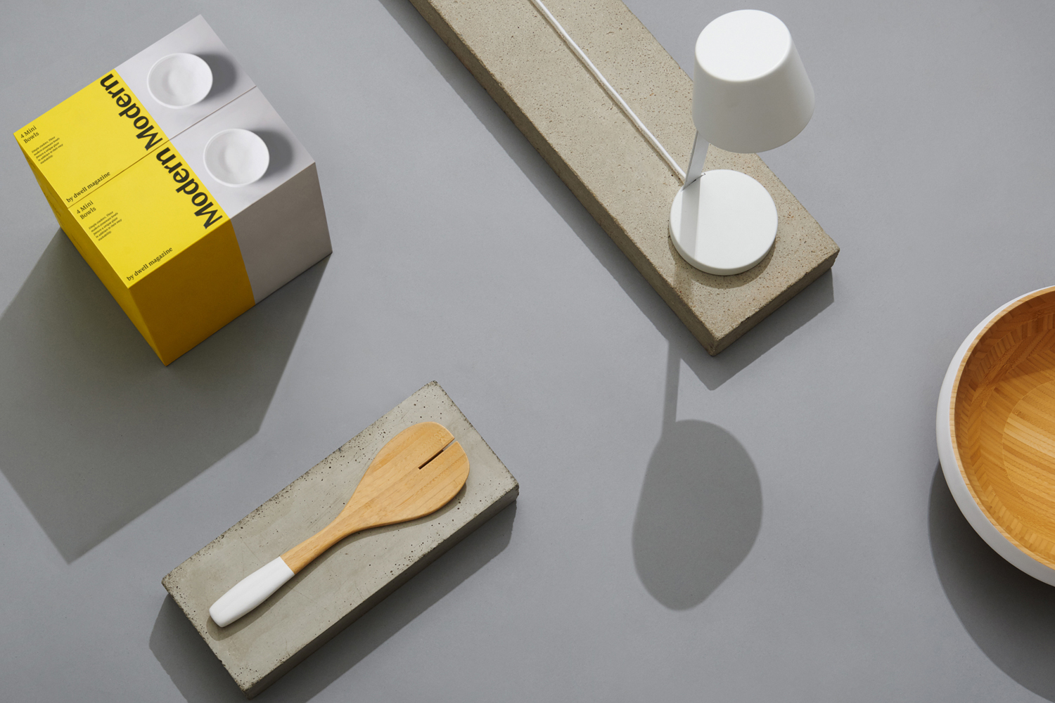
Where you might have expected an International Typographic Style, logotype and typesetting makes a literal connection with the Dwell brand, and its own visual identity system, based around Milo Serif. It is worthwhile alternative with a warmth and crafted quality to this that feels distinctly more personable than something more literally tied to mid-century modernism. This is particularly important within the context of a reductive structural design and a layout that invokes something of the Swiss-style posters. This can be seen in the grid-based layout, the use of proportionality, orientation, positive and negative space.
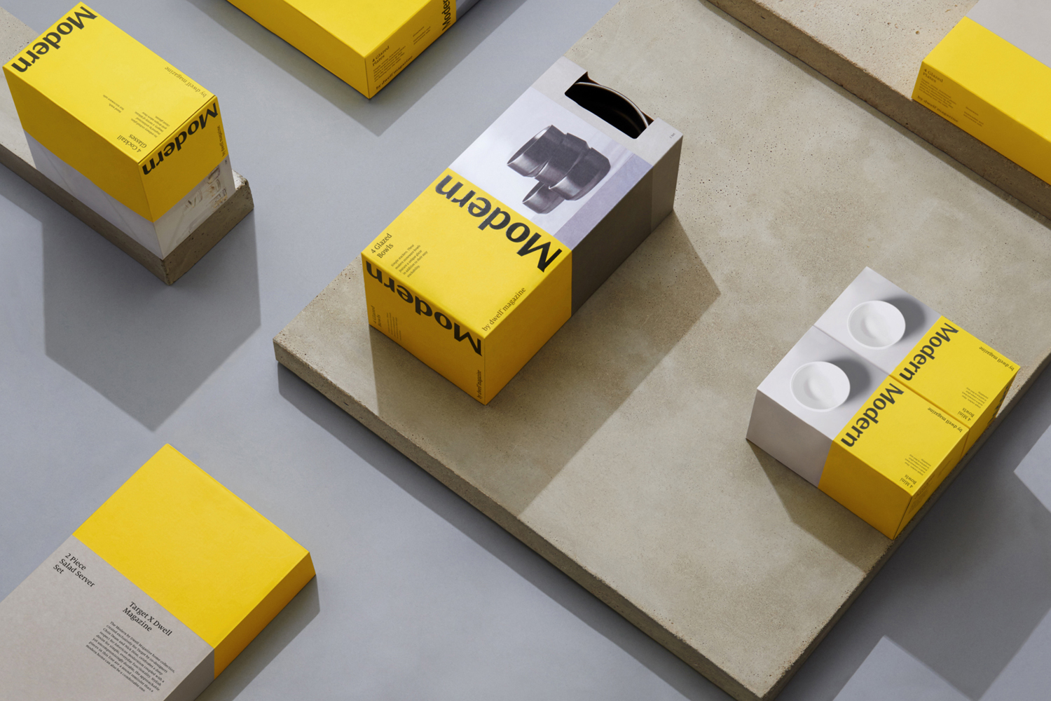
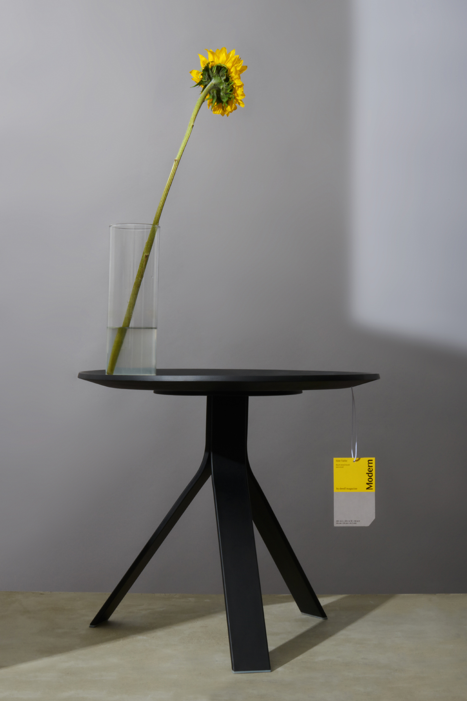
Product photography is well shot with an approach to art direction that places emphasises on material, form and colour, has a easily replicable systematic foundation and offers contrast to the simplicity of a single bright colour and black type. There is a good use of light and shadow and a strong favour for continuity that works equally well for the very simple and the more detailed.
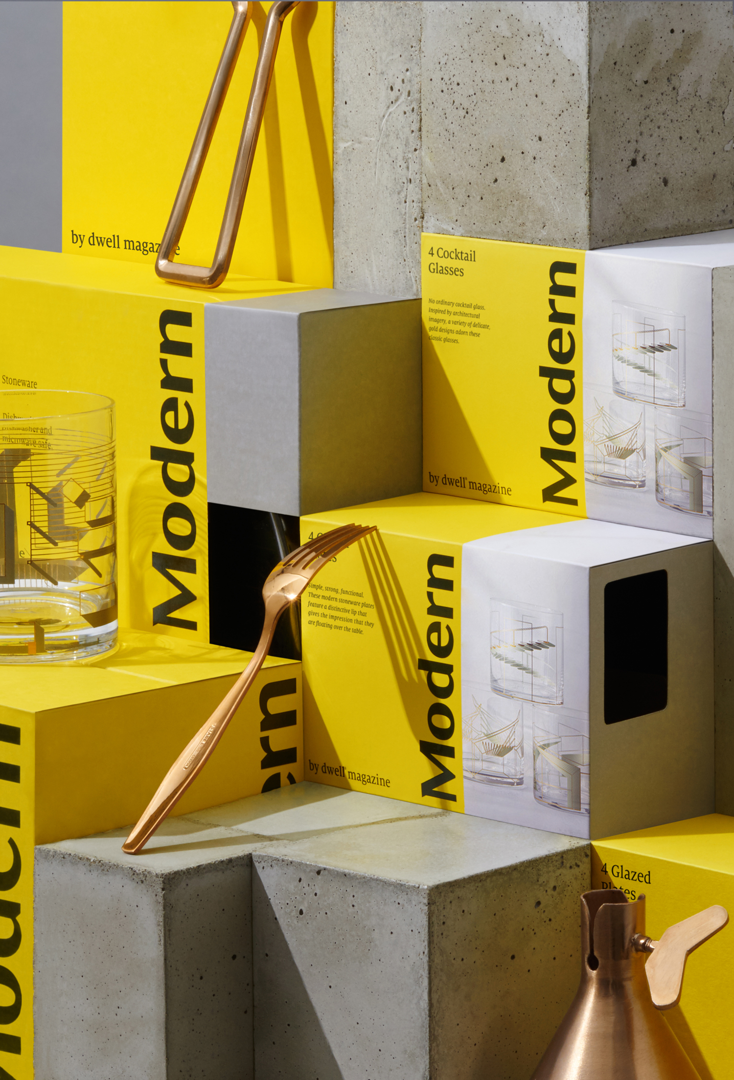
Presentation is perhaps a little more blunt, drawing on the modernist architecture of the mid-century in the use of geometric shape, concrete, and asymmetrical compositions. The commonality between packaging structure and presentation, fitting neatly together, emphasises the guiding principles of the range with a fairly clear use of material, form and arrangement.
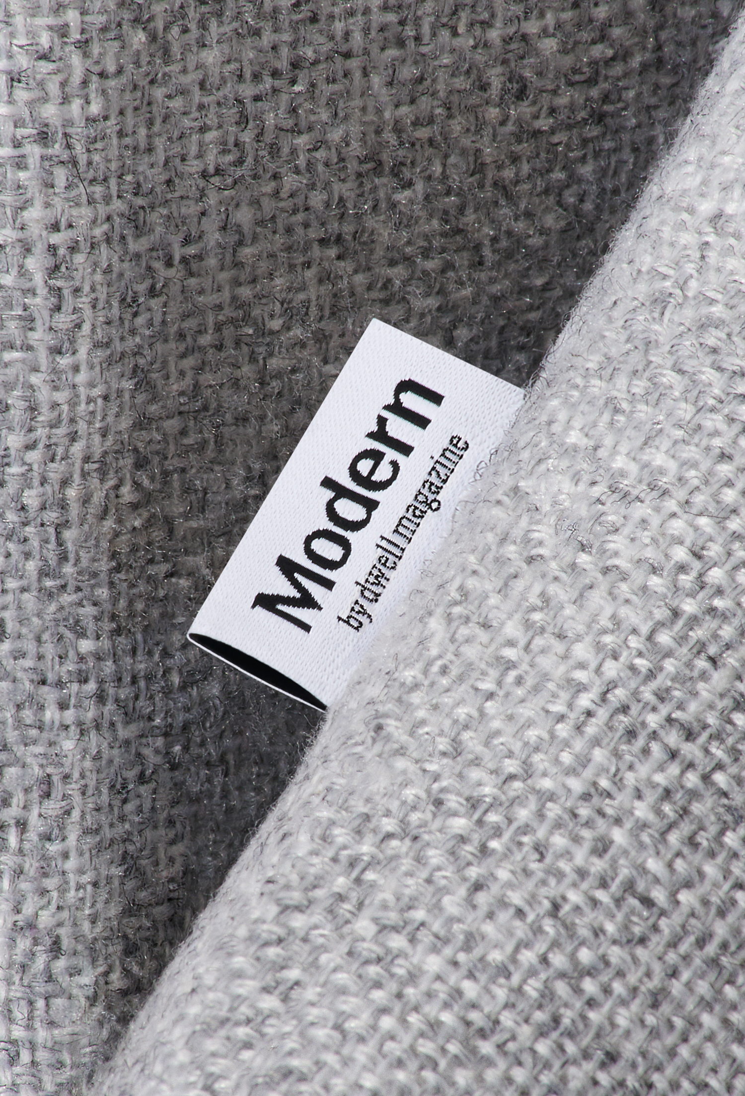
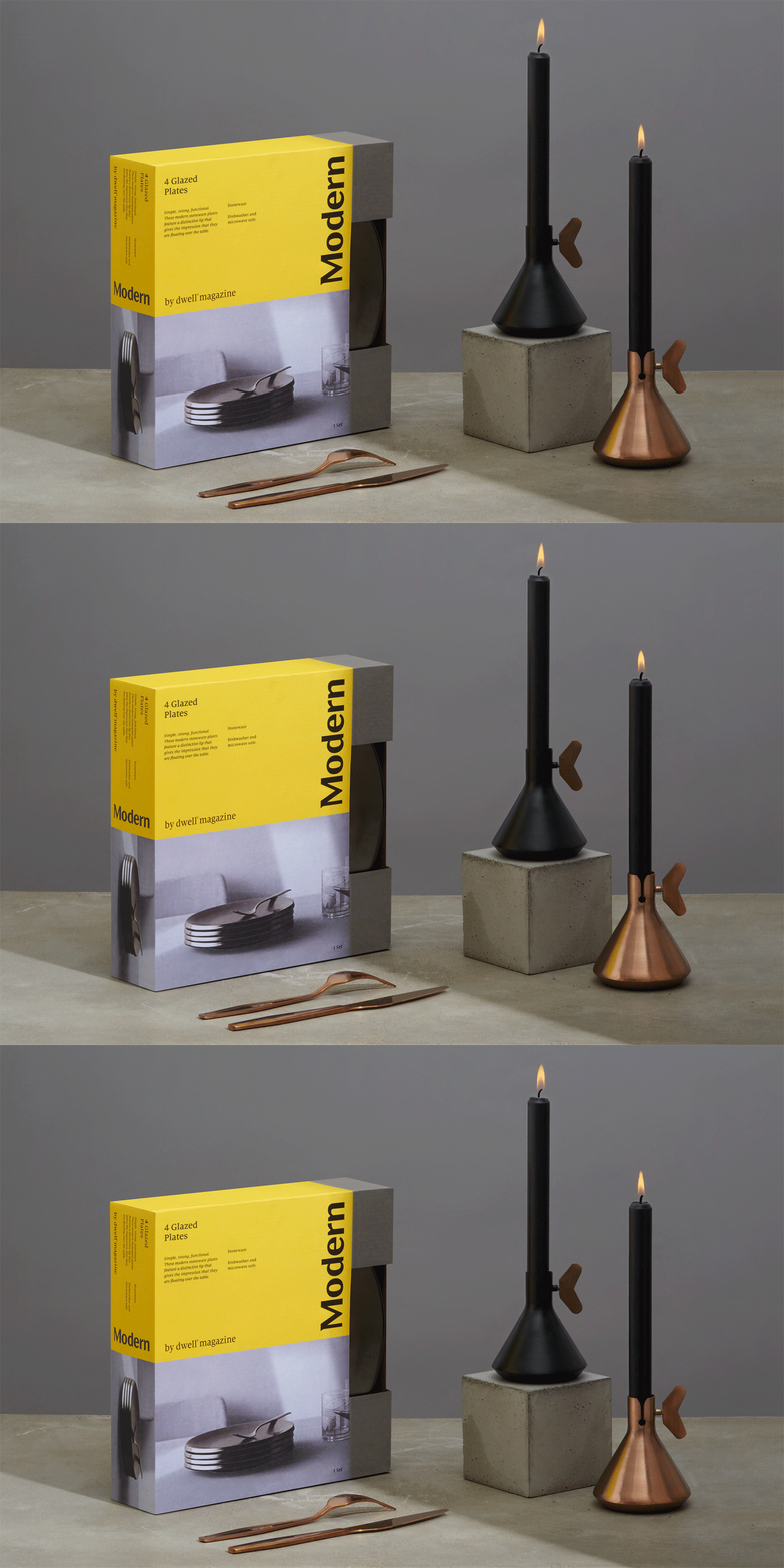
The result is a system that delivers impact from a distance, detail and insight up close, establishes a continuity of brand across a diverse range (using boxes and tags) and establishes a common visual language of colour, form and type, rooted in the principles that informed the design of the range, yet distilled down, brought to light in a concise and understandable manner. More work by Collins on BP&O.
Design: Collins & Target Creative Team. Opinion: Richard Baird. Fonts Used: Milo Serif.
