Tulura by Build
Opinion by Richard Baird Posted 6 April 2017

Tulura is an independent luxury botanical skincare brand created Eileen Feighny, a former professional model brought up in Korea and now working from New York. The first of Tulura’s products is a two-step moisturising program that includes a vitamin peptide serum and a botanical facial oil made from seasonal ingredients hand picked and custom-blended. Ingredients are chosen for their effectiveness, and formulations created without the use of fillers, fragrances, synthetic emulsifiers and preservatives.
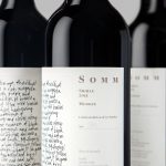
Tulura worked with Leeds-based studio Build to develop a “contemporary, diverse and engaging” brand identity to “inspire and motivate women and beauty enthusiasts”. Build describe their approach as taking a “simplistic, clean and honest approach”. This is expressed by the structure and composition of packaging, in the layout and typesetting of label, and in the lines and forms that make up Tulura logotype.
Tulura is a small, independent and self-funded business, and design intends to sit proudly alongside those products from larger more established brands. As expressed through structural design and labelling, positioning is clear and straightforward, backed up with plenty of insight and background online. The approach balances a clinicality with a personal touch in the meeting of a current practical sans-serif and the more individual crafted and calligraphic qualities of logotype. Orientation and case serve to further define these two components, with colour uniting, while layout that makes the most of the proportions of bottle.


The box is an interesting contrast of blind embossed book with a white exterior, inset with the more rudimentary qualities of layers of what looks like corrugated card. Much like the contrast of type, here there is a similar duality, one of luxury and a more down to earth craft that works together Eileen Feighny’s research and insight, personable approach (she meets all her clients) and an environmental conscientiousness.

Other neats details include a glossy structural choice with a very cosmeceutical quality that leverages associations with clinical effectiveness, the simplicity of packaging and the detail of website, the clear hierarchy and practical systematic qualities of label design, and the way that seasonal ingredients and the seasonality of fashion are intertwined. The work is simple yet balanced, makes the most of well-established perceptions, but with enough material and typographical detail to keep it interesting, distinctive and linked to the values of Eileen Feighny, and backs this up with plenty of insight and a continuity of style online. More work by Build on BP&O.
Design: Build. Packaging: Fred Tulura & Natalie Eshkenasy. Opinion: Richard Baird. Fonts Used: Relative Bold & Book.