The Best of BP&O — May 2017
Opinion by Richard Baird Posted 30 May 2017
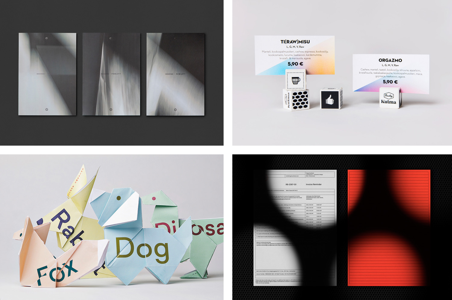
May’s highlights included Requena & Capdevila’s campaign work for Sant Jordi Festival 2017, Socio Design’s packaging for luxury accessory brand Chaos, Band’s custom typeface for restaurant Hill Of Grace and Lundgren+Lindqvist’s continued work with O/O Brewing. There were, however, five projects that stood out, and have made it into BP&O’s Best Of Series. These typically balance a strong singular concept, or an appropriate confluence of ideas, with a compelling aesthetic and clear communicative intention that appropriately plays with form, colour, type and layout, as well as material, texture, image and print finish.
Roger Burkhard by Lundgren+Lindqvist, Sweden
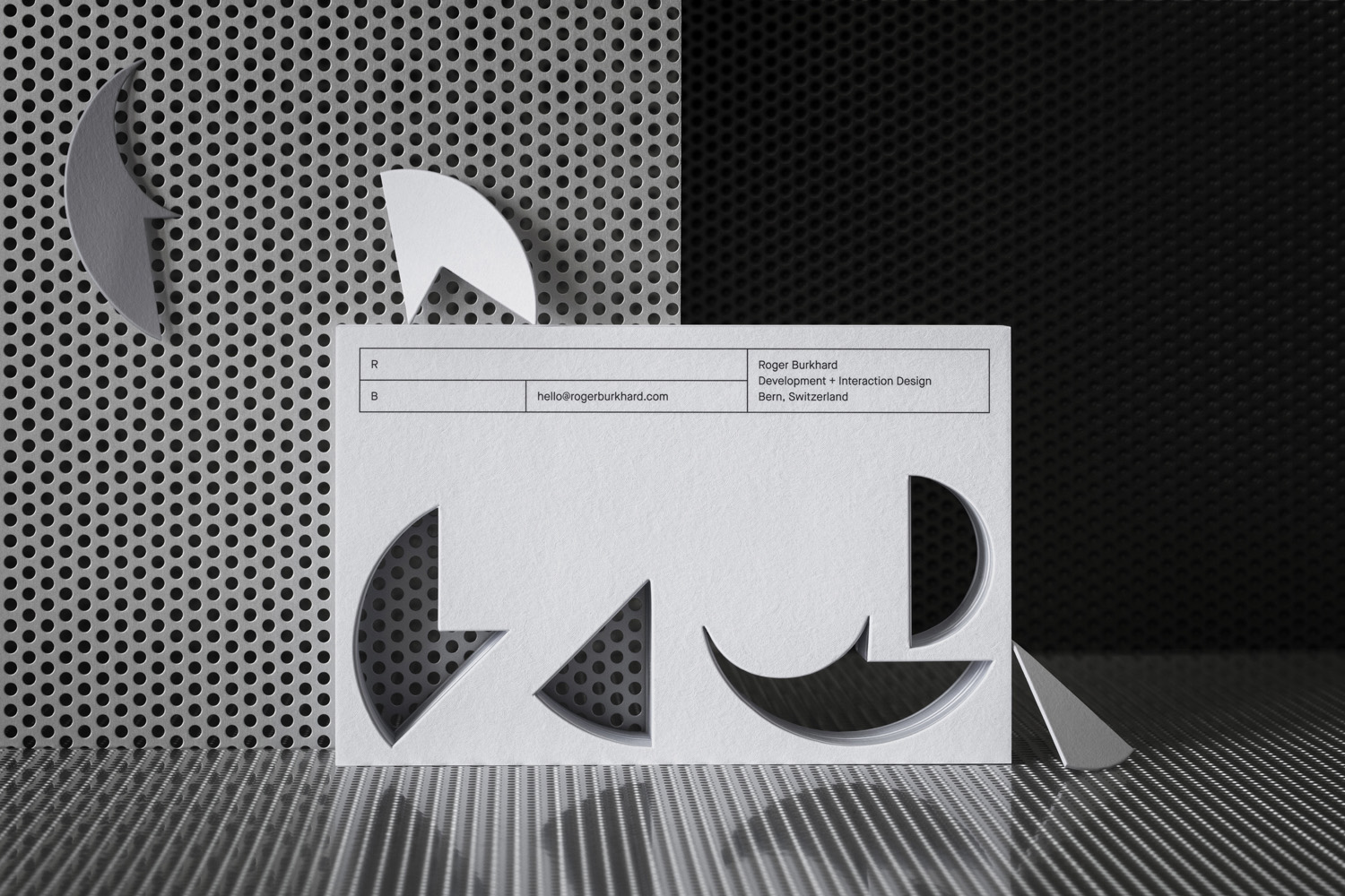
Roger Burkhard is a creative web development and interactive studio based in Bern, Switzerland, with a roster of clients throughout the creative industries. The studio worked with Scandinavian designers Lundgren+Lindqvist on the development of a new brand identity. This included monogram, brand guidelines and website, as well as a stationery set that covered business card and promotional cards, letterhead, invoice and invoice reminder.
Lundgren+Lindqvist, with the intention of avoiding industry convention, brings a thorough material and crafted quality to a service that often favours digital communication, yet layers this with more familiar web-based expressions. These draw on and work together themes such as problem solving, responsive design and creative thinking, conveyed through puzzle pieces, a modular system with a baseline grid and flexible header, and adds a moment of play in the choice of a bright spot colour.
See more of this project here
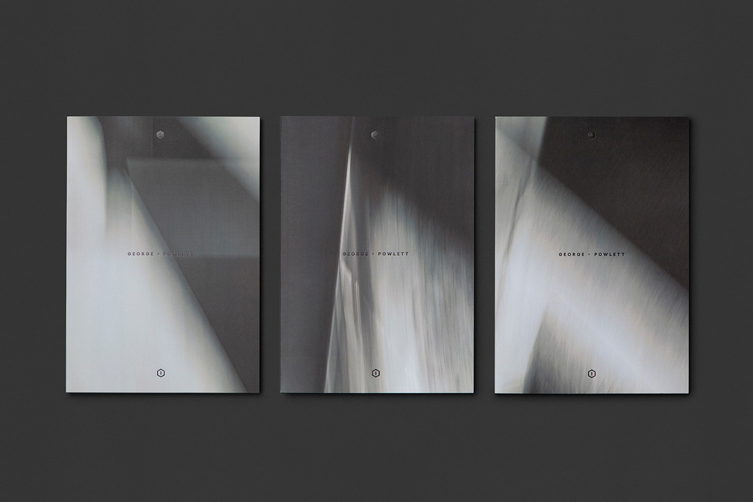
George + Powlett by Studio Brave, Australia
George + Powlett is a residential property development of 11 apartments, created by ICON Developments, and located in East Melbourne. ICON’s properties are described as having a precision and balance, and this continues through to their latest project, which was designed by acclaimed architectural practice Powell & Glenn. The development is set within an environment of what is described as a place of elegant contrasts. This can bee seen in the strong geometric forms of structure, and the surrounding leafy suburb of East Melbourne. Balanced contrast informs brand identity, designed by Studio Brave, with each element said to express the seamless connection between environment and structure. This connects brochure, material sample pack, foldout floor plan and website.
See more of this project here
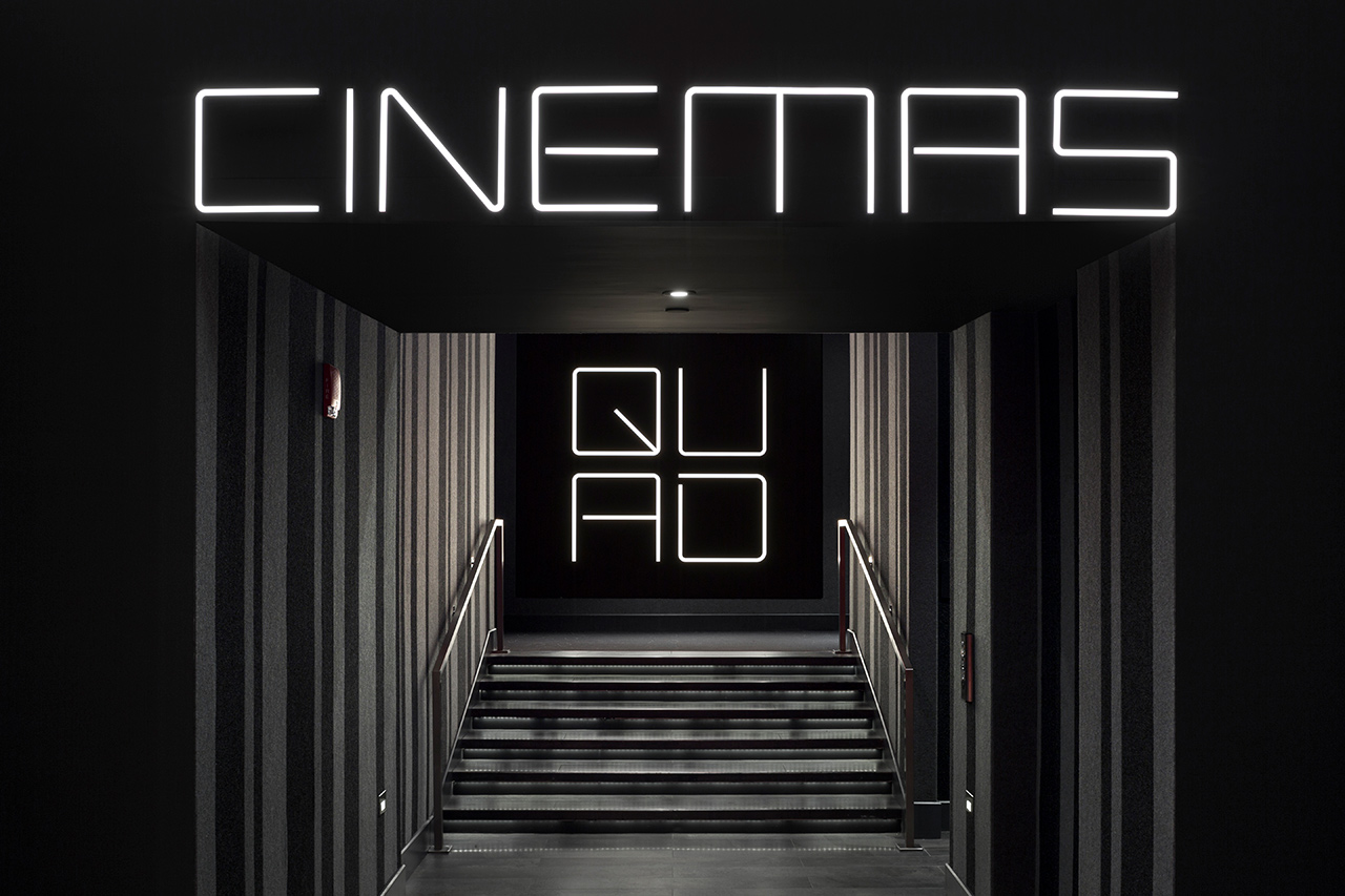
Quad Cinema by Pentagram, United States
Quad opened in 1972 and was New York’s first multi-screen cinema. Since then its four screens have been dedicated to playing a diverse programme of independent, classic and first-run films. To coincide with its contemporary state-of-the-art refurbishment, completed earlier this year, Quad’s new owner Charles S. Cohen and his independent film production and distribution company Cohen Media Group worked with Pentagram partner Paula Scher and her team on brand identity. This included logo and custom typography, environmental graphics, signage and digital installations informed by the visual language of cinema.
See more of this project here
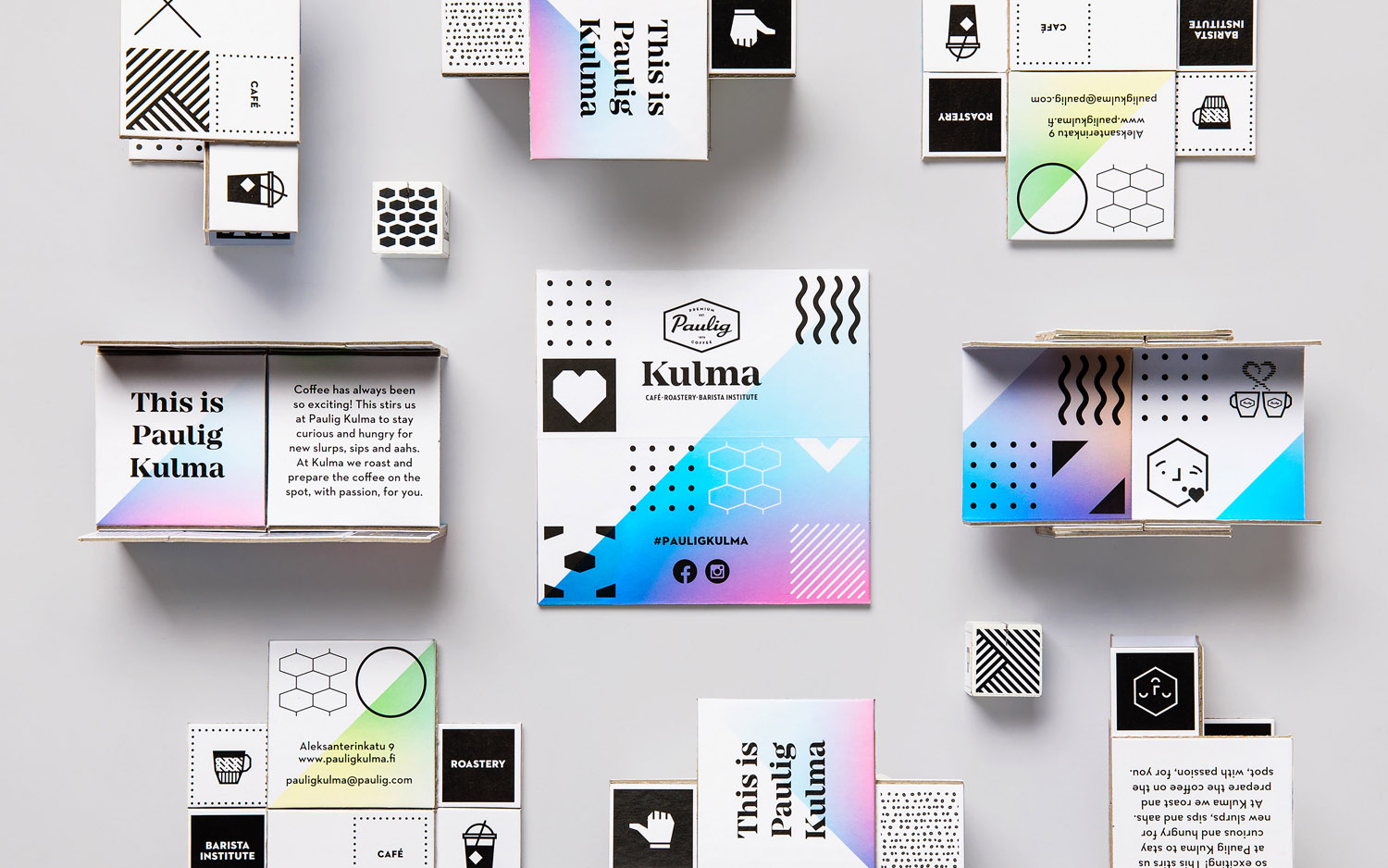
Paulig Kulma by Bond, Finland
Paulig Kulma is distinctive space, located in the heart of Helsinki, developed by Paulig, the leading coffee brand in the Nordics. It combines a coffee shop, roastery and barista institute, and intends to appeal to a broad customer group, and accommodate a variety use cases throughout the day.
Paulig Kulma serves multiple functions. From the inviting and flexible space of the coffee shop, to the industry and craft of the roastery, and the creativity and process taught at the barista institute. Although these exist within separate areas, interior design and brand identity, created by Scandinavian design studio Bond, brings these together as a continuous, integrated and rich brand experience, in print across business cards, coffee packaging and labelling, as interior graphics, menu boards and lighting, and in the choice of furnishings, fixtures and fittings.
See more of this project here
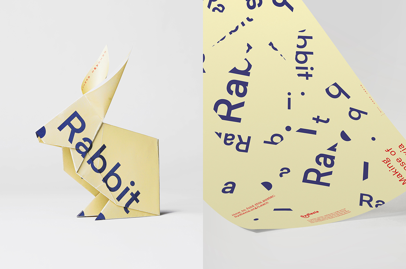
Sydlexia: Making Sense Of Dyslexia by BBDO Dubai, UAE
Sydney Dyslexia intends to challenge the misconception that dyslexia is a learning disability, and instead, move the conversation forward, to more appropriately address it as a learning difference. Sydlexia is an innovative and pioneering platform, created by Sydney Dyslexia, to help aid this change, and offers new techniques and training methods to help facilitate “dyslexia correction”.
Dyslexia is the most common learning disorder. It affects 1 in 10 people worldwide. It is indifferent, and its challenges are felt by those from all walks of life. Sydlexia worked with BBDO Dubai on brand identity and its first campaign with the intention of engaging a diverse group of people.
Taking their cues from the universal notion of dyslexia as a learning difference that breaks up and rearranges letters and words, BBDO finds a convivial, modern and universal expression that draws a lot of visual and cognitive equity from simple typographical play, the fracturing of words and the process of their reconstruction.
See more of this project here

