The Best of BP&O — June 2017
Opinion by Richard Baird Posted 29 June 2017

June’s highlights included Studio fnt’s work for SeMA exhibition Highlights, Föda’s cheerful brand identity for June’s, and Mucho’s continued work with LGBTQ film festival Frameline. There were, however, five projects that stood out, and have made it into BP&O’s Best Of Series. These typically balance a strong singular concept, or an appropriate confluence of ideas, with a compelling stylistic character and clear communicative intention that appropriately plays with form, colour, type and layout, as well as material, texture, image and print finish.
Throughout June, BP&O also continued to expand on its collections series as another way to jump through to older posts on the site. New additions include Material Thinking, Modern Luxury, and Klim Fonts. Updated projects included Bond’s work for Sushi & Co, Clase bcn’s brand identity for Enea, and Zak Group’s collaboration with Paco Rabanne.


Brighton Beach ELC by Studio Brave, Australia
Brighton & Brighton Beach are privately owned boutique childcare and early learning centres in Brighton, Australia. Brighton ELC, the first of the two, opened in 2001 and caters to 60 children, aged between the ages of 8 months and 6 years, and recently underwent renovations, led by Christopher Elliott Design. To coincide with this renovation, Brighton ELC worked with Studio Brave on visual identity for both centres. Taking their inspiration from the bayside location and Brighton Beach’s iconic beach boxes, as well as referencing the geometric forms of maritime flags, the studio created a playful visual expression that finds a commonality between play and seaside location.
See more of this project here
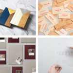
Corps Reviver by Spin, United Kingdom
Corps Reviver is a French publisher and revivalist, redesigning and reprinting classic literary works, the first of which is L’Heure du Cocktail, The Cocktail Hour, written by journalists Marcel Requien and Lucien Farnoux-Reynaud and originally published in 1927. L’Heure du Cocktail, at the time, revolutionised the cocktail book, approaching the subject in a new way. This 2017 bilingual edition, presented in French and English, designed by Spin and illustrated by Spin’s Tony Brook, also offers a new take, pairing expressionist image with a more formal and modernist approach to layout and type. The release of L’Heure du Cocktail coincides with the launch of Corps Reviver’s own identity, also designed by Spin. This similarly explores something of the modernist, in the choice of type and use of form and pattern which appears to be rooted in the military associations of name.
See more of this project here

Anna Bjerger by Bedow, Sweden
Anna Bjerger is a Swedish artist, born 1973 in Skallsjö, now living and working in Älmhult. Through a process of reconfiguring found imagery, bought from secondhand stores and garage sales, by transforming their context and reordering hierarchy with paint and a focus on dimension, Anna intends to intensify experience and create new narratives.
Scandinavian design studio Bedow were commissioned to design Anna Bjerger’s book of works 2013—2017. This was published by Galleri Magnus Karlsson, David Risley Gallery and Kristianstads konsthall in conjunction with her solo exhibition Familiar Shadows.
The book is a limited edition hardback of 104 pages and 155×225 mm in size. It includes texts by Karl Ove Knausgård and Karin Faxén Sporrong. Only 600 copies were available with 50 of these signed and presented in a numbered box marked by the artist’s fingerprints.
See more of this project here

REF by Kurppa Hosk, Sweden
REF is an environmentally conscientious Swedish hair care brand with a range of products that are made from high quality organic ingredients. With a desire to enter the international market of the US and further into the Nordic regions, both dominated by well-established FMCG, Scandinavian design studio Kurppa Hosk were commissioned to rejuvenate REF’s visual identity. This included packaging, art direction, stationery, business cards and web design. These are linked by what the studio describe as a system of simplistic graphic elements and a modest earthy colour palette.
See more of this project here

Endgame by Heydays, Spain
Endgame: Duchamp, Chess, and the Avant-Garde was a temporary exhibition that took place at Barcelona’s Fundació Joan Miró between October 2016 and January 2017. It was curated by Manuel Segade, explored the history of modern art through the lens of its relationship to chess, and featured a variety of works by 20th century artist. These included Marcel Duchamp’s La Partie d’échecs, Max Ernst’s Chess Set, and Mercè Rodoreda’s Untitled (Composition IX), amongst many others. Fundació Joan Miró commissioned Spanish graphic design studio Hey to develop a visual identity for the exhibition. This linked a variety of printed materials, from large format posters, banners and indoor signage to opening night invitations and a programme set in four languages.
See more of this project here