Doméstico Shop & Doméstico Market by Mucho
Opinion by Richard Baird Posted 22 November 2017

Doméstico Shop is online retailer of designer homeware which has grown to become the leader in the Spanish market. It stocks an array of items, from furniture and kitchenwear to textiles and lighting. To coincide with the launch of Doméstico’s concept store Doméstico Market, and the opening of a new flagship store in Barcelona, the retailer worked with Mucho to revise its brand architecture and visual expression. This included a new logotype, a graphic identity of modern colour and form, and material assets that included bags, stickers, swing tags and signage.

A quick bit of research revealed a somewhat dated retail experience, something close to a warehouse, and a visual identity, a green sale star with a solid D inside, to match. Although not particularly compelling this felt like a response to a predominantly online-driven business, a confused cross-purpose functionality rather than the personable and product-focused.
The new approach, a combination of simple image building, pattern, warm colour and type, is a huge improvement and a memorable change. This is given further value linked to a broader strategic evolution of brand which sees it take more pride in its physical space through its new flagship and concept spaces.
Logotype is current in its type choice with some slightly unusual details. The wide M and T and the solid semi-circle diacritic give it a touch of character amongst its geometric shapes and monolinear lines. The M and the T, as well as the centre alignment of the lock-up work well to bring an element of balance to the visual weight and asymmetry of the diacritic.


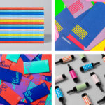
The heart of Doméstico’s graphic identity is a simple and ubiquitous semi-circle device that forms the diacritic above the é and establishes a basic unit that is expanded out to generate different visual expressions and representations, depending on their arrangement.
The semi-circle as diacritic is an interesting approach. It takes ownership of something that is said to be difficult in online contexts. The focus on physical spaces, where previously an e-tailer first, gives this something of a conceptual weight.

DomésticoShop and DomésticoMarket are united by this play with form, yet are diveded in their arrangements, with the former employing simple grid-based layouts and sense of pattern, and the latter working with vertical structure, something that calls to mind stacked plates and bowls. Although abstract, these leverage an element of association, be that the modularity and style of modern furniture and homeware, or the good design for everyone call to action of modernists.
The approach employs some effective graphic design principles, alongside abstraction, ambiguity and association, that include repetition and correlation, individual forms contributing to a greater whole, a warmth and modernity in colour and type, visual impact and distinction from a distance, and clear continuity between different assets.


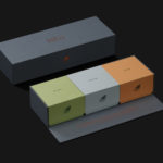
Colour is a highlight. It is modern, warm and distinctive in the case of DomésticoShop, while DomésticoMarket employs something of a more familiar and crafted association in the pairing of kraft paper and a white ink. Other neat details include stickers, using the edge to create semi-circles from circles and the semi-circle to denote discounts online. Although website falls short in terms of clear continuity, the investment in concept and flagship stores are well-served by this new system, with plenty of room for a variety of visual expressions and the leveraging of association. More work by Mucho on BP&O.
Design: Mucho. Photography: Vidal Orga. Opinion: Richard Baird.