Den Norske Filmskolen by Neue
Opinion by Richard Baird Posted 24 November 2017
Den Norske Filmskolen (The Norwegian Film School) provides a broad range of practical film courses taught by a full-time teaching staff and guest lecturers and instructors with active careers in the national and international film industries. It is the only one of its kind in Norway, developed as a separate department at Lillehammer University College in 1997 and now part of Inland Norway University of Applied Sciences. Courses cover film direction, screenplay, cinematography, sound and production design, digital design and documentary making.
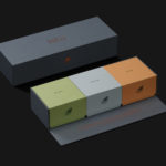
With a desire to better articulate the “energy and vision” of the school, and to help them better differentiate themselves, foster emotions and reflect their role in producing the filmmakers of the future, Den Norske Filmskolen worked with Scandinavian graphic design studio Neue to develop a new graphic identity that would work onscreen and in print. This links a variety of assets that include posters, banners, tote bag and website.
There are plenty of graphic identities, within film and photography, that utilises some form of framing device. Much like film, it is a universal and intelligible tool and connection to the visual arts. Many graphic identities within the field of the visual arts follow a familiar path, borrowing the in-camera frames of film production, the viewfinders of still cameras or the faux-frames that are used in film and TV.
The framing device offers a basic universal unit to quickly establish a sense of context, and often paired with something more distinctive, be that through additional form language, the combination of type, colour or use of implied or literal motion.
Neue’s work for The Norwegian Film School plays with a similar device, yet finds something fresh in cropping and reduction rather than adding and framing. It creates a similar effect, expressing the controlled view point of the director, select pieces of information, combined to tell a larger and evolving story. This is the fundamental idea behind Den Norske Filmskolen’s new graphic identity, and built out into changing patterns. It is concise in its intention and intelligible in its execution, drawing a new and unexpected visual expression from a universal and familiar idea.
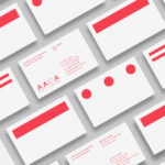
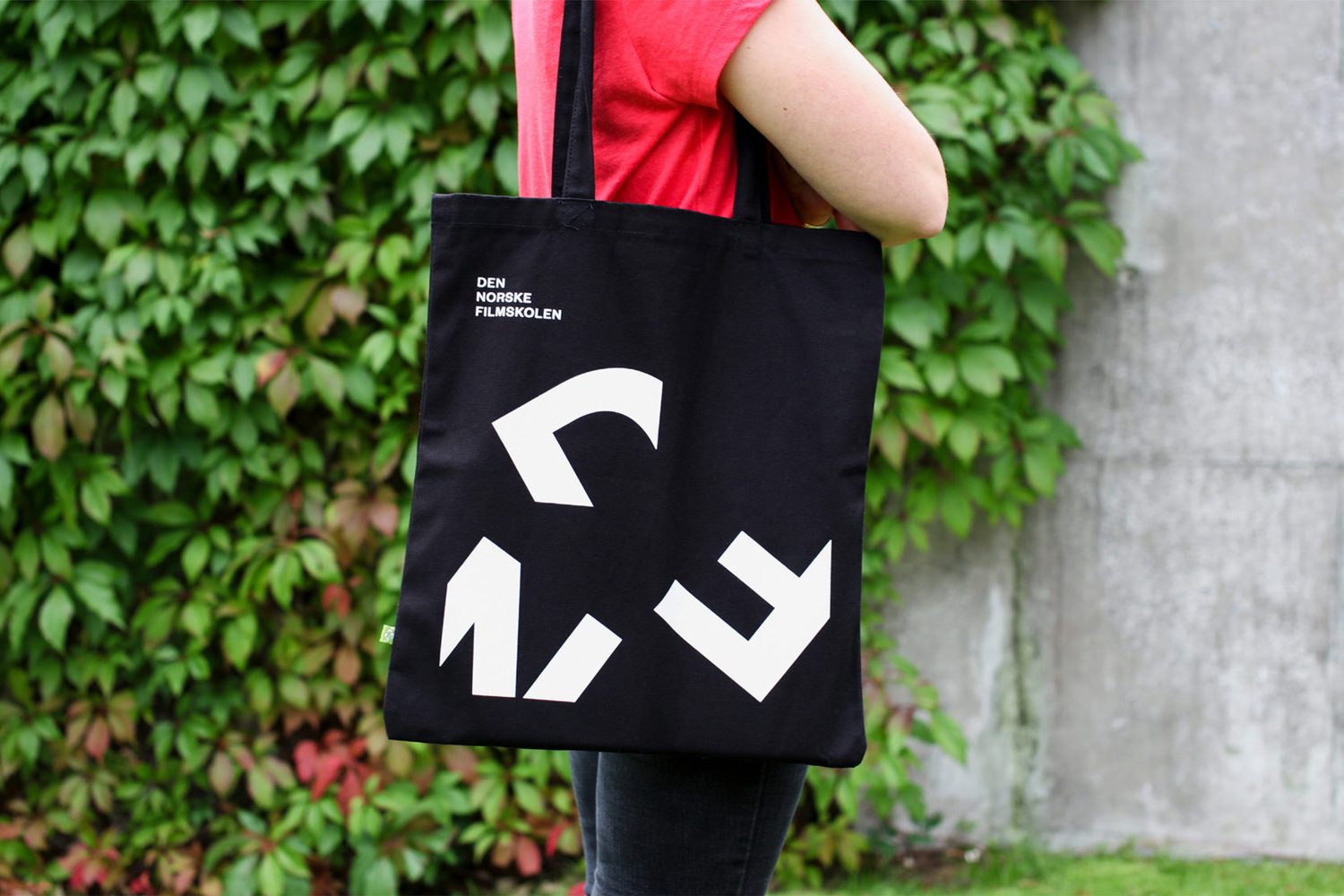
A kaleidoscope of letters makes for a distinct image, both static in print and in motion on screen. This works as a simple motif on tote bags or as a larger pattern across banners, and over solid blocks of colour or across the detail of photography.
Through arrangement, motion and the different cropping of letters, Neue articulate the dynamism and change that is inherent to both film and educational environments. It finds a neat balance between a sense of sequential stills in print and motion on screen. There are some neat little details. These include the response logo online, changing as you scroll, the choice of colour and contrasting type.


There is an interesting approach to colour palette. Red Green Blue, much like the cropping of type, is again rooted in image making and basic formats. This is emphasised further in the use of solid blocks of colour, yet avoids the blunt by not using the three together within a single context. Type plays with film’s ongoing legacy, past and present, the traditional and the modern in the pairing of a serif and sans-serif. The Italic is a nice touch capturing, typographically, some of the energy of graphic image and on screen animation.
The work succeeds in its conceptual intelligibility. It is universal in the visual language it employs, well-suited to the inclusivity and accessibility of modern eduction, but still finds a distinctive graphic identity in the union of these ideas. More from Neue on BP&O.
Design: Neue. Animation: Jørgen Håland. Opinion: Richard Baird. Fonts: GZA.


What do you think of Neue’s graphic identity for Den Norske Filmskolen? Share your thoughts in the comment section below or get the conversation started on Twitter. Never want to miss a post? Sign up to BP&O’s once-weekly newsletter here.