Abodo by Richards Partners
Opinion by Richard Baird Posted 7 December 2017
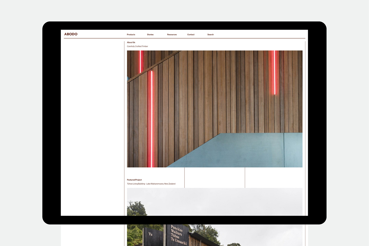
Abodo is a New Zealand-based timber specialist producing high performance and carefully crafted materials for architectural and structural contexts, and has a catalogue of cladding, decking, screening and timber panelling. Abodo worked with Richards Partners to better articulate its brand story, bring clarity to and emphasise the company’s respect for timber; where it comes from, where it is used and by whom, while also clearly communicating its ambition to architects and designers around the world through catalogue and website design.
There is an interesting strategic component to Richards Partners’ work for Abodo. The studio acknowledges the strengths of two distinct formats and moderates content accordingly. Although website and catalogue share content and an element of visual continuity, they have clearly defined experiences and audiences in mind.
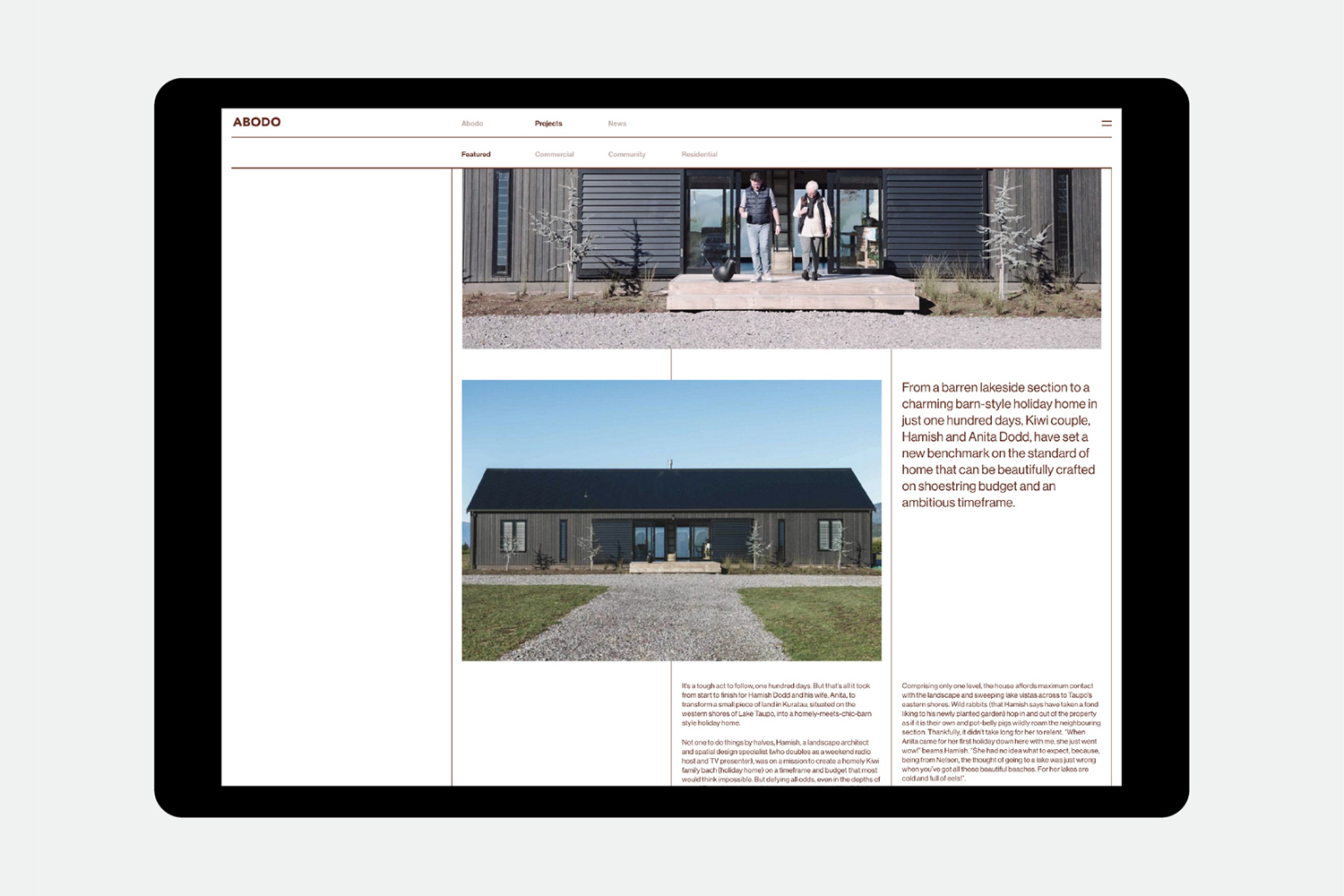
Catalogue recognises the typically linear structure and material expense of bound paper, responding through generous layouts and a predominately tactile rather than solely graphic expression across the cover. Online, website functions more as a direct sales tool and technical utility. The stories of the book, within the context of the website, take on the role of case studies, rather than strung together to form a narrative.
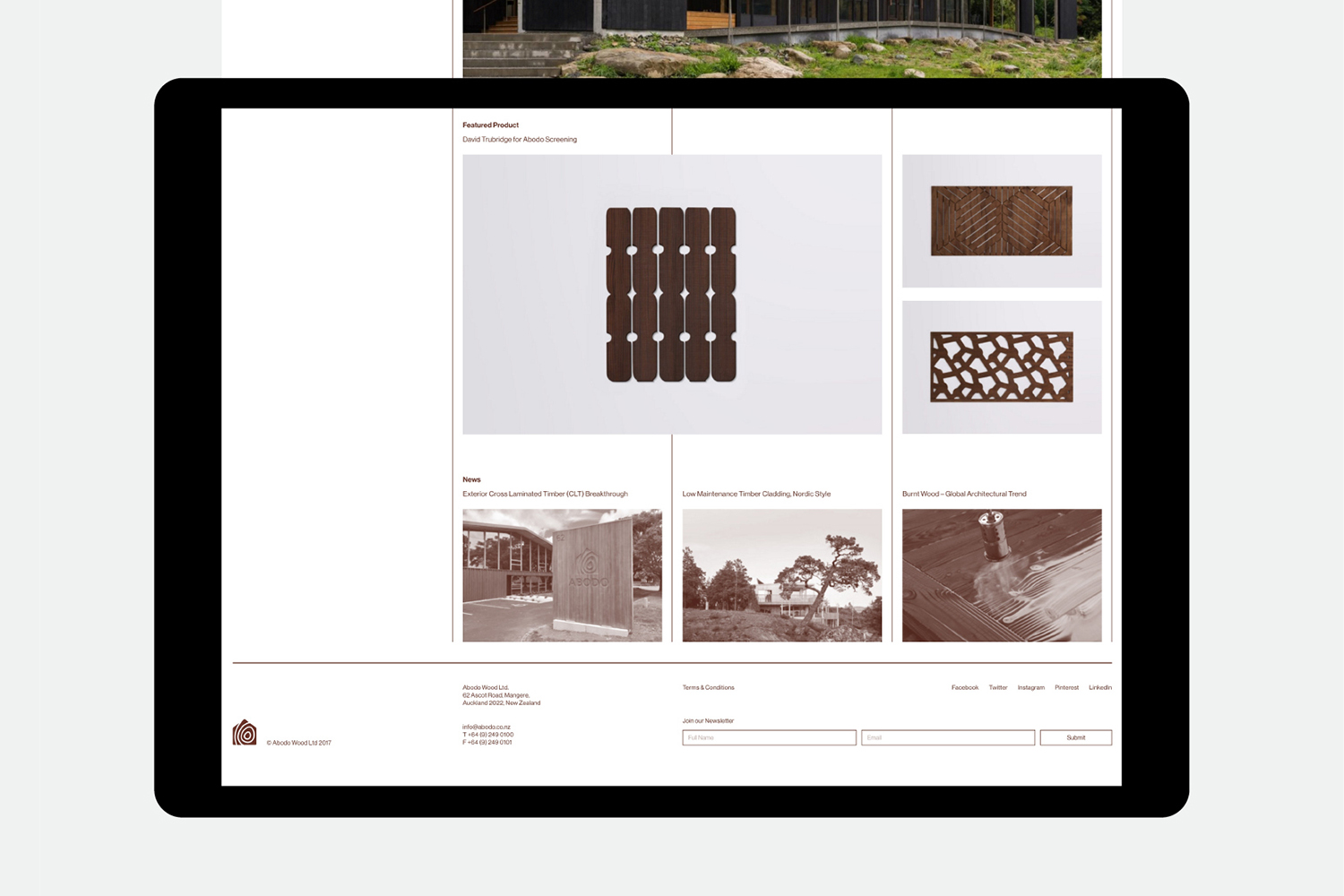
Where catalogue is an intentional slow reading experience, pace and order is managed, website is efficient and non-linear. It provides a quick and seamless transition between information, a clear hierarchy that begins with an overview and provides increasingly granular insight when required.
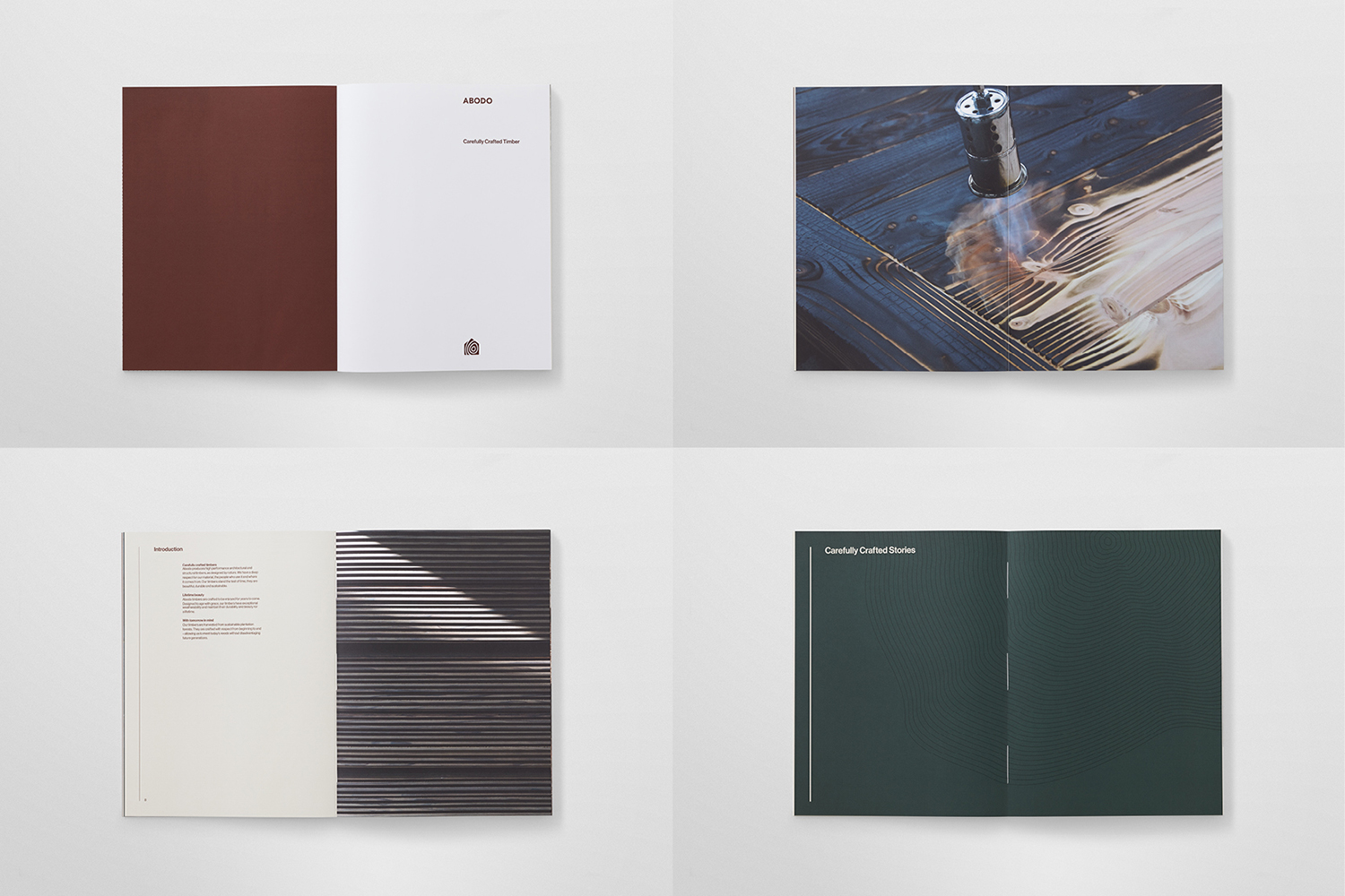
The catalogue blends an initial material impact with a contextual richness, explored through the emotive qualities of art directed image and considered text, alongside the technical insight of line drawings and numerical detail. Their arrangement, and the resulting pace set, is very much about honouring every aspect of product, its origins, its crafting and its use.
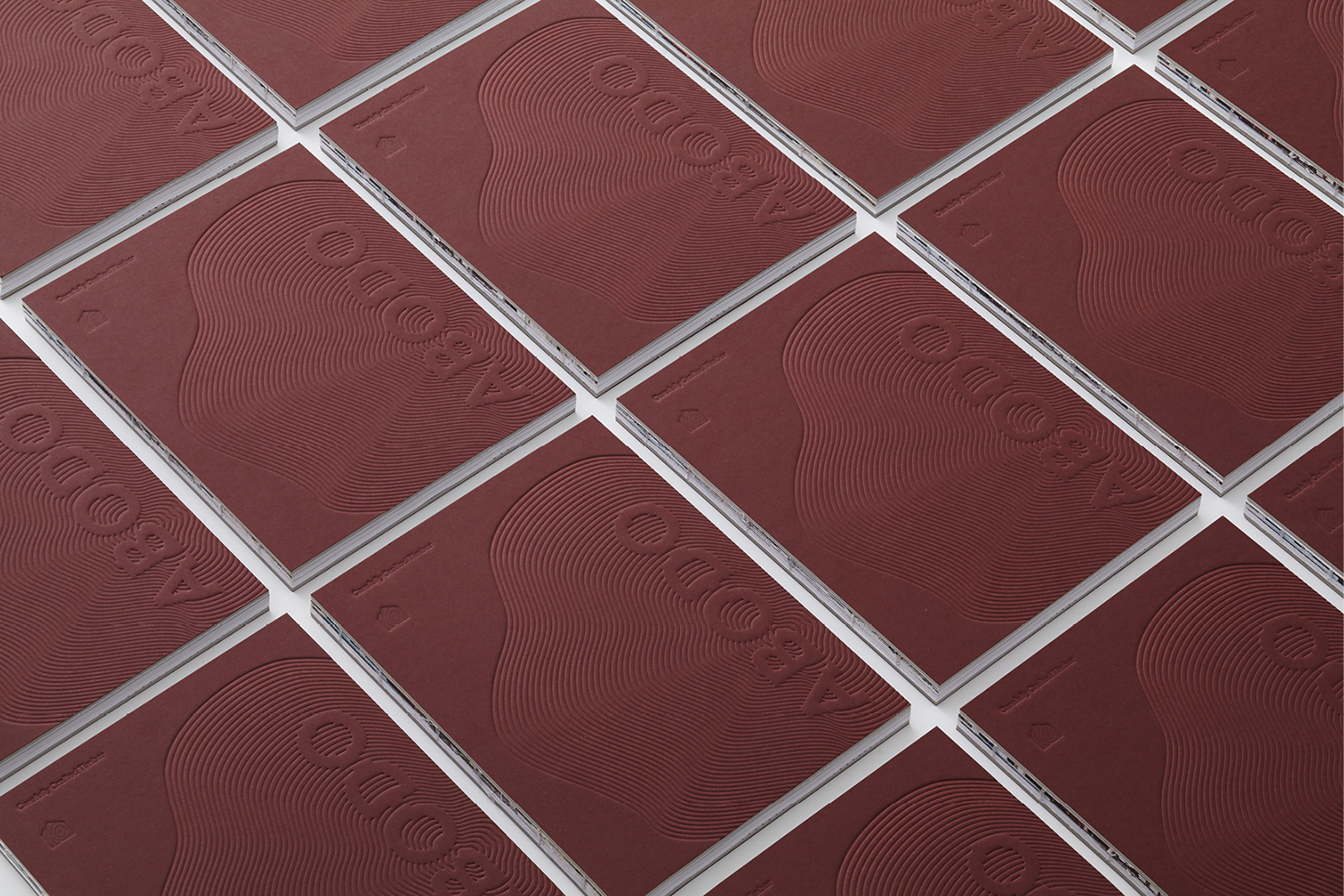
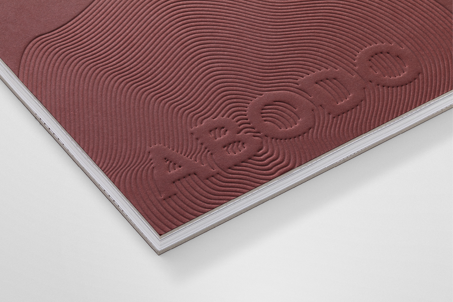
The blind embossed cover, its weight, colour and surface texture is immediate in its associations, calling to mind to the origins of product, the organic rings of a tree. As a cover, the very first thing you see and the entry into a story, this feels rather fitting, but also hints at the material craft at the heart of what Abodo does, expressed through design craft.
Although this is compelling, there are a bunch of other neat details throughout that expand on this initial impression. In particular, the open spine, the exposed stitching and the revealing of layers of paper, much like the growth rings of a tree. This material connection, the exposing of construction, feels grounded in and leverages the international non-verbal language of the architectural industry Abodo collaborates with.
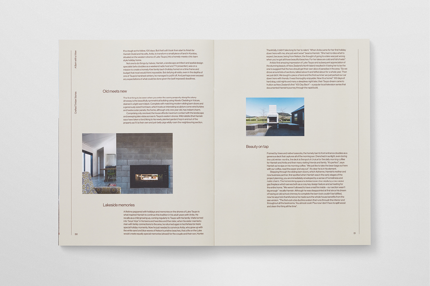
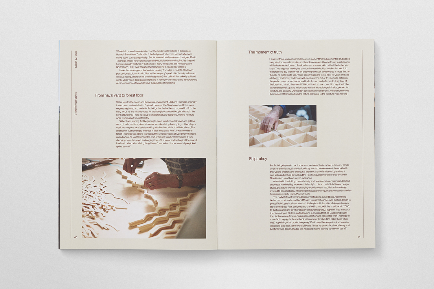
Inside the brochure there is a pleasant interplay between image and text, which makes the most of the printed format. Typesetting, arrangement of text on the page and the use of brown call to mind the texture and horizontal qualities of trees, which are then punctuated by architectural images, their end use. It is an interesting and thoughtful mix of the implied and the literal, origin and outcome.
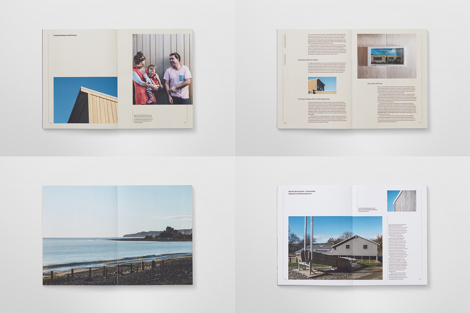
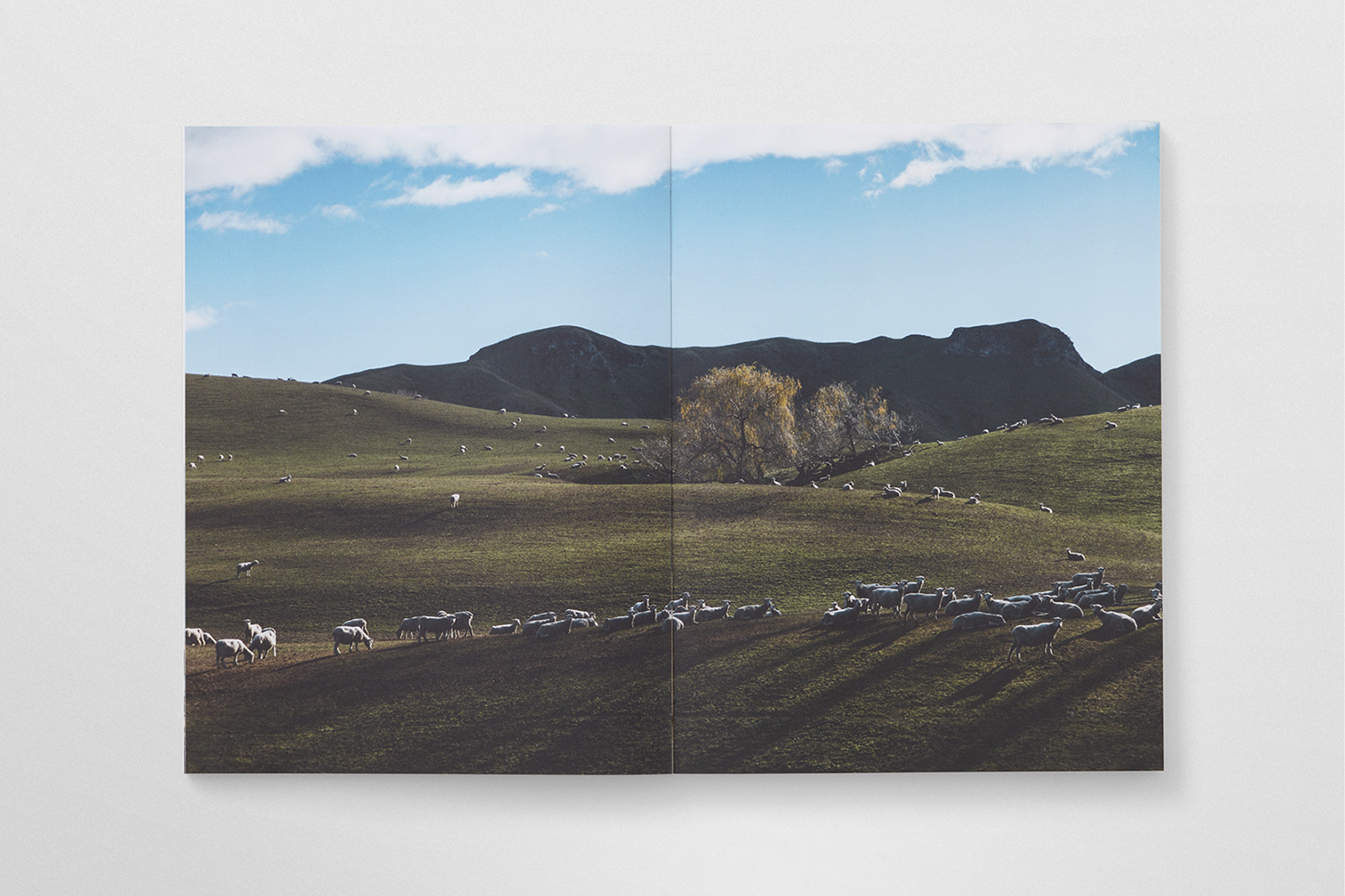
Images, in print and online, effectively tell a visual story, making connections between the beginning and end of production, the natural and built environment, structure and inhabitants. There is also a intelligent mix of large panels of small detail, and smaller images of partial and complete structures, a tool frequently used in architectural publications.
Absent the material impact of brochure, website favours the utility of an archive and database in the use of lines, grids and simple and quick transitions, technical insight and case studies, while colour introduces a touch of natural warmth. In line with a context sensitivity, the website features a timeliness of a news section and the usefulness of search.
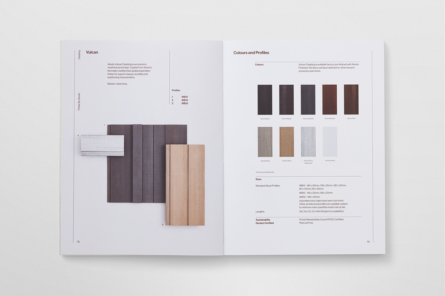
The result is graphically, materially and strategically interesting. Content is varied, moving from the personable to the technical, from the emotive to the pragmatic. Although this is the same across brochure and website, it feels appropriately moderated, implemented in a way that suits context and segments audience. It offers different ways to engage with the company. Brochure generates an initial impact, and has a material beauty. It tells a story and functions as a curated introduction. Website, in contrast, is efficient and immediate in its intentions. More work by Richards Partners on BP&O.
Design: Richards Partners. Opinion: Richard Baird.
