London School of Hygiene & Tropical Medicine by Spy
Opinion by Richard Baird Posted 5 February 2018
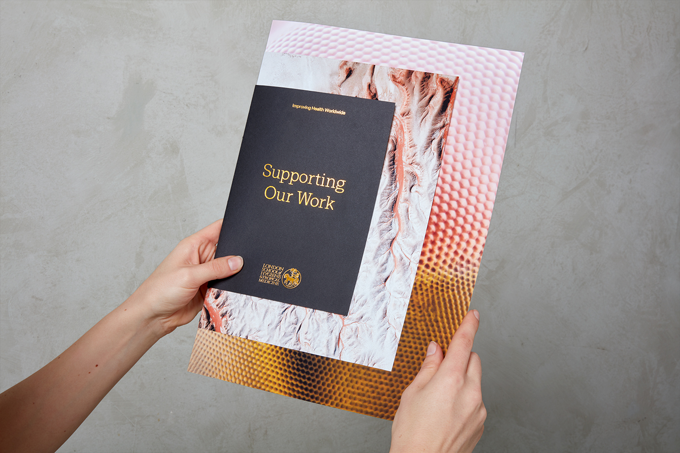
The London School of Hygiene & Tropical Medicine (LSHTM) was founded in 1899 and has established itself as a world leader in the fields of research and postgraduate education in public and global health. The university is made up of more than 4,000 students and 1,000 staff across 100 countries, and is one of the highest-rated research institutions in the United Kingdom.
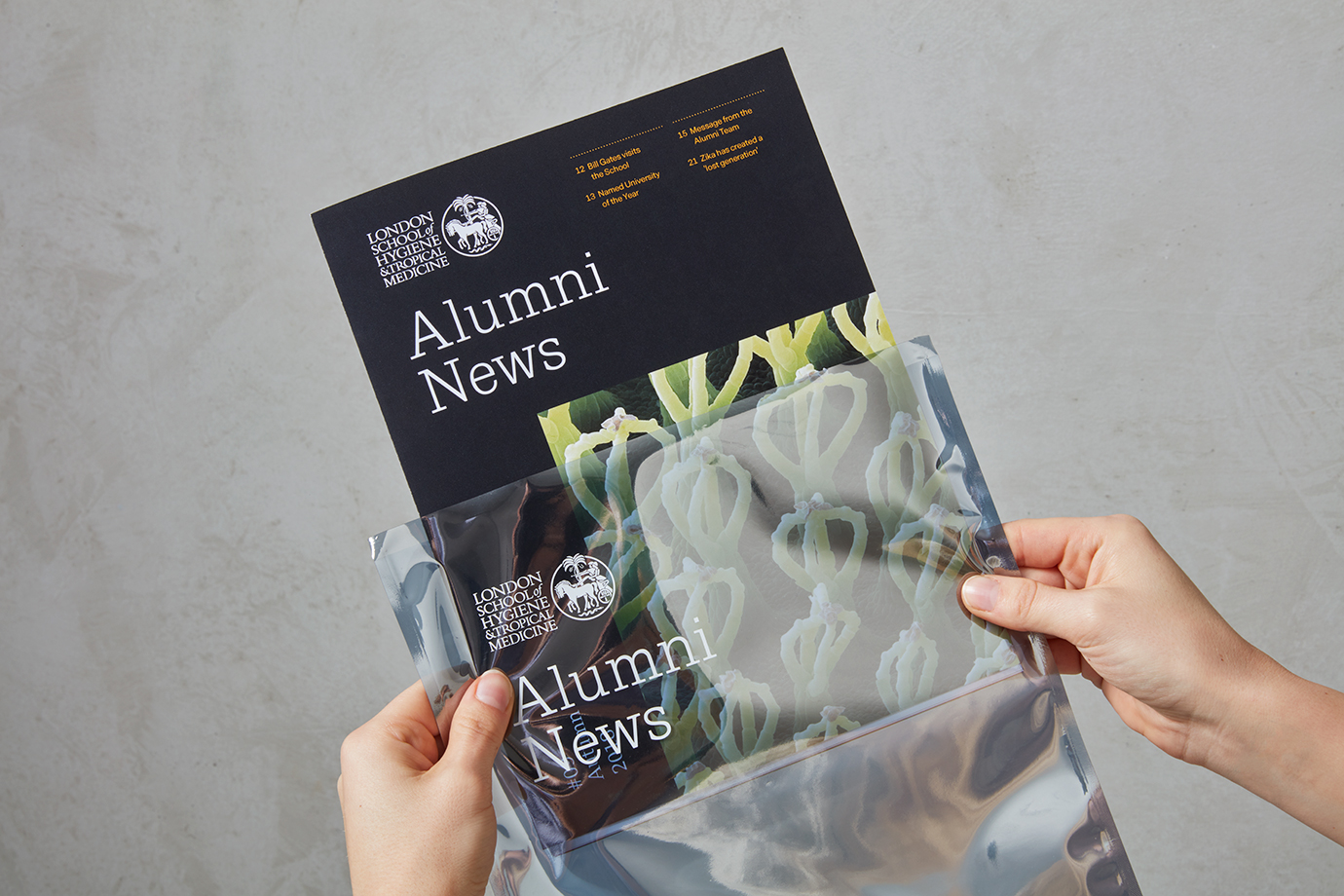
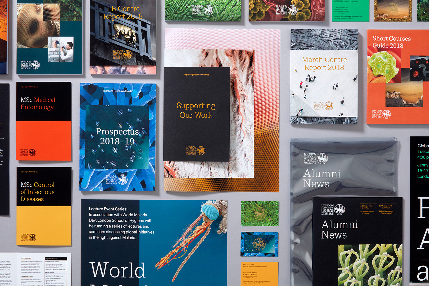
With a need to articulate a broad offering across both education and research, in a more relevant and engaging way, and a desire to become the first choice for research partners and prospective students amongst increasing competition, LSHTM worked with Spy to develop a new graphic identity that would link a wealth of printed assets. These included, reports, brochures and prospectuses, business cards, flyers and posters.
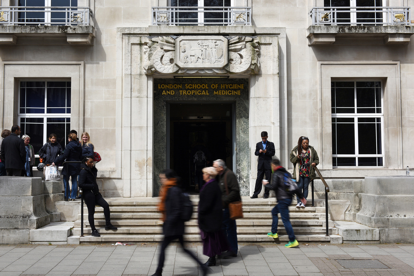

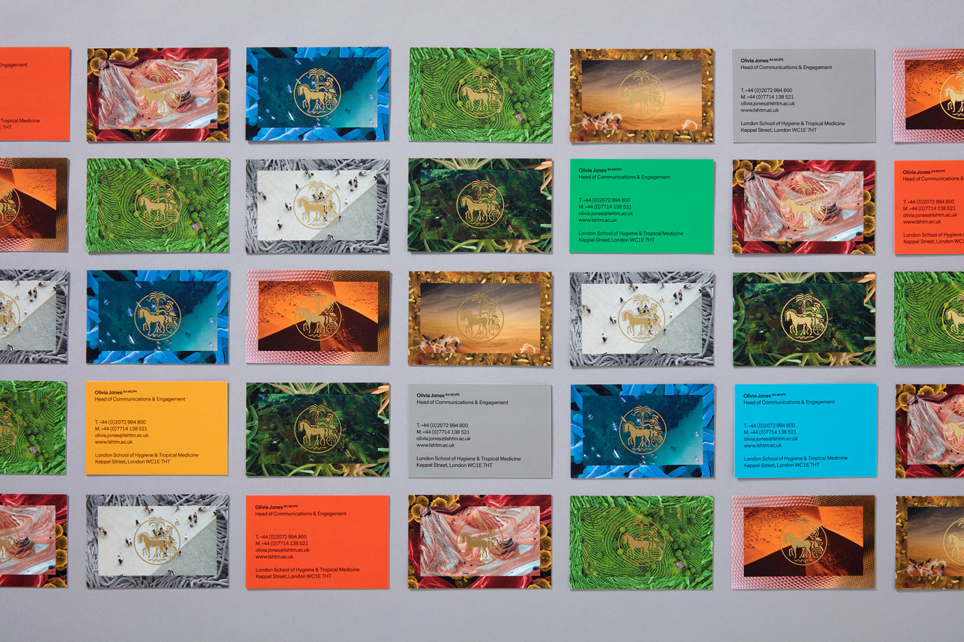
Whilst retaining logotype and symbol, Spy developed a concept and visual expression that articulates LSHTM’s ongoing exploration of the world around us in both macro and micro scales, their capacity to solve a variety of problems from many perspectives, and their desire to ‘Improving health worldwide’ through the intersection and juxtaposition of image.
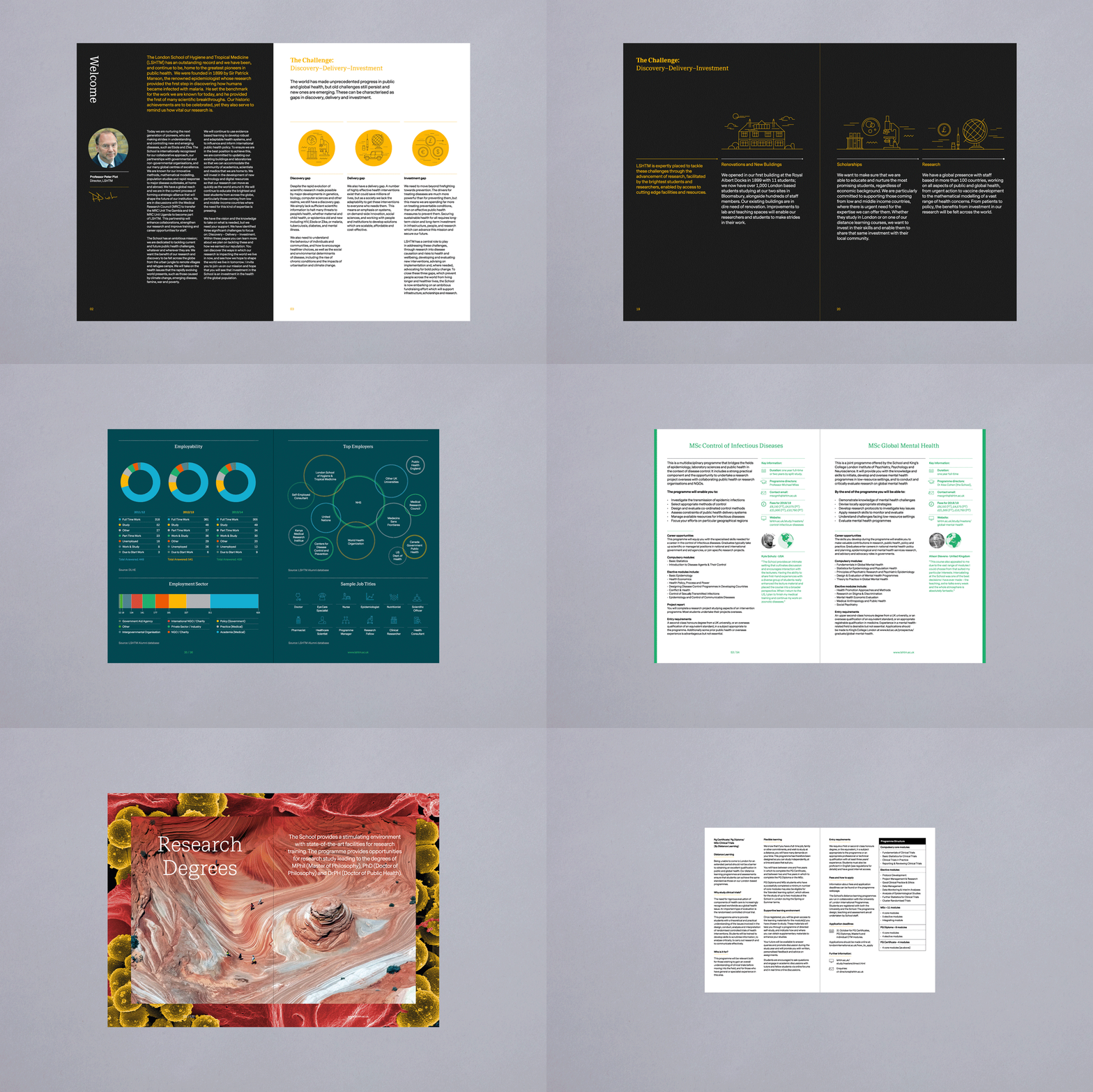
Spy’s direction is notable, not only for the relevance and intrigue of its concept, but the extent and sensitivity of its implementation, with photography running across and throughout much of LSHTM’s print communication, from the small canvas of business cards to the large pages of support document. This sense of big and small is a recurring theme in image, so to see this consistently applied to tiny and oversized material formats is satisfying.
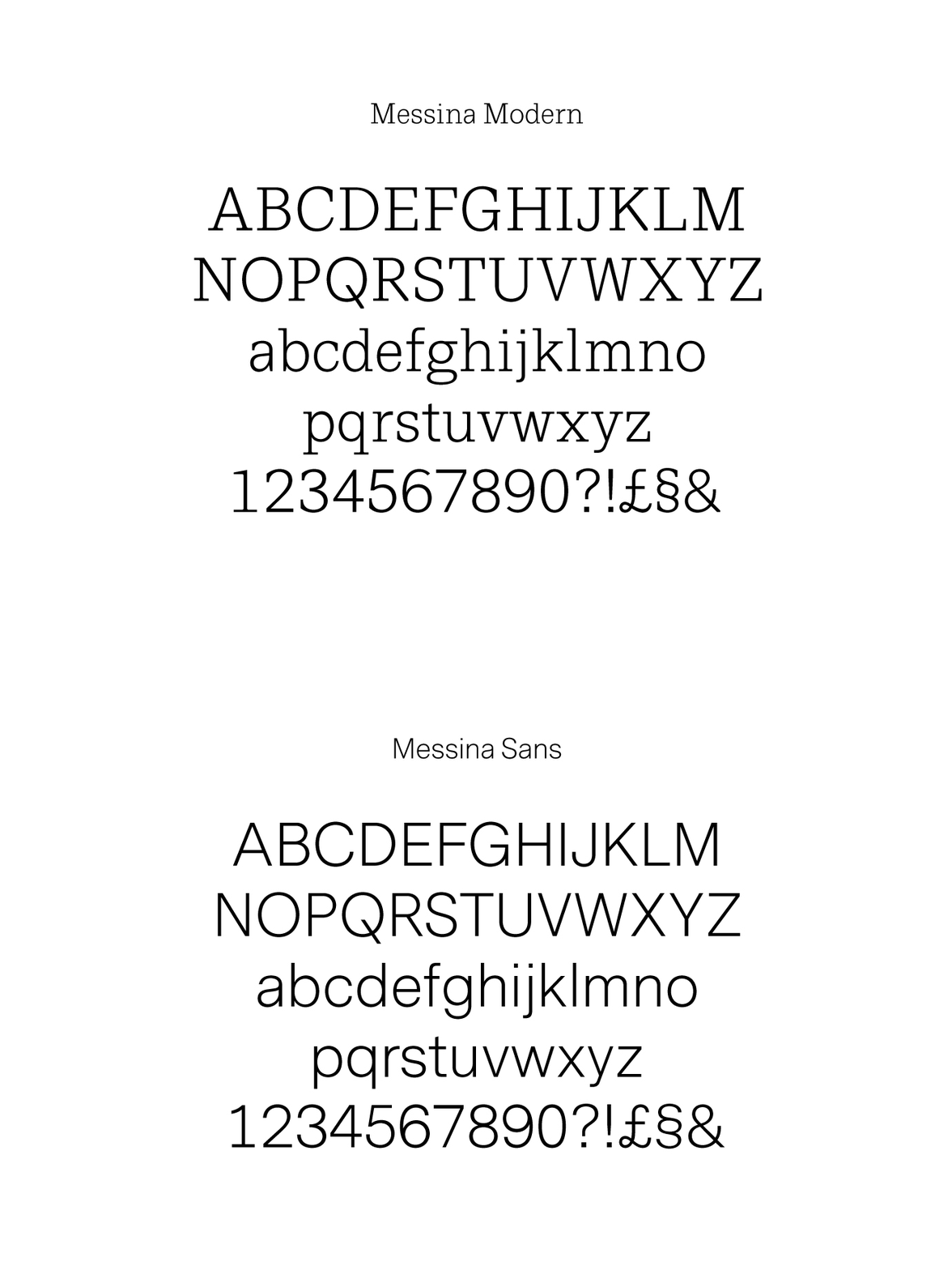
Idea and its deployment serves to link communications in a distinctive and systematised way, beyond just conventional identity assets, and finds a balance between immediate visual impact and detail up close, a simple aesthetic pleasure and a conceptual intelligibility. This continues through to the pairing of Messina Modern and Messina Sans, which plays with the detailed and the simplified, with the former employed as large headings, while the latter, as small body copy.
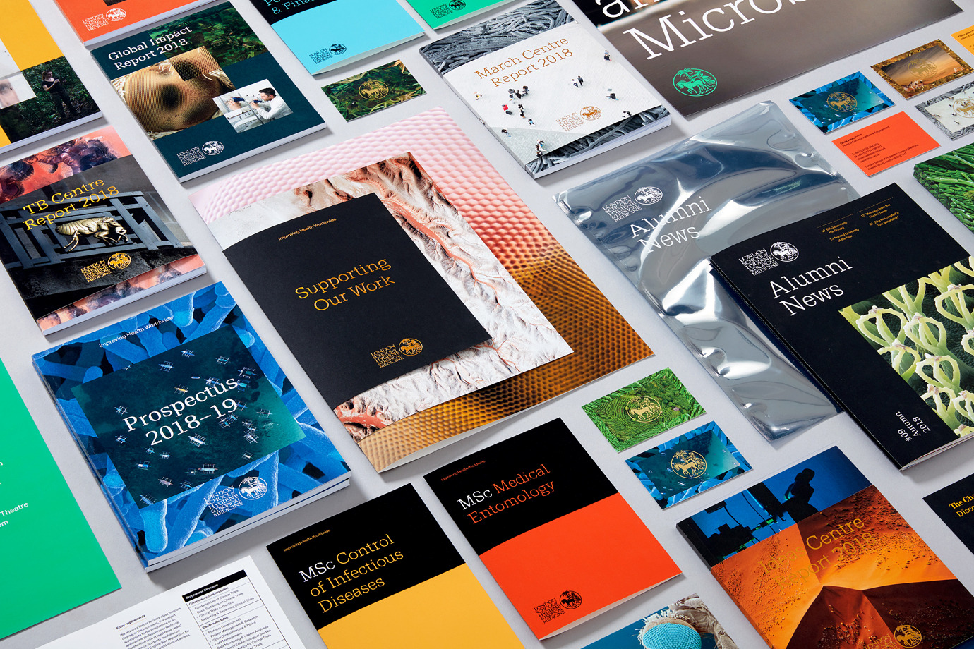
There is a neat mix of correlation and contrast throughout, in colour, form and proportion. This is deployed in a few different ways. In the composition of photography across covers, in the intersection of sleeve and book, and in the layering and different sizing of papers. This material component, and contextual sensitivity, lends the project a variety and a clear continuity.
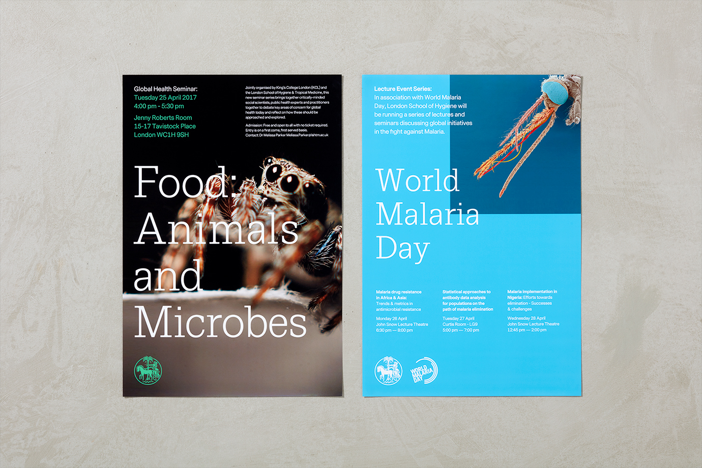
The detail intrinsic to much of the imagery is elevated by moments of solid bright colour. Periods of significant and immediate contrast—times at which temperature is evoked through colour, for example—and instances in which the correlation between two images is, at least initially, imperceptible, only to be illuminated on closer inspection.
The quality of the work lies in the potential for the endless juxtaposition, and a vast communicative possibility in the connection made between the macro and micro, disparate lands and peoples.
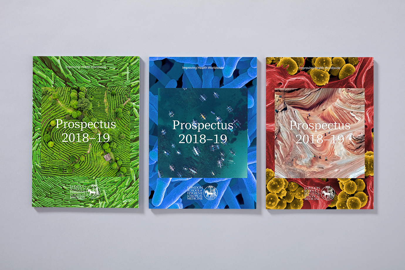
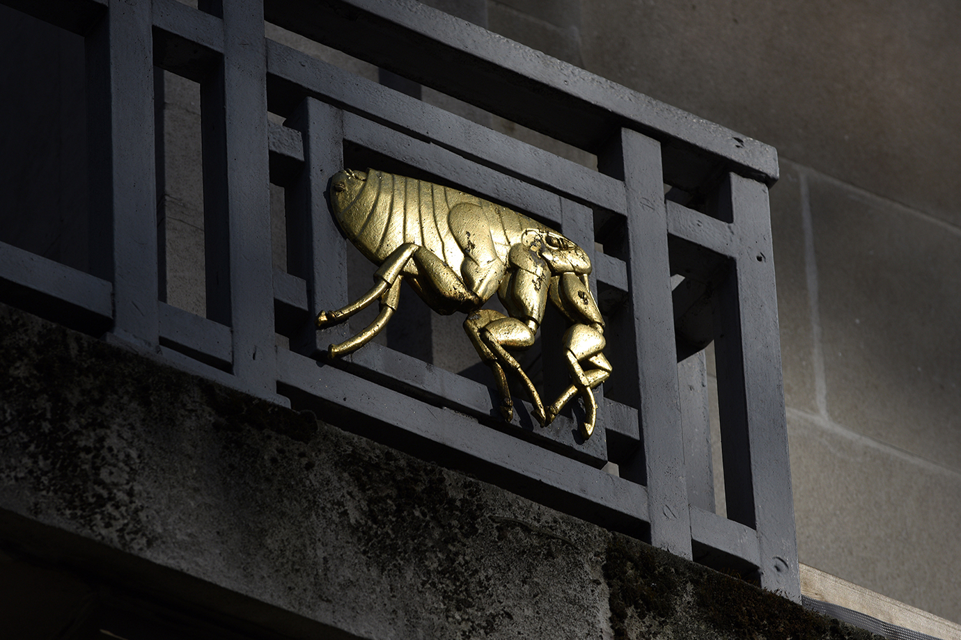
Spy play with contrast and commonality to elevate content beyond its initial visual intrigue. It serves to explore connections between different systems, places and people. It subverts expectation by placing the macro within the micro, when you might expect it to be the other way around. The gold foiling of the university’s symbol drops in a literal legacy element, yet its internal space and placement over image unites two disparate elements, and ties in with concept. This is also evident in the mixing of bright modern spot colour, and images with more natural hues.
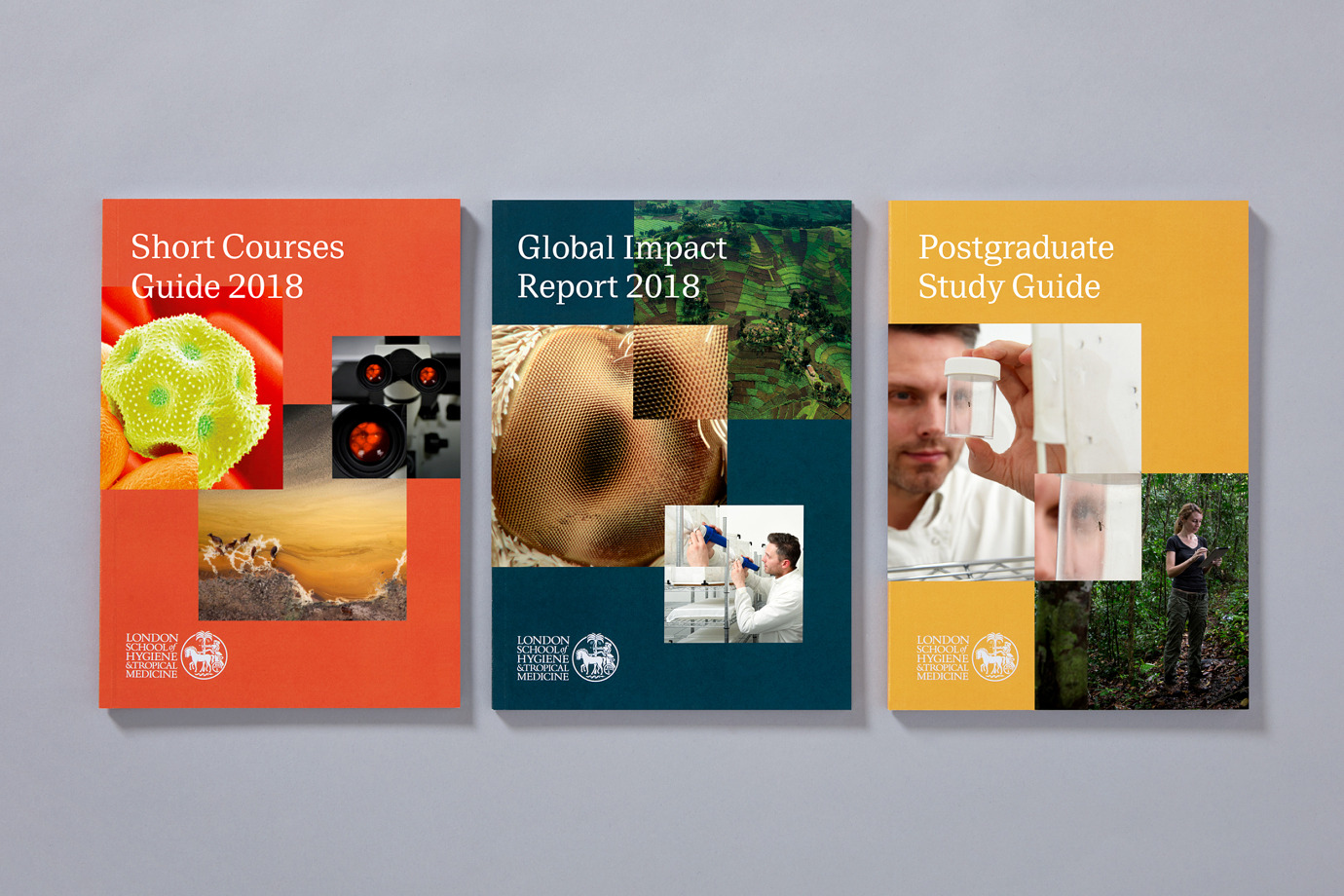
There are the occasional deviations, as above and below. These feel far more conventional, yet, provide further breadth and an immediacy in the use of more literal or singular image, areas of solid colour and space, and in conjunction with type contrast, in size and detail.

It really begins to display some breadth in the composition of the “Supporting Our Work” document, in which paper size and proportionality play with scale in an unexpected way, particularly for an educational and research body. Not only does it deliver on contrast in colour and visual texture, but also has a metaphorical quality, the cramming of a big and complex world into a small and simplified communication document (and struggling). The visual and material language used is a real highlight, and feels like this has been given particular care in the choice of images, both of which feel very modern in the pattern and colour, and in the contrast of a more formal blue and an element of commonality in the gold block foiling. This material language in developed in the use of clear plastic bags, screen printed, that evoke a sense of laboratory sterility, particularly in conjunction with imagery.

A critical component of the work is the need to communicate with research partners and prospective students, quite different groups, in an increasingly competitive market. Finding a balance between visual intrigue and a meaningful connection to the fields of research and study is essential. Spy satisfy this by using a clear and relatable visual language and a simple framework. It does rely on an a sensitivity to commonality and contrast but not difficult to deploy in a technical sense. More work by Spy on BP&O.
Design: Spy. Opinion: Richard Baird. Fonts Used: Messina Modern & Messina Sans.
