BBC Creative by Spin
Opinion by Richard Baird Posted 20 February 2018
With the intention of being the most creative organisation in the world the BBC has developed its own in-house agency, BBC Creative, to develop cross-platform marketing materials such as trails and idents to engage with a global audience and bring to their attention the vast range of BBC programmes and services available. To express this unified vision and creative potential, BBC Creative worked with London based studio Spin to develop their graphic identity. Drawing on the iconic three blocks associated with the BBC, Spin introduce a fourth, a creative box and abstract C as a way to form a critical and essential relationship between the BBC and creative thinking in a concise and dynamic manner. This is deployed as small details across mugs and tote bags all the way up to supergraphics.
The concept is simple and intelligible yet with a wealth of expressive potential. There is, in its entirety, a narrative component, beginning with the more conventional box structures and evolving into ribbons, the sculptural and the architectural. Thinking outside of the box is an enduring metaphor. Spin takes this a step further, reshaping the box, exploring it inside and out, through it and around it. The box and the C are essentially anchors, starting points for more abstract and distinct interpretations. On occasion, the motif significantly break from these two foundational components yet remain clearly tied to the system through form language, colour and implementation.
There are some neat variations. These move between the material–occasionally looking like literal boxes with creases and folds–and times where they are entirely and obviously digital in their nature–with edges, faces and vertices that would not make much sense in the physical world. Lines knocked out of solid blocks of colour, wireframes and line shading all help to introduce a visual breadth.

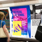
Supergraphics work well to unify space with plenty of variety, although it is difficult to get a sense of whether these also serve to sub-divide space and inform of a transition between these.
The concept offers an endless visual language and a clear continuity, one with a playful and explorative quality well-suited to a creative division that works in both static and dynamic forms, scaled down on to a mug or up as a supergraphic. Individually, the forms exist somewhere between the simple and familiar and the complex and distinct. Collectively, there is a sequential quality, an articulation of change, of flexibility and dynamism. More work by Spin on BP&O.
Design: Spin. Opinion: Richard Baird.