Next To The Ocean by Lundgren+Lindqvist
Opinion by Richard Baird Posted 21 August 2018

Valand Academy in Sweden offers a complete range of undergraduate, postgraduate and artistic research opportunities. This is a unique educational environment, the only one of its kind in Sweden. Next to the Ocean is an exhibition of works created by 23 of the students from the BFA, MFA and research programmes, which was held at Röda Sten Konsthall in Gothenburg.
The exhibition serves two purposes. The micro; a look at the individual interests and concerns of those on Valand Academy’s photography programme, and the meta; an intention to position this a representation and overview of what is happening in young contemporary photography in Sweden today. To express this proposition The Valand Academy approached Scandinavian design studio Lundgren+Lindqvist to develop the visual identity and catalogue for the exhibition. This is characterised by an immediacy of form language and a material appeal, and a conceptual subtlety in the relationship and direction of essay and image.

There are two essential gestures to the work. An initial, strong and unifying graphic impact; the collective, and the nuanced, idiosyncratic and conceptual photographic work; the individual. This is brought together within the catalogue, and by extension, the visual identity of the exhibition, and augmented by essay and through an online portal of words and images drawn from the exhibition.


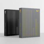
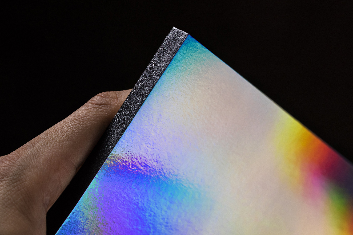
Covers are striking and immediate in their aesthetic appeal and intelligible in their visual language; an intersection of holographic film that diffracts white light into a rainbow of colour and 350 arrow variations to create unique catalogue covers.
This neatly balances the optical science of photography, distilling it down to its most abstract but materially and dynamically satisfying and unifying, and the theme of direction, building on the title of the exhibition which points out the location of the exhibition venue.
In the continuity and universality of the arrow, yet its individual and unrepeated styling, the visual language of distinct perspectives but a shared forward momentum emerges. Further, although each student has a unique point of view and their own intention, they are both consciously and subconsciously informed by the movements within the field at large. The arrows as a collective gesture stacked capture this suggestion whilst also demanding the attention of visitors and direct focus.
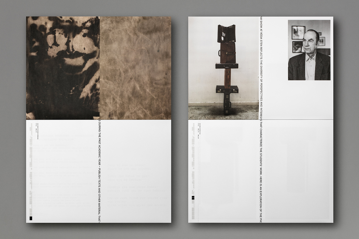
The catalogue balances a strong graphic expression with a texture, volume, weight and large format that itself demands attention as a large image (in content, composition and colour) may in a gallery setting. Small details like the binding, a black glue with an almost sand grain-like texture is a satisfying finish, particularly in reference to the ocean. It pushes the unifying visual language, a solid and consistent surface. As such, the catalogue becomes an object of specific expression itself, like a sculpture.

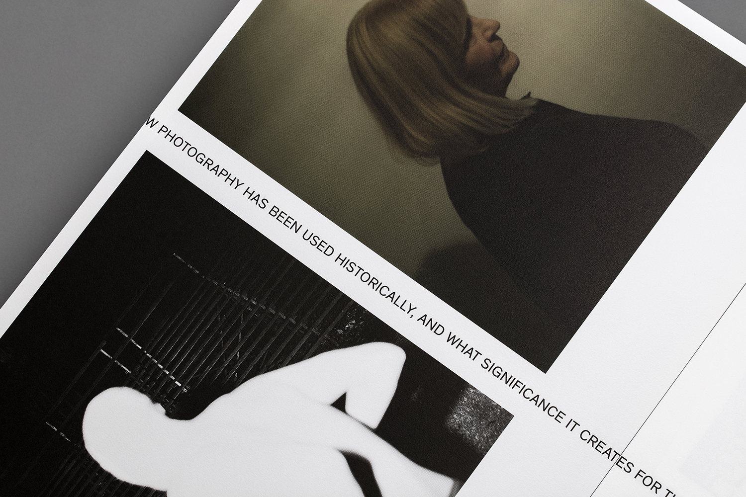
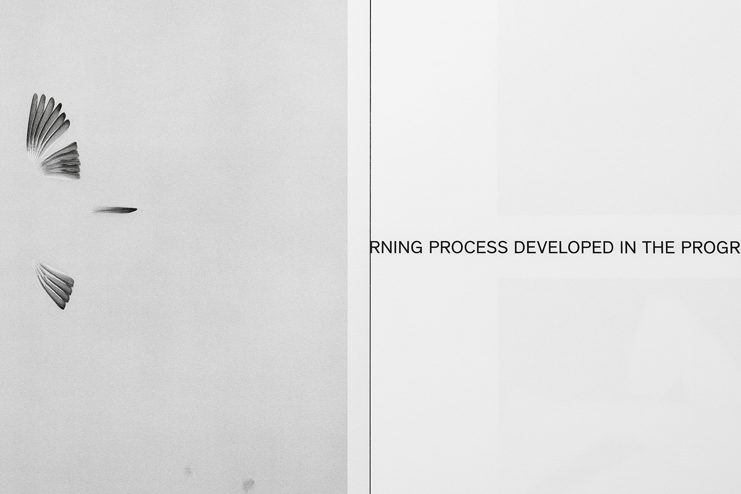
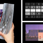
Inside, the catalogue offers something quite different to the graphic immediacy of the cover. It employs a conceptual nuance and subtlety in the arrangement of image and words, in the way that it can be engaged with bi-directionally. An essay by Östlind runs as a single line throughout the catalogue, creating what Lundgren+lindqvist describe as a fictional gutter, serving to divide and structure content. The way it runs off the edge of the page, the placement and proportion of images around this centre line, infuse this with a temporal quality, text caught and cut as it moves through the press. This back and forth, the motion, also manifests itself online in interaction, in the independent scrolls of two columns and in the continuity of the arrows.

The images are displayed in the opposite orientation to the text, building on the theme of direction. Text becomes a tool to aid the format and arrangement of image but not competing with these. This is complemented by an index that intends to hint at the technical side of photography, guiding the reader through the publication, tying work to titles to authors.
Lundgren+Lindqvist’s work for the exhibition effectively balances the eye-catching and materially substantial with the more visceral, cerebral and conceptual. It serves to unify diverse works under a single forward outlook and the dynamics of industry influence and diffusion of ideas, but also the desire to say something new, something personal and individual. More work by Lundgren+Lindqvist on BP&O.
Design: Lundgren+Lindqvist. Opinion: Richard Baird. Fonts Used: Theinhardt.