Migrant Journal by Offshore Studio
Opinion by Richard Baird Posted 26 September 2018

Migrant Journal is a six-part exploration of migration in all its forms. Indeed, it covers the very current and pressing political and socio-cultural implications of the migration of people fleeing from persecution, seeking better economic opportunities or under pressure from shifting environmental conditions, yet it also touches upon the more abstract movement of objects and ideas around the globe. Migrant Journal, in its breadth but continuity of theme, intends to reclaim the word migration, to make a break from the prejudices and clichés of migrants and migration.
This is a hands-on review. Migrant Journal began as a Kickstarter project, is edited by Justinien Tribillon, Michaela Büsse and Dámaso Randulfe, co-edited and designed by Isabel Seiffert and Christoph Miler of Offshore Studio.

Migrant Journal is a curious project. The initial impression is one of material seduction and graphic provocation. The visual and material language employed could be described as indulgent, its design in opposition to its title and theme, a cynical aestheticisation and exploitation of a troubling issue and leveraging of prejudicial word association. Its price point struggles to moderate this, placing itself at the heart of a neo-liberal bubble at 20EUR. However, its specificity, its mix of dyed and embossed cover, metallic inks, idiosyncratic custom type and abstract lines alongside the illustrative, works incredibly well to tether the journal to a very specific time, and seek out a particular audience. This is Something Offshore Studio is clearly sensitive too. That is not to say that it ignores the past; events that led up to, impact on and supersede the present, quite the contrary, only that these are viewed from the here and now. In many ways Migrant Journal is a review, a review that can be, itself, reviewed.


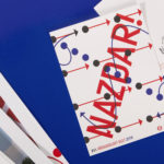
Cover is loaded, politically, materially and graphically. It demands to be shown and shared, yet borders on an uncomfortable virtue signalling in its bold short form MIGRANT title. The tension between the two, name and physical form is essential to understanding the journal, its intention to reclaim the word MIGRANT and bring to light the migrating efforts of the journal itself. Visual and material seduction is an essential component of this, the potential to reach more people outside of those accustomed to buying academic journals and reading long-form texts unillustrated, absent an emotional and stylistic component.
The journal imposes itself within the context of a retail space in its proportion, colours, graphic language and materiality. These convey the breadth in which the subject is tackled. Logotype and lines clearly imply flow, architecture and the demarcation and threshold of space, illustration on the reverse forms a dialogue with the front, working in the implication of individual insight, experience, expression and viewpoint. The meta and the micro essentially form a framework, a metaphorical space in which to explore the theme of migration, but also, literally presented across the front and back covers, creates a physical space of page in which to hold ideas. These are delivered through the texts and numerical data of academics (given a compelling stylistic dimension), the personal experiences of photographers and individual responses by artists.

The metallic spot colours function well to unify disparate imagery from different sources and skillsets, to connect the graphic with the photographic, the micro and the macro, the impressionist and the impartial. There is a seduction at play in the totality of the spot colour coverage, the impression it gives when quickly flicking through in a retail situation. It is rare to see metallics used so completely, cover to cover, and in its rarity and expense within the context of themes such as inequality, oppression, conflict, poverty and demarcation the choice feels provocative, it asks a question of the reader. What do you value?

Interior layouts are very much in keeping with the architectural journals of the past. For those not accustomed to this, it is going to look edgy. Architects familiar with OASE and other architectural journals may see something familiar here in the slim margins, inset text instead of paragraph breaks. Also check Real Review and Mies In London. Again, and alongside the use of lines, this is very much about demarcating space and the flow of information across the surface of the page and the overall architecture of the book.
The notion of paratext comes to mind in the relationship between text and space, image and text, image to be read or an emotion to be felt. The Typeface’s curious angles capture something of the graphic design zeitgeist but is neatly tied to boundaries, of strict lines applied to the organic surface of the world. Again, there is a provocation here, it is harder to read, but is committed to its ideation, to its worldview, to that line between written idea, stylistic expression and visual language. This is where its desired audience is revealed. The graphic designer, the architect and the spatial planners.
Time is a critical component of the project. Not only in its frequency, twice yearly, but also in its existence as a total project; as a self-imposed six-issue run. Just as graphic design speaks of modes of seducing people into sharing and moving the journal around space, frequency speaks of a more considered journalistic approach, time taken to research rather than be forced into a cycle of immediacy and responsiveness. Slow journalism places it within our time, touches on a feeling and responds to sensationalism, the commodification of crises, and the need to simplify and tether complex issues to a single emotive word.

Migrant Journal; in its editorial curation, in its materiality, layout and graphic language is idiosyncratic. It is fascinating in its complete commitment to presenting itself as a product of now. But in its specificity, as a total project that proposes a worldview (a way of seeing and understanding things), as perhaps an example of Gesamtkunstwerk in its bringing together of multiple disciplines and disciplinarians, guarantees itself something of a legacy.
There are layers to the theme of migration which the text reveals and the design augments. Design never seeks to really illustrate content, but to find its own way of exploring and expressing this, to draw to light the migratory nature of the journal format, and how aestheticisation, material and graphic pleasure facilitates this migration through physical space and via digital transmission. This article is drawn into and becomes part the project of Migrant Journal. This is its beauty. Also, check out Migrant Journal No. 5 Micro Odysseys.
Design: Offshore Studio. Opinion: Richard Baird. Fonts: MigrantJournalGrotesk.