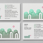
Ulju Mountain Film Festival by Studio fnt
UMFF is a film festival that takes place at the Ulju Arts Centre located in the South Korean city of Ulsan, and draws its name from the Ulju mountains to the west. Studio fnt worked with the film festival to develop a new visual identity treatment, which went on to include logotype, iconography, business cards, stationery, t-shirt design and signage, based around a contemporary...
Marco Marco by Acre
Marco Marco is an Italian restaurant business with five locations across the city-state of Singapore and an affordable menu made up of international interpretations of classic dishes. These are created from simple recipes inspired by modern food culture using fresh locally sourced ingredients. The name, a reference to the adventures of merchant traveller Marco Polo, was chosen to reflect the international meeting...
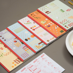
Antéoise by UMA
Antéoise is a creme dacquoise range from Anténor, a Japanese patisserie established in 1966 that creates French style cakes, cookies, tarts and variety of other confectionery. Antéoise’s brand identity and packaging treatment, developed by Osaka based graphic design studio UMA, draws on the range’s flagship positioning, high quality ingredients and the craft employed in its creation, the heritage and experience of Anténor, the streets of Kobe, and the...
Milk Lab by Studio fnt
Milk Lab is a 100% pure milk dessert, flake and roll cake restaurant located in the South Korean city of Busan. The restaurant’s visual identity, designed by Studio fnt, conveys some of the chill and smoothness of its desserts through the rounded terminals of a slab serif logotype, its container, similarly styled monolinear icons, icy photography and a milky pastel colour palette, and...

Hotel Cycle by UMA
U2 is a cyclist-friendly retail and hospitality destination, located in the Japanese city of Onomichi, made up of shops, bakeries, restaurants and hotels. Design studio UMA were recently commissioned to develop a visual identity for U2’s Hotel Cycle as part of a larger brand identity project that covered a variety of spaces, packaging and signage within the complex. UMA’S brand identity solution...
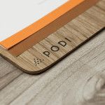
Podi by Bravo
Podi is a Singapore-based organic restaurant that ‘celebrates bold, robust and unique flavours’ and the responsible sourcing and cooking of ingredients. Drawing inspiration from the restaurant’s name, a Hindi word to describe a mixture of ground dry spices and herbs, design agency Bravo developed a visual identity that pairs a small, abstract interpretation of heaped spices with a bold logo-type, earthy tones and...
Sifang Art Museum by Foreign Policy
Sifang Art Museum is a gallery and creative space located in the Pukou region of Nanjing, China dedicated to art, architecture and international collaboration. Their visual identity, a bilingual logo-type set across a collateral of unusual trapezoidal cut detail and monochromatic colour palette—developed by Singapore-based creative and strategic design agency Foreign Policy—draws together the themes of architectural space, the dimensionality created by light and shadow,...

Multicourse by Bravo
Multicourse is a provider of F&B service training for catering staff developed by industry experts and operates across Singapore. Their identity, developed by independent design agency Bravo (also based in Singapore) translates the brand’s high quality service proposition and accessibility in a neat logo-type solution and a playfully contrasting, folded napkin logo-mark and collateral....