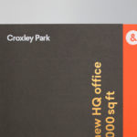
Croxley Park by Blast, United Kingdom
Posted: February 10, 2017 Filed under: Business, Banking, Law and Finance, Graphic Design Reviews, Logo Reviews | Tags: Brand Identity Reviews, Branding & Packaging of 2017, Branding Blog, Branding Reviews, British Design, Brochure Design, Design For Print, Design Opinion, Design Reviews, Designed by Blast, Gold Foil, Graphic Design, Graphic Design Blog, Graphic Design Trends: Monolinear Illustration, Illustration, Logo Design & Branding Blog, Sans-serif Typography, Stencil, Stencil Cut Logotypes, The Very Best of BP&O, Typography, Uncoated Papers & Cards 1 Comment »Opinion by Richard Baird.
Croxley Park is a business park located two miles from the town of Watford, United Kingdom, with good local public transport links and twelve minutes from the M25, an arterial route that encircles Greater London. Although strategically placed to make the most of these networks, Croxely Park also has a unique 25 acre parkland setting. Currently, this is home to both multi-national companies and small start-ups, which make up the park’s 2,600 inhabitants.
With the aspiration of becoming one of the top UK business parks, and the intention of competing on a national and international scale, Croxley park worked with London-based graphic design studio Blast to conduct a strategic review, help clarify its positioning and create a new brand identity.
Based around the concept “&More”, Blast developed a solution that brings to life the environment and culture that surrounds the park, its amenities and high-quality service. This is brought together and expressed through cheerful colour and illustration, custom type treatment, photography and moving image, copyrighting, symbol and the materiality of brochure.
Assembly by Blast, United Kingdom
Posted: February 15, 2016 Filed under: Graphic Design Reviews, Logo Reviews, Property | Tags: Black Paper, Blue Block Foil, Brand Identity Reviews, Branding, Branding Agency, Branding Blog, Branding Reviews, British Design, Brochure Design, Business Card Design, Catalogue Design, Coloured Paper, Corporate Identity Design, Custom Typefaces & Logotypes, Custom Typography, Design For Print, Design News, Design Opinion, Design Reviews, Designed by Blast, Estate Agent, Foil Blocking, Fonts in Use: Brown, Fonts in Use: Freight, Fonts In Use: Geometric Sans-serif, From Europe, From the United Kingdom, Graphic Design, Graphic Design Blog, Logo Design & Branding Blog, Logo Design Trends: Clever Logos, Logotypes, Responsive Websites, Sans-serif Typography, Stencil Cut Logotypes, The Best Brand Identities of 2016, The Best Graphic Design Work of 2016, The Best Logo Designs of 2016, Typography, Uncoated Papers & Cards, White Block Foil, White Ink 1 Comment »Opinion by Richard Baird.
Assembly is a new 250,000 sq ft. development project managed by Axa Real Estate, located in London’s Hammersmith, and comprised of 4 office buildings, 3 public squares, bars, restaurants and estate wide amenities. As a business hub the development is strategically positioned between Central London and Heathrow, with easy access to the Underground, road and river networks.
Working with Axa Real Estate, Bell Hammer, CBRE and Knight Frank, graphic design studio Blast, alongside naming, developed a cohesive visual identity system for the entire estate, its offices, retail spaces and public facilities with the intention of creating a sense of place. This was achieved through a stencil cut typographical direction that extends across brochures for the site but also individual buildings, as well as marketing campaign, film and responsive website.