
Sant Francesc by Mucho
Sant Francesc is a 5-star hotel located in the Placa Sant Francesc, beside the Church of the Templarios, within the city of Palma on the Spanish island of Mallorca. The hotel is set inside the walls of a restored historical landmark built in a neoclassical style during the 19th century and has 42 rooms and suites. Some of these rooms include wood-beamed ceilings, original frescos and...
Blackhorse Lane Ateliers by StudioSmall
Blackhorse Lane Ateliers is a UK-based premium selvedge and organic raw denim jeans brand. It was founded in 2016 by Han Ates, who has over 25 years experience in the textiles industry, and is located in a renovated 1920s factory building with a distinctive profile in Walthamstow, North London. Blackhorse Lane Ateliers is committed to implementing a sustainable and ethical production model....

Modern by Dwell Magazine by Collins
Modern by Dwell Magazine is a new range of home decor products, tablewear and furnishings for those who want to create a welcoming space with a modern aesthetic. It is a collaborative project between design and architecture magazine Dwell, designers Chris Deam and Nick Dine of Deam+Dine, and the American retailer Target. The range features over 120 products. From chairs, tables and glassware to kitchen utensils,...
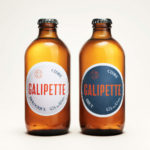
Galipette Cidre by Werklig
Galipette is a premium cidre made from 100% pure fermented apple juice (pur jus) pressed from apples that are hand picked from orchards in Brittany, Northwest France. Galipette is available as a Brut and a sweeter Biologique. These are free of gluten and added sugar and created for the international markets of Europe, North America and China by the Cider Supply Company,...
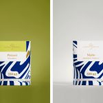
Suomen Jäätelö by Werklig
Suomen Jäätelö is a super-premium ice cream brand currently available in five flavours and a sorbet. These include Milk, Pistachio, Vanilla and Chocolate made from Finncattle milk, a Rhubarb sorbet and Spruce created in collaboration with iconic furniture maker Artek. Although ice cream is internationally ubiquitous, Suomen Jäätelö is described as having a distinctively Finnish character. This is expressed throughout its packaging design, developed by...
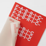
Fabric of Onehunga by Richards Partners
Fabric is a residential property development project and new pocket neighbourhood within the area of Onehunga, one of Auckland’s oldest suburbs and a brownfield site of warehouses with a light industrial heritage. Developers Lamont and Co., alongside Colliers International, commissioned graphic design studio Richards Partners to create a brand identity for the development that would link brochures, specifications pack, website and a variety of print communications for the...
AIGA Design Conference by Mother Design
The American Institute of Graphic Arts (AIGA) is a professional design organisation with a membership that covers all forms of visual communication, from graphic design, typography and interaction to branding, motion graphics and environmental design. As well as supporting a community of over 25,000 nationwide members, advancing design as a professional craft, strategic advantage and vital cultural force, AIGA organises two...

Galerija Kranjčar by Bunch
Galerija Kranjčar is an art gallery, located at the heart of Zagreb, opened in 2006 to showcase the work of Croatian contemporary artists and function as hub for a variety of cultural activities. The gallery is a long and unique space, one that balances the modern and historic. This can be seen in the meeting of smooth white walls, concrete floor...
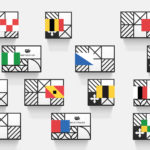
Helvetimart by Anagrama, Mexico
Helvetimart is a supermarket in the Swiss city of Lausanne. It offers a broad range of groceries and high-quality Swiss specialities sourced from across the country. The supermarket also holds daily tastings and workshops, has an informed staff and a tablet-based service that gives shoppers access to information on the Swiss cantons and their products. Drawing on regional flags and antique architecture, Mexican graphic design...

Trika by Bunch
Trika is an interior design company, working on both public and private spaces, with a showroom and studio in the Croatian capital of Zagreb. They represent furniture and equipment manufacturers such as Billiani, Enea and Federicia, amongst many others, whose brand names are described as being synonyms for quality, comfort and design. Graphic design studio Bunch worked with Trika to develop a new brand identity....

Raumindex by Moodley
Raumindex is an Austrian design, development and project management studio established in 2005 that creates integrated interior and exterior retail environments for national and international clients. Its philosophy is rooted in the shaping and arrangement of form, space and content to create functional and flexible environments to add value and elicit feelings. With a desire to appear more accessible, and with...

Croxley Park by Blast
Croxley Park is a business park located two miles from the town of Watford, United Kingdom, with good local public transport links and twelve minutes from the M25, an arterial route that encircles Greater London. Although strategically placed to make the most of these networks, Croxely Park also has a unique 25 acre parkland setting. Currently, this is home to both multi-national companies and...