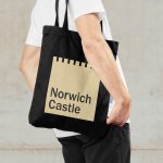
Norwich Castle by The Click
The competitive landscape for experiences has been significantly catalysed post-pandemic. Perhaps the sensory deprivation of stay-at-home orders created an intense need to make up for lost time, indulge in all manner of out-of-home activities and platform them. Times have changed. Old needs to feel new and fight on equal footing with what appears to be an endless stream of pop-up...
Stereoscope by Olssøn Barbieri
Oslo-based multi-disciplinary design studio Olssøn Barbieri has created the brand identity for Los Angeles-based speciality coffee roastery Stereoscope, working across its packaging design and printed materials with a typography-led approach that celebrates tactility. According to Olssøn Barbieri, Stereoscope is underpinned by a philosophy that sees coffee as a living organism rather than a commodity, and which takes its responsibility to...
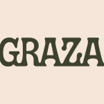
Graza by Gander
Using olive oil has never been so squ-easy. That’s how Andrew Benin, founder of Graza, would like us to feel. As Kelsey McClellan reports for the Wall Street Journal, Benin knew the last thing the world needed was another snobby olive oil and the key goal was finding ‘the sweet spot between flavor and affordability’. This product does feel different...
Whale Tales by Interbrand
Every year an impressive 40,000 humpback whales travel along the Sydney coastline. This annual migration pattern is one of the many awe-inspiring natural spectacles that make the city so unique. It is fitting then, that the New Sydney Waterfront Company chose to revitalise Sydney’s Western Harbour Precinct with an installation of thirty whale tail sculptures, telling thirty individual stories, or...
Nordoff & Robbins by Pentagram
For decades, Pentagram has been one of the most famous and renowned design consultancies in the world; but when it comes to the charity sphere, music therapy organisation Nordoff & Robbins is far less starry – it’s not, say an Oxfam, or an RSPCA, or Médecins Sans Frontières. Arguably that’s all the more reason for it to bring in the...
Time by For The People
‘The story of the internet is the story of life’. Understood in this way, rebranding Malaysia’s challenger internet service provider Time presented the appropriately existentially titled For the People with a daunting task. As legislation in Malaysia shifted, requiring companies like Time to share their infrastructure with other ISPs, competition has grown. As such, Time needed to evolve its brand. What is...
Ortto by Christopher Doyle & Co.
All systems grow. What a fun line. Setting up and positioning Ortto, formerly Autopilot, as the leading marketing automation solution for business. The name is great, a wonderful move forward for the company, and sufficiently taking something technical and inhuman-sounding and giving it a somewhat anthropomorphised quality, easy to remember and providing room for growth into other technologies and services....
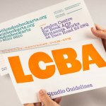
LCBA by Studio Bergini
Not a new project, but a lovely one nonetheless; it seems there couldn’t have been a more perfect fit for London Centre for Book Arts than Studio Bergini when it was looking for a design team to task with creating its new visual identity. Formed by two Central Saint Martins grads – Norwegian Kristian Hjorth Berge and Italian Francesco Corsini (hence...
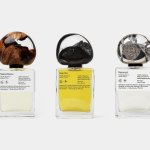
.Oddity Fragrance by .Oddity Studio
In July 2019 New York-based Stefan Sagmeister and Jessica Walsh announced that they would be splitting their shared practice after nearly a decade of innovative and boundary-pushing work together. In the amicable separation, &Walsh took over the commercial projects while Sagmeister announced he would exclusively be working on ‘self-generated design’ under Sagmeister Inc. Having made his millions, Sagmeister’s days are...
Tugg by Kurppa Hosk
The hamburger is an American icon. It conjures associations with all-American diners and drive-thrus, backyard cookouts and family gatherings; American values, such as entrepreneurship, as well as less positive attributes of Western countries, like obesity. The burger’s visual identity is inseparable from its history and has been solidified time and time again as the big fast food franchises conquered the...
Mode by Gretel
How to make a data business approachable yet hold gravitas? Can it be engaging yet authoritative, sage yet cool? These are the implicit tensions NY-based Gretel has grappled with in its branding of Mode, a data intelligence and technology business seeking to widen its appeal. Gretel has established a brand identity which is triumphant and clean. It balances the contradictions that so...
Seedsman by Here Design
Water masquerading as an edgelord-baiting energy drink (Blackletter fonts, skulls, and a name straight out of the heavy rock canon); running shoes aping a chesty cough remedy; olive oil bottles that owe more to the science lab than the Mediterranean. Packaging at the moment, it seems, is frequently playing fancy dress. That’s no bad thing, of course: brands borrowing aesthetics...