Fashion
Feel the heat
Most branding has to give some suggestion of what said brand is, or does, or stands for – it’s usually not ideal if they bear little to no resemblance or representation of their category, audience or ideals. The exceptions are usually things like record covers, or other inherently creative entities like musical instruments, editorial projects; occasionally booze brands, like the...
Blueberry by Studio NARI
“Mind. Blown”, as someone in Gen Alpha might have said a long time ago, maybe while performing some flossing at a velocity so rapid as to be barely perceptible to the naked Millennial eye. But they probably wouldn’t say that any more, such is the rapacious speed at which all things ‘young person’ change. Gen Alpha inhabits a world so...
Monica Rich Kosann by Here
There’s been a fair bit of chatter in recent times in the brand design world about the ‘new codes of luxury’ – how today’s hip young well-to-dos are eschewing the signifiers of yesteryear (ostentation, gold, bling, anything remotely showy) for a more understated aesthetic. Being fabulously rich today, then, is perhaps a little like the whole ‘no makeup’ thing: anyone...

Tameko by DutchScot
Founded by Dominika Leveau and Chim Sonne-Schmidt in 2021, textile brand Tameko feels thoroughly ‘Scandi’ in aesthetics and ethos – it’s all clean lines, a singularly restrained stance on beauty. It’s form following function. Tameko embodies that very contemporary take on the luxury sensibility that never shouts about its status. It doesn’t need to: luxe quietly but confidently oozes from...

Kindred Black by Ania et Lucie
There has always been something borderline magical about the fields of beauty, makeup and skincare – a hint of esoteric or mystical knowledge. When it comes to visual storytelling, this association offers plenty of rich inspiration, along with established style signifiers that are easy to follow. Nods to old-school apothecaries abound in the likes of Typology Paris and Le Labo,...

Ventura Foreman by Studio Blackburn
Founded by Robert Ventura and Sophie Foreman, Ventura Foreman is a design and manufacturing studio based in Woolwich, south London, which specialises in quality workwear pieces for clients like Paul Smith, Matches, and much-hyped North London ‘liberal metropolitan elite’ take on the greasy spoon, Norman’s Cafe. Having been around for a while without a ‘brand’, there came a point in...

.Oddity Fragrance by .Oddity Studio
In July 2019 New York-based Stefan Sagmeister and Jessica Walsh announced that they would be splitting their shared practice after nearly a decade of innovative and boundary-pushing work together. In the amicable separation, &Walsh took over the commercial projects while Sagmeister announced he would exclusively be working on ‘self-generated design’ under Sagmeister Inc. Having made his millions, Sagmeister’s days are...

Marc Jacobs by Triboro
Fashion designer Marc Jacobs heads his own eponymous fashion brand, as well as diffusion lines The Marc Jacobs and Heaven by Marc Jacobs. He was also creative director at Louis Vuitton from 1997 to 2014, where he created the company’s first ready-to-wear clothing line. In his own words, Jacobs’ work is ‘a little preppy, a little grungy, a little couture’, and this...

Maria Sole Ferragamo by Lundgren+Lindqvist
Maria Sole Ferragamo is one-of-a-kind jewellery designer using up-cycled premium leather; remnants of the Italian fashion industry. She has a degree in architecture at Politecnico, Milan and another in jewellery design from Central Saint Martins, London. This intersection of fashion and architecture can be seen throughout the designer’s collection and has gone on to inform the design of her visual identity...
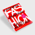
Fashion Central Saint Martins by Praline
Fashion Central Saint Martins documents and celebrates what has become one of the most influential fashion courses in the world. It is a collaboration between publisher Thames & Hudson and Central Saint Martins, and co-authored by Programme Director of Fashion Hywel Davies and Cally Blackman, lecturer in Fashion History and Theory. The Central Saint Martins Fashion Course has a legacy...

Aurlands by Heydays
Aurlands is the oldest running workshop for handcrafted shoes in Norway. It was founded in 1907 by shoemaker Nils G. Tveranger who, following time in America training as a shoemaker, went on to create the world’s first Penny Loafer in 1926. This, subsequently, became an enduring unisex fashion icon across Europe and America. Aurlands continues to build on this legacy,...

DOIY Honom by Folch
Honom is a new “male-oriented” range from Barcelona-based DOIY, a product design company creating objects that move between the practical, the ornamental and the more whimsical. Honom veers heavily towards the former with objects that include a wallet, multitool, bottle opener, keyring and bike bell. In their design, materials and build these find a balance between everyday utility and premium positioning....