Food and Drink

Another Collective’s identity for smash burger brand Brusco deftly reinvents classic burger joint design tropes
Food trends are a funny old thing aren’t they. And just as design trends are never just about ‘aesthetics’ – the ‘what something looks like’ divorced from the world around it, food trends aren’t just about ‘edible stuff’, or ‘what things taste like’. Such movements both hold up a mirror to, predict, and feed back to us (literally, in the...
OlssønBarbieri rewrites the rulebook on ‘formality’ in its melodrama-infused Theaterbaren identity
Oslo’s Nationaltheatret (simply translated to English as National Theatre) first opened its doors more than a century ago in 1899, and has since come to not only reflect, but actively shape cultural identity in Norway. Having staged everything from more traditional Norwegian dramas from the likes of Henrik Ibsen to experimental contemporary works, the building itself is also a marriage...
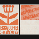
Mecca Coffee by Christopher Doyle & Co.
Sydney-based Mecca Coffee started life in 2005, and has since become one of the city’s leading specialty coffee roasters, importers, and retailers. To mark the company’s 20th anniversary, Christopher Doyle & Co. (Ortto, Machine Screen Printers, New Aim), which is also based in Sydney, was brought in to evolve its brand identity across “packaging, merchandising and collateral systems,” Doyle explains....
Strangers by Auge Design
Strangers is a new confectionery brand created by Valgosa, a family company dating back to 1912 and seemingly best known as purveyors of saffron. It seems an unlikely starting point for such a boldly positioned brand – and one boasting an exquisite visual identity thanks to Milan-based Auge Design (Erbert, Ginori 1735). According to Auge – which worked across everything...
Gaptooth Soda by Saint Urbain
One person’s imperfection is another’s luck– especially, it turns out, when it comes to teeth. The front-tooth-gap, as exemplified and celebrated by the likes of Madonna (and, it turns out, Chaucer’s famously, unabashedly lustful “gap-toothed” Wife of Bath) is known in more scientific or medical terms as a ‘diastema’. Many see this aesthetic dental quirk as attractive; others not so...
Fizzing with expression
It’s always a joy when a project manages to do something that feels new, bold, refreshing and resolutely contemporary; all the while wearing its influences absolutely front and centre on its sleeve. Treblasé is one such project, thanks to this superb brand design by Oslo-based multi-disciplinary design studio Olssøn Barbieri (Pursue Hard Seltzer, Stereoscope, Chelan Beauty). Riding on the high...
Like, so retro, but so the future
There’s really so little not to love about this branding for Sooki – in fact, I’d go as far as saying there’s nothing not to love. It’s purely, and simply, gorgeous; every goddam inch of it. Kudos, then, to The Collected Works, the New York City- and New Orleans-based independent design studio behind the identity design created to bring Sooki...
Where fallow deer roam
Deer feel like unlikely ambassadors/ mascots/ PosterCreatures for olive oil, but it turns out they work brilliantly – when, that is, in the superlatively capable hands of a studio like SMLXL. Said olive oil is D’arbequina, a name which more broadly simply refers to the sort of plant from which the oil is produced: Arbequina is a widely cultivated olive...
Pink! pink! everywhere!
Wine company Nice started life in 2019, and ever since, has aimed to be a far more straightforward alternative to the wildly confusing, jargon-packed, somewhat stuffy world of wine. In Nice’s words, the whole idea is to “liberate drinkers from wine headaches” both literal and metaphorical, “whether it’s inflexible packaging, confusing labels or next day regret”… Now after more than...
Goofy, playful and knowingly a bit silly
Design systems are often spoken about in terms of those moments of ‘surprise and delight’, but often, there’s little either surprising or delightful to be found. Blurr Bureau’s new brand identity for Yes! Apples, however, is so brimming with surprise and delight that those moments become the entire timeframe here: the Easter Eggs absolutely abound here, for the brand design...
An act of restitution
Caffè Nazionale is a historic bar on Piazza Libertà in Arzignano, a small city in Veneto, Italy, which was the social heart of the town – a place for conversation, card games, billiards, and the daily ritual of an espresso at the bar – for generations, before falling into closure and decline. Having first opened in the 1950s, the Caffè...
Equipped for Life
The protein market has absolutely boomed in recent years – a trend that doesn’t look as though it’s going away any time soon: a 2025 survey from the US-based International Food Information Council (IFIC) revealed that the most common diet that Americans followed in the past year was “high protein”, and that consumers use “good source of protein” as the...