Retail
Diggin’ it
Just when you thought we were approaching a post-pet-parent era, a brand comes along and proves very much otherwise. Thankfully, though, while pet parenting seems to be alive and well; fingers crossed we’ve left behind the whole rather icky “fur baby” days of things like dog bandanas that read, “My Mom is Sooooo Obsessed with Me”; or dog nail varnish;...
Storrd by Among Equals
London is awash with convenience stores – from the acrid yellow signage of Nisa to the misleadingly named ubiquity of Costcutter to the countless independents named things like Ben’s, despite the fact they have nothing to do with anybody called Ben. Such shops – reliably there at most times of day, reliably overpriced (hence the convenience I suppose, like an...
Blueberry by Studio NARI
“Mind. Blown”, as someone in Gen Alpha might have said a long time ago, maybe while performing some flossing at a velocity so rapid as to be barely perceptible to the naked Millennial eye. But they probably wouldn’t say that any more, such is the rapacious speed at which all things ‘young person’ change. Gen Alpha inhabits a world so...
Big Cartel by How&How
Big Cartel launched in 2005 as a low-cost, easily customisable ecommerce platform specifically aimed at artists and other creatives. In the two decades since, the platform has quietly revolutionised what it is to be an independent maker, powering more than $2.5 billion in sales from ceramicists, jewellery designers, illustrators, and the occasional medieval tapestry revivalist. But as the marketplace for,...
BRiMM by Harriman Steel
Combining an online shop, journal, and collective, BRiMM describes itself as a platform for ‘planet-positive living’, drawing together some big ideas and ruthlessly sustainable brands. Based between London and Stockholm, it was founded last year by James Haycock, who’s billed as, ‘an exited founder, angel investor, and the vision behind’ it all. The fact the whole thing looks so great...

Suupaa by A Friend of Mine
There isn’t a shortage of well-executed, interesting branding projects out there – ones that are joyful, witty, slick, or just perfectly fit a brief – which do their job perfectly. But 99% of the time, you can sort of see where they came from – the broader cultural spheres they’re playing into (nostalgia; fauxstalgia; irony, for instance) or the wider...
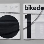
Bikedot by Studio Sutherl&
The concept of a brand today rarely has a sense of physicality. The hand (or indeed roller), the mark-maker, usually feels totally absent. It makes sense really, considering our primary interaction with a brand is often online; but when a project comes along that’s so obviously delighting in the possibilities of print processes, inks and paper it feels like a...

Murray’s Cheese by Base Design
The ‘shoppy shop’ trend shows no sign of abating. For those not in the know, the term – popularised by New York Magazine’s Grub Street – indicates those small-to-medium businesses selling upmarket ‘provisions’ (charcuterie, legumes, sauces, tinned goods) with a veneer of heritage, authenticity, and (seemingly) innovative ingredients, as if they were the modern ‘general stores’ of olden days. On...
Kettle Kids by Two Times Elliott
The once laudable claim to have started a thriving business with ‘a small loan’ from a doting family member may have been muddied beyond recognition by the truth-stretching of serial tax-offender and part-time Presidential candidate Donald Trump. Despite this, turning ‘one thousand pounds from nan’ into a luxury watch and diamond dealership with a sparkling flagship store in Mayfair remains...
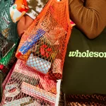
Wholesome by Universal Favourite
Wholesome is a new breed of supermarket that doesn’t fill a gap in a market so much as it positions itself at a nexus of multiple intersecting demands. The pursuit of ethical grocery and household shopping has, for decades, been both deeply commendable and exasperatingly time-consuming, expensive and convoluted. One supermarket will stock Fairtrade products but have a scant gluten-free...

TWELV. by Seachange
Maybe the recent explosion in astrology is thanks to a more secular society; or a post-Covid sense of generalised uncertainty that’s left us grasping for answers. Perhaps it’s the rise of Instagram/TikTok influencers; or maybe it’s just because its foundations lie in astronomical reality that’s been harnessed by civilisations stretching back tens of thousands of years. Whatever it is, where...
Petit Planet by Studio fnt
The Hyundai is one of the three major department stores in South Korea, with its 15 branches across the regions of Seoul, Yeongnam and Hoseo accruing more than $6 billion in annual sales. Petit Planet is the Hyundai’s new specialised children’s division, presenting premium brands in an environment designed to stimulate young imaginations. This post includes Extended Insights for BP&O...