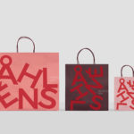
Åhléns by Happy FB
Åhléns began in 1899 as a small mail-order business. Aside from it being one of the oldest it has also grown to become one of the largest retail chains in Sweden. By carefully collating a variety of items across brands and price categories, the retailer maintains its relevance today, understanding and responding to the many ways in which its customers...

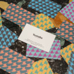
Espelma by Commission
Espelma is a clean-burning natural wax candle company. They have an online store and have hosted pop-ups in London and New York. Each candle comes in a refillable glass vessel, designed by Espelma founders Clara and Claudia, and handmade on the Italian island of Murano. Espelma is distinguished by its mix of glass craft, distinctive colour and form, the clean-burning nature...

Heyday by Collins
Heyday is a range of 150 moderately-priced high-quality own-brand consumer tech products from American retailer Target and their first foray into the electronics and tech accessories sector. The range includes battery packs and chargers, cables, covers and wireless speakers amongst many other products. These share a form language that balances an everyday simplicity, robustness and utility with novelty and cheerfulness by...
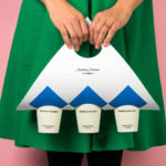
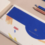
Teatulia by Here Design
Teatulia is a Bangladeshi single origin tea brand that recently moved into the UK market, opening a flagship store, tea shop and cocktail bar in London’s Covent Garden. It is a social enterprise creating jobs in a remote region of Bangladesh and has, so far, transformed 3,000 acres of barren land into an organic tea garden. Drawing on Teatulia’s single-source positioning—common...
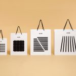
Anton&Anton Kioski by Bond
Anton&Anton (A&A) is an alternative to and antithesis of the large supermarket chains. Staff are described as relaxed, smiley and proud. Their ranges (mostly) organic, some homecooked and also available online for home delivery. With a desire to express an approachable, playful yet credible positioning, and a need to develop a cohesive set of packaging and communications assets A&A worked...
Hages by The Studio
Hages began selling shortwave radios in Stockholm during the 1940s and is one of the oldest of its kind in Sweden. While the retailing of electronic goods has changed dramatically, sold increasingly online and on price by large chains, Hages has remained true to an independent spirit and established and developed a solid reputation. To coincide with the opening of their second store,...
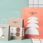
Doméstico Shop & Doméstico Market by Mucho
Doméstico Shop is online retailer of designer homeware which has grown to become the leader in the Spanish market. It stocks an array of items, from furniture and kitchenwear to textiles and lighting. To coincide with the launch of Doméstico’s concept store Doméstico Market, and the opening of a new flagship store in Barcelona, the retailer worked with Mucho to...
Maisonette by Lotta Nieminen Studio
Maisonette is an American online retailer of luxury children’s brands, founded by former Vogue co-workers Sylvana Durrett and Luisana Mendoza Roccia. The retailer carries a carefully selected yet extensive catalogue of clothing, homeware, gifts and accessories that mixes local up-and-coming brands with those that are well-established and international. Maisonette’s visual identity, designed by New York based Lotta Nieminen Studio, intends to balance and juxtapose a...

Summerhill Market by Blok
Summerhill Market is a family-run business, managed by the third generation, with premises on Toronto’s Summerhill Avenue and a smaller location—a floral boutique—on Mt. Pleasant Rd. The store has 200 employees, a butchers, bakery and deli, a BBQ in the summer and offers a variety of catering services. Summerhill Market is admired for its high quality products, and its ability—since 1954—to consistently redefine what...

The Dayrooms by Two Times Elliott
The Dayrooms is a multi-label womenswear store, located in the London district of Notting Hill, created by Aytan Mehdiyeva and Zumrud Mammadova. The store gives a UK platform to emerging Australian designers and is an expression of Aytan and Zumrud’s shared passion for fashion and travel, and Aytan’s love of photography, textiles and Australian craftsmanship. This is reflected throughout The Dayroom’s graphic identity, developed by Two Times...
Blå Bär by BVD
Blå Bär (Swedish for blueberries) sells a variety miscellaneous goods from Scandinavia from its store in Osaka, Japan. These include, but are not limited to, glass and kitchenware, soft furnishings, ornaments and jewellery. Many of these could be described as having something of a shared Scandinavian simplicity of form, lightness of colour, natural material quality and cheerful character in pattern...
Artek Helsinki by Tsto
Artek is a Finnish furniture and product design business and retailer with a flagship store in Helsinki. It was founded in 1935 by architect Alvar Aalto and wife Aino Aalto, the arts promoter Maire Gullichsen and art historian Nils-Gustav Hahl. Artek grew alongside and shared many of the qualities of the 20th century modernist movement, blending art and technology, and making the...