GUT by &Walsh
Guts aren’t exactly glamorous. And the connotations of the word ‘gut’ are multifarious: there’s the gory (‘blood and guts’); the Germanic ‘good’; the straightforwardly corporeal; or for those with an interest in newer psychological findings, it’s a wondrous ‘second brain’. Ad agency folk, however, have long taken the word ‘guts’ far outside of the bodily. For many of them, ‘guts’...
Orchestra Sinfonica di Milano by Landor & Fitch
In the words of synesthete Johann Wolfgang von Goethe, ‘music is liquid architecture; architecture is frozen music’. Unlike 19th-century architecture, contemporary graphic design is afforded no such static reprieve – it faces the challenge of animating the ‘universal language’. Whereas once the plastic arts could content themselves with merely freezing music, any contemporary attempt to visually translate music must now...
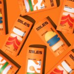
Miles by Buddy Buddy
Deodorant isn’t traditionally a hotbed of innovation: for the most part, ‘women’s’ products don an unremarkable raft of white packaging (freshness!); blue, pragmatic type; and vague, rarely-kept promises about lasting for 72-hours. For the men, packs are sombre shades of black, dark blue, or grey (manly!) and just as drearily practical as the women’s. Deodorant, for the most part, has...
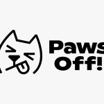
Paws Off! by Seachange
Anyone who’s ever had a dog, or just interacted with one, has likely spotted that over and above pretty much anything, food is the centre of their universe. Unfortunately for us, though, it’s not just dog-safe food that they’ll do whatever it takes to get their paws on: human food, it seems, often has the most appeal. But just as...
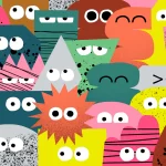
Marshmallow by Ragged Edge
A marshmallow is sweet, soft, pliable. Yet they are also resilient and surprisingly strong – who among us hasn’t enjoyed watching them perform surprisingly well under a hydraulic press compared to substances that much more obviously scream ‘structural integrity’? Perhaps this soft-yet-strong dynamic is why the name works for an insurance company. Or perhaps, more simply, the name works because...
Frydate by Skinn
Beyond its eye-wateringly strong beers, decadent chocolates, and waffles; Belgium is famous for serving up one beloved belt-buster that’s easy to eat, and deceptively hard to get right: chips. A new Belgian homemade burger and snacks offer, Frydate, positions itself far beyond a humble chippie and into the realm of ‘Belgian frymanship’-led ‘friterie concept’. To help it achieve its ‘insatiable...
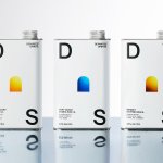
smlXL by DIA
As the adage goes, ‘Give a man a fish, you feed him for a day; teach him to fish, and you feed him for a lifetime’. With this vivid paradigm of self-sufficiency in mind, we can esteem the advent of creative coding in branding, allowing design agencies to hand brands over to clients as generative tools capable of generating limitless...
Monkey Baa Theatre Co. by Universal Favourite
Theatre is an artform that relies not only on its visual and verbal performance elements, but the text from which all the rest of the more showy aspects are born. An obvious point, but one that often makes me wonder: why do so many theatre companies have such terrible names? Maybe it’s a sort of in-joke, maybe I’m just missing...
Partech by Koto
Certain sectors lend themselves beautifully to innovative, eye-catching design – things like craft beer, perhaps; or beauty; or small-run editorial publications. Investment firms aren’t traditionally among those sectors that engender more outre, bold design work. And that’s partly the reason that this work for Partech, a global tech investment firm headquartered in Paris, stands out. Created by brand and digital...

Wisl by andstudio
Shaking off a hangover on a crisp Sunday morning kick-about with the boys; dunking a perfect basket on a court raked with the long shadows of a high-summer sunset; obliterating Janet from HR in a ‘friendly’ after-work squash game/grudge-match. These vignettes, I am assured by those who participate in such wholesome activities, capture both the hazy idyll and everyday reality...
Departed Spirits by Marx Design
Maybe it’s been ‘silly season’ summer; maybe there’s a lack of risk-taking/imagination/budget; maybe I’m just jaded, but it’s felt as though recent months haven’t exactly seen a wealth of particularly exciting branding and packaging projects. That’s not to say there hasn’t been a steady stream of good work, but I’ve personally not felt hugely ‘wowed’: there’s been work that’s strong,...
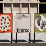
Entrée by Saint Urbain
More than three years since the outbreak of the Covid pandemic, we’re in a strange situation when it comes to all the things that flourished due to lockdown – grocery delivery services like Getir, et al; streaming services that poured literally billions into what once seemed like a never-ending gold-rush of content-consumption; flashy home-centric lifestyle brands like Peloton. Indeed, the...