Ridley by RE:
Ridley is a pioneer of digital architectural services and operates as a central hub from which builders, developers and architects can collaborate. Originally established, and continuing to operate as an architectural documentation specialist, Ridley, from its premises in Australia and the Philippines, has also grown to become a leader in Virtual Design Construction. This is a practice that involves attaching live...
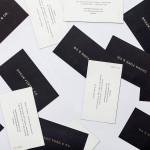
Shaun Ford & Co. by Savvy
Shaun Ford & Co. is a Canadian bespoke furniture an interiors business that creates tailored environments for the sophisticated, style conscious consumer, and whose work revolves around a timeless approach to space. Each piece of furniture is designed with careful consideration given to the years that it will have to coexist within a particular environment and with the intention that each acquires further...
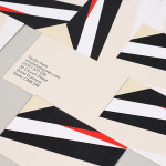
Studio Aves by Build
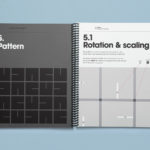
Studio Aves is a soon to launch UK design practice that will specialise in typeface and typographic design. Its visual identity, based around a high contrast colour palette drawn from the markings of British birds — a reflection of the name and inspired by blue tits, goldfinches, magpies, robins plus many more — was recently created by Build. The identity runs...
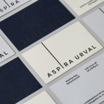
Aspira Urval by BVD
Aspira Urval is a banking, finance and insurance recruitment specialist with offices in the Swedish city of Stockholm. Its new brand identity, designed by BVD, draws its inspiration from the name and the themes of ‘elevated ambitions’ and ‘reaching new heights’. These are visualised as a generously spaced, uppercase, sans-serif logotype with an adaptive ascender that changes depending on its context. It is...
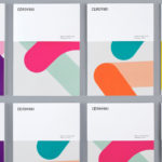
Cerovski by Bunch
Cerovski is a young Croatian print production studio that revels in the challenge of “nebulous finishing, microscopic editions, absurd materials and crazy deadlines”. Bunch worked with Cerovski to develop a new brand identity for the studio—which included a custom logotype and typeface, website, and a variety of printed collateral—that delivers a distinctive contrast of utility and creative flourish, technology and individualised service...
Cemento by S-T
Cemento is the UK distributor of an Italian lightweight concrete product that can be used for wall panelling and furniture. Inspired by brutalist design — a movement that grew out of early 20th century modernist architecture and described by Wikipedia as being “linear, fortresslike and blockish” — London based studio S-T developed a visual identity for Cemento that included logo, logotype, brand...

University of the Arts Helsinki by Bond
“The Finnish Academy of Fine Arts, Sibelius Academy and Theatre Academy Helsinki merged in the beginning of 2013 into the University of the Arts Helsinki. Bond created the complete branding solution for the new university. The strategy for the identity was to create a distinctive set of logotypes based on a common design language, and to introduce an anchor symbol...
Valentto Olive Oil by Anagrama
Valentto is a Mexican cold-pressed virgin olive oil produced by Olivarera Italo-Mexicana – a Mexican Italian collaboration – created for commercial kitchen and restaurant use. Multidisciplinary design agency Anagrama recently developed a new brand identity and packaging solution for Valentto that juxtaposes the natural detail of Italian landscapes alongside the industrial utility of a square tin structural choice, described by Anagrama as being...
MediaCreator by Lundgren+Lindqvist
Media Creator is a Swedish print production and project management company that utilises a flexible web-based system that pairs a ‘intuitive computerized system’ and translation service, with ‘alert’ and ‘friendly’ staff to streamline their entire print process. Utilising a predominantly two-tone colour palette, san-serif typography and bright contemporary illustrative detail, MediaCreator’s new visual identity, which included a new logo, stationery set and...
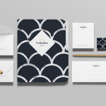
Tabarka Studio by Anagrama
Tabarka Studio specialises in ‘detail-oriented’ and handcrafted tiles made from terracotta, a ‘clay-based ceramic earthenware that becomes porous when fired creating a worn-out, antique finish’. Anagrama, the design agency responsible for the studio’s visual identity and collateral, describe their approach as embracing an ‘archaic timelessness’ that reflects the products through the use of a blue and white scale pattern, tiled icon...