Jackalope Hotels by Fabio Ongarato Design, Australia
Posted: October 12, 2017 | Author: Richard Baird | Filed under: Cafes, Bars and Restaurants, Graphic Design Reviews, Leisure and Tourism, Logo Reviews, Material & Print Specs | Tags: Black Block Foil, Brand Identity, Brand Identity Reviews, Branding, Branding & Packaging of 2017, Branding Blog, Branding Reviews, Business Card Design, Colorplan Papers and Boards, Coloured Paper, Design Blog, Design For Print, Design News, Design Opinion, Design Reviews, Designed by Fabio Ongarato Design, Designed in Melbourne, Die Cut Design Detail, From Australia, G.F Smith Papers & Boards, Gloss Ink, Gold Foil, Graphic Design, Graphic Design Blog, Hotel Logos, Interior Design, Leather Detail, Leather Menu Cover, Logo Design & Branding Blog, Logo Design Inspiration, Logo Design Resource, Logo Designs, Logo Opinion, Logotypes, Print Finishing, Restaurant & Cafe Menu Designs, Restaurant Logos, Sans-serif Typography, Stationery Design, The Best Graphic Design Work of 2017, The Very Best Brand Identities of 2017, Thermographic Ink, Typography, Wordmark Design | 4 Comments »Opinion by Richard Baird
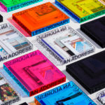
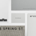
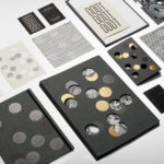
Jackalope Hotels is a luxury hospitality experience developed by Melbourne-based Louis Li, a hotelier described as having a penchant for the avant-garde. The first Jackalope Hotel is situated in the heart of the Mornington Peninsula, Victoria, Australia. It is unique in its location, surrounded by the hotel’s vineyard, in its architecture and interior by Carr Design, and in its visual identity, created by Fabio Ongarato Design.
Interior design and visual identity are linked by the theme of alchemy – a metaphor for winemaking, a core part of the business, and expressed in the juxtaposition of visual and material elements to create a new whole. These include the hybrid qualities of the Jackalope sculpture by Emily Floyd, the mixed techniques employed by artist Kate Robertson, and the polished layers of stone and carved busts of Rolf Sachs. This also extends to the visual identity for hotel, its restaurant and bar, in the combination of paper and finish, organic image and precise typographical and geometric forms.
Kisumé by Fabio Ongarato Design, Australia
Posted: September 6, 2017 | Author: Richard Baird | Filed under: Cafes, Bars and Restaurants, Graphic Design Reviews, Logo Reviews | Tags: Black Block Foil, Brand Identity, Brand Identity Reviews, Branding, Branding & Packaging of 2017, Branding Blog, Branding Reviews, Business Card Design, Colorplan Papers and Boards, Coloured Paper, Design Blog, Design For Print, Design News, Design Opinion, Design Reviews, Designed by Fabio Ongarato Design, Designed in Melbourne, From Australia, Graphic Design, Graphic Design Blog, Graphic Identity Shortlist 2017, Logo Design & Branding Blog, Logo Design Inspiration, Logo Design Resource, Logo Designs, Logo Opinion, Logos, Logotypes, Restaurant & Cafe Menu Designs, Restaurant Logos, Sans-serif Typography, Stationery Design, The Best Graphic Design Work of 2017, The Best New Logo Designs of 2017, The Very Best Brand Identities of 2017, The Very Best of 2017, Typography, Wordmark Design | 4 Comments »Opinion by Richard Baird.
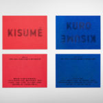
Kisumé is a Japanese restaurant located on Melbourne’s Flinders Lane. It is described by Fabio Ongarato Design, the studio behind its visual identity, as an unconventional, slightly twisted and artfully executed experience. The restaurant intends to immerse guests in an intriguing view of Japanese traditions, and fuses these with the owner’s obsession with beauty and sensuality. This is expressed by a “brutally sophisticated and minimal interior design” created by Wood Marsh Architecture which features curated artworks by Japanese photographer Nobuyoshi Araki as well as Polly Borland, and in the break from the conventions of a typical Japanese dining experience in the movement and colour of visual identity. This links business cards, stationery, menus, window and lighting decals, posters and website.