LogoArchive Issue 1
This first edition of LogoArchive in print was conceived, designed and sent to the printers for quotation within a day. It was inspired by a panel discussion that took place the day before at Somerset House as part of the exhibition Print! Tearing It Up. Today’s zine format and the revival of the independent publishing spirit of the past is a...
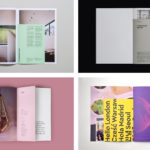
BP&O Collections — Inserts
A continually updated gallery of graphic identity design work, reviewed and published on BP&O, that feature an insert component. Where inserts have traditionally sat loosely within newspapers and magazines, quite separate from content and often adverts, the examples here are bound in and characterised by a proportional difference, either smaller than the cover, punctuating content in size, colour and content,...
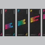
Frameline 41 by Mucho
Frameline is an American nonprofit arts organisation and the world’s longest running LGBTQ film festival. Frameline continues its mission, since its founding in 1977, to change the world through the power of gay cinema, and to connect filmmakers with audiences locally and internationally. Graphic design studio Mucho worked with Frameline on its visual identity and campaigns for its 40th and 41st LGBTQ...
Helsinki City Museum by Werklig
Helsinki City Museum, through its collection of objects and images, provides visitors with historical insight into the everyday lives and personal experiences of the people of Helsinki. It is free to enter and features 2400 sqm of exhibitions and public spaces, a cafe, inner courtyard, areas to relax and conference rooms. To coincide with a move to a new space;...

ArtRabbit by Bond
ArtRabbit is a global platform for the promotion, discovery and appreciation of contemporary art, connecting thousands of art spaces, exhibitions and events to artists, art professionals, collectors, students and anyone interested in art. Bond’s London-based studio worked with the team at ArtRabbit to create a new wordmark and brand language that could be used both in print and online....

APartMENT by UMA
APartMENT is a residential property development in Kitakagaya, a former industrial area of Osaka, Japan. It is part of the Kitakagaya Creative Village Project, an initiative to turn an area, left unused since 1988 following the withdrawal of Namura Shipbuilding Co., into a creative hub. With recent investment many of the warehouses and sprawling factory buildings have been turned into creative spaces...
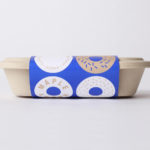
Happy Maple by Garbett
Happy Maple is a Adelaide-based bakery dedicated to producing small batch 100% vegan donuts, baked not fried, made from gluten, tree nut and peanut free recipes. Orders are by phone, e-mail or through their pop-up stores. There is no website, just a social media presence with lots of donut images, a personable approach to communication, and a cheerful brand identity created by...
Linden Staub by Bibliothèque
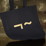
Linden Stuab is a UK-based model agency challenging industry conventions with their mantra ‘Empowering Women’, and by acting as a mother agency to all of their models. The name Linden Staub, derived from the maiden names of the two founding partner’s mothers, is an expression of this, and alongside the agency’s strong human-focus, was the basis for their new brand identity, created...
Rattis Books by The Counter Press
Rattis Books is a new London-based independent publisher that celebrates the convergence of traditional and modern print processes and has a firm belief that the book is an art object. To help convey this, the publisher worked with design studio, private press and typography workshop The Counter Press to create their brand identity, and the design for their first book Tiro, a collection of football writings....
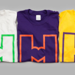
M11 studio by Inhouse
M11 studio is a luxe salon, located in the heart of the fashion, shopping and entertainment district of Newmarket, Auckland, that references the refinery of a Tom Ford fashion boutique. It has a well-proportioned, spacious, linear and light filled interior of large mirrors, strip and spot lighting, white and black walls, gold fixtures, concrete surfaces and robust furniture developed by...
Frameline 40 by Mucho
Frameline is a San Francisco-based nonprofit arts organisation and LGBTQ film festival that intends to change the world through the power of gay cinema, and to connect filmmakers with audiences locally and internationally. Graphic design studio Mucho worked with Frameline on its brand identity and campaign for its 40th LGBTQ film festival, delivering a system based around a framing device, a bright and diverse colour palette and...
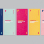
Social Enterprise UK by Paul Belford Ltd.
Social Enterprise UK is an organisation that represents those that use the power of business to bring about social and environmental change. With the intention of dramatising the organisation’s investment in, and contribution to, developing a fairer society, London-based graphic design studio Paul Belford Ltd. created a logo that draws an equals symbol from an S, links a number of sub-brands and differentiates these through colour....