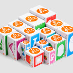
Kid O by Studio Lin
Kid O is a modern American toy company that creates products that engage and stimulate children through a rich variety of shapes, colours, and sizes. Designed by Studio Lin, Kid O’s new packaging treatment — which included over 50 boxes — takes the vivid colours of the industry, reduces these down to four, contains them within geometric boundaries and pairs...
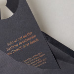
The Confidante by RE:
The Confidante is a group of CEOs who draw on their extensive networks to provide business leaders with tailored executive coaching and mentoring services. Designed by Re: Sydney, The Confidante’s new brand identity effectively visualises the confidential and discretionary nature of their work and the executive level of their service through a simple negative space keyhole logo that has been given...

Fort Standard designed by Studio Lin
Fort Standard is a New York based industrial design studio using long-lasting natural materials and traditional production methods in an innovative way to produce products, lighting and furniture with a simplicity, high functionality and an attention to detail. As the studio explain online, their ability to act as both designers and manufacturers not only informs their process, but yields smarter products...
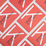
Colours Of The Kalahari by Believe In
Believe In recently published images of their print and brand identity work created for the Mall Galleries’ exhibition Colours Of The Kalahari, the first major display and sale of southern African Bushman art ever to be held in London. The exhibition represents the latest generation of contemporary San artists from an unbroken line that stretches back 20,000 years, and includes 150...
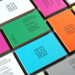
KVGD by Kerr Vernon
KVGD is a Glasgow based graphic design studio run by Kerr Vernon that works within the fields of brand identity design and print, has a ‘be nice, do good work’ philosophy, and a reputation for producing engaging, thoughtful and crafted projects. The studio’s client base is diverse, local and national, and includes businesses such as gallery, event and creative workspace The Whisky Bond,...
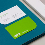
Eika by Mission
In response to the financial crash the Terra-Gruppen, a Norwegian financial group owned by and in alliance with 80 local banks, looked to take positive steps to reaffirm its commitment to local customers and the continued contribution it makes to the growth and development of the communities it serves. This came in the form of a rebranding exercise that led to the name Eika and...
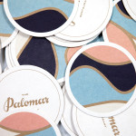
The Palomar Restaurant by Here
The Palomar Restaurant is located at the heart of London’s Soho district with a menu that is described as being reflective of the foods of modern-day Jerusalem and influenced by the cultures of Southern Spain, North Africa and the Levant. Its interior features a zinc kitchen bar, mosaic marble and reclaimed parquet floors, marble surfaces, oak panelled walls, a skylight providing natural light and royal blue...
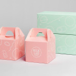
Milk Lab by Studio fnt
Milk Lab is a 100% pure milk dessert, flake and roll cake restaurant located in the South Korean city of Busan. The restaurant’s visual identity, designed by Studio fnt, conveys some of the chill and smoothness of its desserts through the rounded terminals of a slab serif logotype, its container, similarly styled monolinear icons, icy photography and a milky pastel colour palette, and...
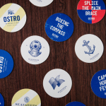
Seafarers & Ostro by Inhouse
Seafarers is a recently rejuvenated seven floor habour front building located in Auckland’s Britomart precinct that will house, over two floors, Michelin starred chef Josh Emett’s flagship restaurant, due to open in stages throughout 2014, as well as brasserie and bar Ostro. The brand identity for the building, restaurant and brasserie, developed by Inhouse, draws on the rich history of the space—once known as...

Limelight Sports by Studio Blackburn
Limelight Sports is a London based agency that specialises in grass roots sports consultation, organises high profile events and campaigns such as ‘SwimBritain’, ‘Nike She Runs 10km’ and the London Duathlon, and creates programmes designed to engage with a mass audience by utilising mobile and location based technologies and social networking platforms to connect competitors and spectators during live events. Design agency Studio Blackburn...
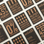
Miinus by Bond
Miinus is kitchen created by Finnish furniture manufacture Puustelli. As the name suggests, Miinus was developed around the philosophy of reduction, the process of removing superfluous elements to leave only the minimum, most functional aspects intact. Helsinki based design studio Bond where commissioned by Puustelli to develop a brand identity for the kitchen that would extend across stationery, print, retail and exhibition spaces. By utilising...
Los Italianos by Huaman
Los Italianos is a traditional Italian food producer and retailer with three locations across Barcelona but with its roots in the Piemonte region of Italy and a significant history that dates back to 1939. Los Italianos recently commissioned Spanish design studio Huaman to develop a new brand identity that would better position them within the gourmet category, introduce an elegance and modernity...