
Candela by RoAndCo
“Candela is a women’s footwear and ready-to-wear line created by Gabriela Perezutti. Influenced in part by her childhood spent on a horse ranch in Uruguay, the collection embodies Gabi’s soft femininity, adventurous gaucho spirit and South American roots. We [RoAndCo] conveyed this spirit throughout all iterations of the company’s branding—from business cards and lookbooks to art direction and campaigns—through elements...
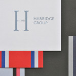
Harridge Group by Igloo
Harridge, formerly Ealing Travel Services, is a corporate travel group made up of Harridge Business Travel, Harridge Luxury and Harridge Events. London-based design studio Igloo were recently commissioned to design the group’s visual identity and brand architecture which would reference its “significant history and experience”. Their design solution, a combination of serif detail, sans-serif characters and a modern colour palette and pattern set, drawing on...
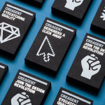
Creagent by Bond
Creagent is a Finnish ‘design broker’ that provides a “unique pool of talented designers from all fields and a wide range of expertise to match various business needs.” Creagent’s new brand identity and website, developed by multidisciplinary design studio Bond – currently on a roll with new work for Allsorts and the University of the Arts Helsinki – utilises a bold, brightly coloured set of pictograms and...
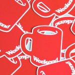
Weekend by RoAndCo
Inspired by ‘cartoonish film titles from the 1980’s’, design agency RoAndCo recently developed the brand identity for Dallas coffee shop Weekend, an extension of their retail store “which has become a relaxing everyday haunt for vacationers”. Based around a tightly spaced Cooper Black logotype, a “minimal and refined typographic system” and a striking but restrained red and white colour palette, Ro&Co created a solution...
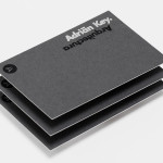
Adrián Key by Face
Adrián Key is a San Pedro based architecture firm and architect working with the rich and famous from “one of the most exclusive corners of northern Mexico”. Design agency Face Creative developed a new visual identity for the firm with a “clean, simple aesthetic with bold and modern touches, an icon that cleverly encases the name of the brand in its design, and...
Cocktails & Bitters by Bureau Collective
Cocktails & Bitter is the identity of professional Swiss bartender Philipp Grob whose service is described by Bureau Collective, the design agency behind his new visual identity, as a “special and individual bar experience” “for gourmets, connoisseurs and explorers.”...
Platform by Pentagram
Platform is a not-for-profit organisation that aims to “increase the interest and participation of underrepresented groups in the fields of technology and entrepreneurship, with a particular focus on African-Americans, Latinos and women” and “to help influence and inspire the next generation of innovators, inventors and entrepreneurs” through its website, conferences and providing “access to current leaders and role models”. Platform’s visual identity, designed...
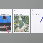
Tegn_3 by Neue
Tegn_3 is a Norwegian, multidisciplinary, architecture design studio that, through inclusive methods, process-oriented and competent project management, deliver holistic solutions that encompass the fields of architecture, planning and landscape, to large clients across Scandinavia. Their visual identity, developed by Neue, draws together the themes of technical knowledge, structure, connections, collaboration and creativity through neutral typography, a modular and expanding geometric...
Longton by Longton
Longton is a Melbourne-based multidisciplinary design studio, established in 2012 by Michael Longton, that offers its clients holistic design solutions built on Michael’s past experience—under his previous agency And—with large, international businesses such Sony Music, Billabong, Stussy and Warner Music. The studio’s brand identity—an unusual, modernistic arrangement of neutral sans-serif characters, recurring circular forms and a single consistent line weight forming a logo—has a...
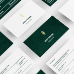
Guy Bauer by Anagrama
Guy Bauer is a Chicago-based video production company ‘committed to creating stories that elicit feelings’. The company’s new visual identity, based around a quill logo – conveying their story-telling philosophy – a stationery solution that references the film industry in its layout and a deep green color palette, designed to convey depth and reliability, was recently developed by independent design agency Anagrama....
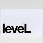
Level Improvements by Studio Hi Ho
Level Improvements is a small-scale builder that possesses, in the words of Hi Ho – the studio responsible for their new identity – a characteristic often lacking in others in their field — a high level of craft and attention to detail. To reflect these values, Hi Ho developed a ‘easily managed and straight talking’ visual identity solution that leverages the...
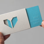
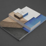
Minke by Atipo
Minke is a Spanish print production studio that favours ‘analogue splendour’ over mass manufacture, providing its clients with a variety of small-scale, mechanical and handcrafted processes. Their visual identity, developed by multidisciplinary design studio Atipo, reflects these services, processes and philosophy through a union of traditional and contemporary detail that exists across type, colour, material texture, print finish, pattern and die cut...