Mixed Fibre Materials
Kettle Kids by Two Times Elliott
The once laudable claim to have started a thriving business with ‘a small loan’ from a doting family member may have been muddied beyond recognition by the truth-stretching of serial tax-offender and part-time Presidential candidate Donald Trump. Despite this, turning ‘one thousand pounds from nan’ into a luxury watch and diamond dealership with a sparkling flagship store in Mayfair remains...
Tale London by Two Times Elliott
Tale London creates photorealistic renderings for both interior design and architectural clients across a diverse range of projects, from the traditional and rich to the modern and simple. Their sensitivity to both exterior structure and interior materiality, as well as associated considerations and a stylistic breadth is expressed by Tale London’s visual identity, designed by Two Times Elliott, in the graphic...
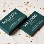
Maldini Studios by Jens Nilsson
Maldini Studios is a Stockholm-based interior design and carpentry studio made up of project manager and carpenter Rasmus Moberg, interior designer Elina Johansson and carpenter Theo Klyvar. The studio’s work often uses precise lines and geometric forms to elevate the irregular detail and texture of natural materials. There are moments of utilitarian and ornamental juxtaposition, times at which this feels subtle and transitional,...
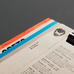
Brewdog Menus by O Street
O Street worked with craft brewery Brewdog; best known for their beers and big attitude but also a growing hospitality presence throughout the United Kingdom, to create a distinctive menu design and system for over fifty of their bars. This included both a full menu which features a handmade backboard, and a Daily Drafts menu, individually finished at each location....
Royal West of England Academy by Spy
Royal West of England Academy brings world-class visual art from around the world to Bristol. It is the city’s first art gallery, the UK’s only regional Royal Academy of Art, and is located in a grand Grade II listed building. RWA worked with London-based graphic design studio Spy to develop a visual identity that would feel relevant and engaging, and re-establish confidence...
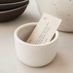
Natasha Alphonse Ceramics by Shore
Natasha Alphonse is a ceramic artist raised in the Saskatchewan province of Canada who now works from a studio in the US city of Seattle. Her ceramics are characterised by a mix of simple forms, irregular surfaces and an earthiness in colour and texture. With a desire to scale her brand into a viable business Natasha worked with American graphic design studio Shore to develop...
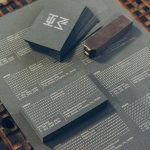
HEWN by Föda
HEWN is an American architectural woodworking shop, custom furniture fabrication and metalworking business with extensive facilities, a team of master-craftsmen, a national presence and local legacy. It also has a preference for native Texas and reclaimed woods. HEWN worked with Austin based graphic design studio Föda to develop a new brand identity that would help ensure market share and longevity, and would lay the...
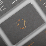
DNA Development by Face
DNA development is a New York based, privately held and vertically integrated real estate investment and development business that looks to create beautiful, functional and liveable spaces. This intention is reflected throughout their new brand identity, designed by Mexican graphic design studio Face, across business cards, stationery, notebooks and website....
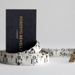
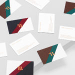
Roberto Revilla London by Friends
Roberto Revilla, working with his wife Carolina, provides luxury yet accessible custom tailoring services nationally and internationally from his premises not far from London’s Saville Row. As well as tailoring, Roberto also retails a range of high quality accessories online. In response to a growing global client base and a desire to position the company alongside the “giants of luxury tailoring”...
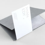
Ryan Edy by Founded
Ryan Edy is a UK based, award-winning advertising and editorial photographer whose clients have included Vodafone, Wilkinson & Wetherell and Innov-8. Design studio Founded worked with Ryan Edy to develop a brand identity treatment that, based around a simple, familiar but communicative framing device, also went on to include both print and digital portfolio design....