
Daniel Juncadella by Mucho
Following his recent promotion to official Mercedes driver for the DTM (Deutsche Tourenwagen Masters) and test driver for The F1 Mercedes team, Daniel Juncadella recently commissioned design agency Mucho to “improve his personal brand and the way he communicated with his growing fan base and the press”....
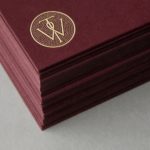
Willow Tree by Bunch
Willow Tree, one of London’s leading business consultancies, worked with graphic design studio Bunch to develop a new but traditional-looking visual identity with an attention to detail. Based around a WT monogram, created by typographer Spencer Charles, utilised as a mix of embosses, carved in seals and simulated watermark, and using purple cloth, black leather, cream paper and handmade coffee pottery, Bunch’s solution embraces a...
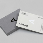
Ali Sharaf by Mash Creative
Ali Sharaf is a Bahrain-based commercial photographer who specialises in fashion, beauty and lifestyle images for the advertising and editorial markets. He describes himself as contemporary, upbeat, outspoken and edgy. Inspired by a shared interest in Swiss modernism and adopting a less is more approach, design studio Mash Creative developed a new brand identity for Ali that combines an iconic...
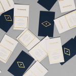
Tourean by Anagrama
Tourean is a British multinational venture capital firm that manages a variety of lifestyle subsidiaries within the music, design, events, social media and fashion industries. Their new visual identity, developed by design agency Anagrama and drawing inspiration from the Tourean name – a compounding of the words taurean and tour created to convey the values of strength, fortitude, courage and integrity as well as...
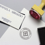
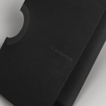
Rafaela Abrahão by BR/Bauen
Brazilian fashion blogger Rafaela Abrahao recently commissioned design agency BR/Bauen to develop a new visual identity that would extend across her website and stationery. Drawing on Rafaela’s favourite brands, Prada, Versace and Hermes, and an interest in English nobility for inspiration, BR/Bauen developed a solution that unites the fine illustrative detail and typographical flourish of a blackletter monogram executed with a contemporary and consistent...
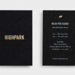
Highpark by Face
Highpark is a new residential project located in the middle of San Pedro Garza García and described by Face – the agency behind the development’s visual identity, print work and website – as ‘arguably one of Latin America’s most affluent municipalities’ and widely credited as an “architectural masterpiece”. Face go on to say that the “project needed to speak volumes about the...
Metronet by Work In Progress
Metronet is an Oslo-based consultancy that provides strategic SEO, PPC, e-commerce, social media, web analytic, design and development services to a wide range of international clients. The consultancy’s visual identity, developed by Work In Progress, mixes the established technological conventions of simple geometric forms, fine line weights, grids and a mono-spaced typeface with abstract interior artwork and a retrospective undertone to convey digital networks,...
K2LD Architects by Studio Hi Ho
K2LD is a small Melbourne-based architecture and interior design firm with a project history that includes individual private homes, community precincts, multi-unit developments and large-scale commercial projects. The firm’s identity, an abstract, structural and modular amalgamation of initials (check the ideation animation here), uncoated materials and a monochromatic colour palette – developed by brand and communication studio Hi Ho – unapologetically embraces the established and reductionist cues of the industry....
NB Flowers by Karoshi
NB Flowers is a florist – founded by Neil Birks and located at London’s New Covent Garden Market – that specialises in corporate and private events, delivering value through a combination of ‘beautiful flowers, creativity, and a personable service’. Multi-disciplinary design agency Karoshi were commissioned to ‘rebrand and reposition NB Flowers as one of London’s leading luxury event florists and capture the essence of the...
O Architecture by Heydays
O Architecture is a small, Lille-based multidisciplinary studio whose practices extend beyond traditional architectural services to include artistic installations, educational courses and editorial work. Their visual identity, ‘a solid circle with a disruption that creates a triangle reminiscent of an A’ – created by design agency Heydays – , unites the broad remit of the studio under a simple symbol with a revolving, holistic quality that...

The Beaufort by The Company You Keep
Design agency The Company You Keep (TCYK) have recently finished working with bartender Dave Kerr on the naming, branding, collateral design and signage for The Beaufort, a themed dive bar located on Melbourne’s Rathdowne St. The agency’s visual identity solution, a combination of a quirky, well rendered, bespoke logo-type – built from unusual but original uppercase characters inspired by iron dock...
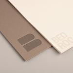
Bedroc by Perky Bros
Bedroc is a Tennessee-based consultancy firm that takes complex business issues and simplifies them with technology to reduce risk, optimise efficiency and creating revenue for its clients (ROC). The firm’s visual identity, created by multidisciplinary design agency Perky Bros, avoids the conventions of the industry and instead favours a direction that draws an analogy between bedrock and technology—the physical stability, sub-surface...